Navigation Bar

August 30, 2014

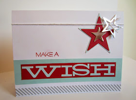
WISH

I was so impressed with the July Paper Pumpkin kit, not only because of the cool designs for the projects -- little treat boxes and cards -- but because of the great stamps that were part of it. Stamps that I can use over and over throughout the coming years, because they are so versatile.

Following is a photo of the front of the instruction sheet, how Stampin' Up! meant for the card to look:


I thought it could easily be stepped up and made my own with only a few simple changes. This is what I came up with:


It's basically the same card, but with a bit of color to make it all pop! That turquoise/red combo is so popular, and was just right for this card.


I also changed up the star formation a bit. Not a LOT different, but it is a little more "Linda". I always like to add my own personal twist to a project.


Which brings to mind a memory of several years back. Usually when I went to some stamping function, it was rare that I did the project the way it was meant to be. I know. Call me "rebel". Always marching to my own drummer. 

In fact, when I hold my monthly Stamp-In workshops, I always encourage my attendees to make it more their own if they wish. Just because I created a project in such a way doesn't mean it's the only or the best way. We have to be creative and be individuals at times. If you are comfortable with that. I know some people work best when they can follow a sample and/or instructions precisely as presented. Which is perfectly fine. But, there is nothing at all wrong with trying to make your own creations just that. Your own. I mean, isn't that what Paper Seedlings is all about? Planting little creative Paper Seedlings.

Anyway, back to my years-ago memory: One time I was at a stamping function by myself. I didn't know any of the other attendees. So I was able to work at my own pace and do  my own thing. Well, it happened that a lady sitting right across the table from me was obviously keeping a close eye on what I was doing. When I eliminated one of the stamped images the creator had used in her sample, the lady pointed it out to me. So helpful. I just told her that that was how I wanted to do it. Her indignant answer: "Well, to each his own I guess." I still chuckle when I think of how upset she was that I didn't do it the way I was SUPPOSED TO. 

That is the beauty of the monthly Paper Pumpkin kits: You can make it EXACTLY as presented. Or, you can switch it up to make it uniquely YOU. I love that. Often, I make some of the projects just as Stampin' Up! meant them, while, from the same kit, I will change things to make it mine.


A N D . . . for a few more days, you can get your first two months of a Paper Pumpkin subscription for HALF PRICE! 

* For new subscribers only
* Month-to-month subscriptions only, not prepaid subscriptions
* First two months are half price. The regular price is $19.95 per month.
* Must join by 11:50 p.m. Mountain Time on Wednesday, September 10.
* Go to https://mypaperpumpkin.com/en/ to sign up for your special. 
* Enter the promo code "HALFOFF2" when you are signing up.
* Don't forget to name me as your demonstrator!
* Have a BLAST when your first kit arrives the middle of September!

Paper
Pumpkin
Smiles.

August 26, 2014

TRUCKS AND DIGGERS

I do love a challenge. That's when the Paper Seedlings are planted really deep. I get to THINK and really PLAN! And it is so much fun to watch those Seedlings grow and develop!

I especially love it when someone hands me a challenge that is quite outside my personal box. Those are the projects that really help me grow as a creative person.

When a friend discovered that I had in my possession some bright yellow tissue paper with Caterpillars (the kind of Caterpillars used in road construction) she got very excited. Oh?

She proposed to me that I make a birthday card for her son using that tissue because "he is in construction! He would love that!" I immediately agreed. But . . .

. . . when I got down to my Creation Station and looked at the tissue once again, I discovered that the Caterpillars were several inches apart. With the usual size of a card being 4 1/4" x 5 1/2", I would be able to fit maybe two-and-a-half Caterpillars on a card front. Real impressive, huh?

I fixed that problem by ripping out the Caterpillars with a bit of yellow tissue around each one. I then collaged the pieces onto a piece of cardstock, overlapping as needed. It turned out pretty cool. And, the ruggedness of the torn edges further added to the construction site look of the card!

Being a mother of girls, I had no construction-type stamps in my stash. So, I went gladly to my old buddy MDS (My Digital Studio). I knew I had something in there that would work perfectly.

I created my trucks and a few traffic signs in MDS, printed them, then cut them out with wiggly borders around each image. For a dirt/sand look, I tore some handmade sandy-colored paper into a couple pieces upon which the trucks could be grrrrrr-ing.

My sentiment was also created in MDS, then printed and cut out.

Here is the final result:


I must report that when I delivered the card to her yesterday, she was delighted and knew he would love it too. Happy Birthday to Gus!

Are you ever presented with a challenge, maybe more than you think you're capable of? Did/Do you pursue it to the end? Or did you give up before you even started? How about discovering that it wasn't working out quite the way you had planned/hoped? Did you give up then? Or are you always ready for a continuing challenge -- that of rethinking and possibly ditching your original plans? 

Sometimes when I'm trying to figure something out and it is just not going right no matter what I do, I step away from it for the rest of the day and come back to it later. Often I will discover that it wasn't nearly the disaster I had originally thought it was, and was able to pick up where I had left off and finish it up. And be happy with the result. At other times I'll come back, take one look at what I had walked away from and realized that I was right to have done so. I rarely throw something away completely. I am usually able to rescue at least part of the project, and proceed from there. I will never call a project finished until I am completely satisfied.

Please share some of your challenging experiences with us?

Constructive
Smiles.


August 23, 2014

FLOWER PATCH

The Flower Patch bundle. Have you checked out this delightful offering in the big Stampin' Up! Inspire Create Share catalog? The 19-piece photopolymer stamp set, found on page 156, when combined with the 11-piece Flower Fair Framelits set on page 230, is an unstoppable winner. Really, if you don't believe me, check out all the fun ideas on pages 154 and 155 in the catalog. And, when you purchase it as a bundle, you save 15% off the price of buying them separately. 

I was so excited when I finally got this bundle in my greedy little hands! Unfortunately, it was a few days before I could get some creating done with it. Here is what I finally came up with:


I knew I wanted to use the Large Polka Dot embossing folder on a crispy Whisper White background. But, when I set all the flowers and leaves against that background, it fell way short. I hate to admit it, but I rarely use Washi Tape in my work lately. I don't know why. It is so versatile and easy to work with. 

So, on a whim, before mounting my embossed piece to the card base, I added three strips of the Washi Tape from the Retro Fresh set (found on page 190). Adorable, wouldn't you say?

I used the retired Curly Cute stamp set for my sentiment and cut it out with one of the Framelits from the Project Life Cards & Labels set (page 230). The white-against-white wasn't striking enough. So, I cut a piece of cardstock to act as a little mat for the label, and edged the top and bottom with more of the Washi Tape. 


When seen from the front, the flowers show lots of dimension. But . . .


. . . from the side, those flower layers really P.O.P.! 


Why don't you consider joining me in the Flower Patch and order a bundle for yourself? I would love to be your demonstrator!

Flower
Patch
Smiles.


August 19, 2014

EMERGING COLOR TUTORIAL

Believe it or not, the bright red background on this card actually started out life as a piece of Whisper White cardstock! Amazing, huh?

This card features a technique called Emerging Color. It is a variation on the wondrous emboss resist technique.


Do you see how the underlying colors seem to be emerging? Even though the whole thing seems to be pretty mysterious, it is really easy -- and gratifying!! -- to do!


Since this card has so much punch and personality, I decided Sassy Salutations (page 67 of the big catalog) was the just right choice for the greeting. Do you not agree?

And I love the tag with the little blip on one side from the Chalk Talk Framelits (page 230 of the big catalog) upon which to place the snappy Happy Birthday.

I used the flower from the retired Button Buddies stamp set. But any stamp that is mostly solid inked areas would work just as well: the two bottom left stamps from Label Love (page 14); Perfect Pennants (page 16); even the frame from Say Cheese (page 30); the cute octopus from Sea Street (page 48); the cupcake bottom from Cupcake Party (page 58); the large label from Everything Eleanor (page 69); Something for Baby (page 74) would be aDORable; the elephant and the rhino from Zoo Babies (page 78); imagine the sports characters from Simply Sports (page 92); the alphabet, Larger Than Life Alphabet & Numbers, (page 99) would be so cool; many of the stamps from Flower Patch (page 156); What's Your Type? (page 160); and For All Things (from the new Holiday Catalog, page 41) would be great to try. This is just from a quick look through the catalogs. I'm sure there are lots more that I missed. Use your imagination!


Now, how would you like me to tell you just how to make a card like this one for  yourself or someone special? In lieu of Button Buddies, try any of the sets I listed, or maybe you already have one in your stash that would be perfect for the technique! 

Anyway, this is how you would replicate my card:

Supplies:
Circle Circus stamp set
Button Buddies stamp set
Sassy Salutations stamp set

Whisper White cardstock
Pool Party cardstock

Strawberry Slush ink
Crisp Cantaloupe ink
Hello Honey ink
Pool Party ink
VersaMark ink

Big Shot
Chalk Talk Framelits
Heat Tool
Embossing Buddy
Clear Embossing Powder
Brayer
White Baker's Twine
Glue Dots
Stampin' Dimensionals
Button
Paper towel

Directions:
Fold a 5 1/2" x 8 1/2" piece of Whisper White cardstock in half, creasing well with a bone folder.

Adhere a 5 1/2" x 4" piece of Pool Party cardstock to the card base.

Randomly stamp three circles from Circle Circus, each in its appropriate color, across a 3 3/4" x 5" piece of Whisper White cardstock. It is OK to overlap these colors, but not just TOO much. This will provide the color in the flowers.

Rub the Embossing Buddy well over this small piece of cardstock.

In VersaMark, randomly stamp the large flower (or stamp of your choice) over the color circles. Keep track of where you are stamping these flowers. If possible, do not let them overlap.

Cover the stamped flowers with Clear Embossing Powder. Heat to emboss, making sure each flower is fully shiny and embossed.

Run the brayer through the Strawberry Slush ink pad several times, always in the same direction. Brayer this over the flowered paper. Continue inking and brayering in all directions until you have an even coat of color. This will take several applications. Be patient! The end result will be so worth it!

Use a paper towel to gently rub the excess ink from the flowers. Adhere the flowered panel over the Pool Party layer.

Stamp the sentiment in Strawberry Slush on a scrap piece of Whisper White. Use the Framelit from Chalk Talk in the Big Shot to make the label. Attach the label to a 1 3/8" x 3 1/4" piece of Pool Party cardstock. Adhere this piece to the card front with three Stampin' Dimensionals, keeping the two edges flush with the outer edge of the card.

Tie White Baker's Twine through the holes of the button, forming a large bow at the back of the button. Adhere the button to the center of one of the flowers with a Glue Dot.

There! Have fun with those emerging colors!

Emerging 
Smiles.

August 16, 2014

GOOD MORNING!

A former co-worker contacted me recently asking if I would be willing to make a special card for her. She gave me a few parameters to work within: a get well card, ice cream-related, favorite ice cream flavor is chocolate or swirl, must include the words "Good Morning" on it, and it's for a funny man.

I had no rubber stamps with the theme of ice cream, nothing even remotely close. So I turned to my trusty MDS (My Digital Studio).

Even though I have tons and tons of stuff within my MDS arsenal, it is so easy to come up with a certain type of image. By using the search magnifying glass, you just need to type in a key word or words, such as "ice cream". All images, words, embellishments, punches, DSP, that have anything to do with "ice cream" that you have among your personal downloads pop up within the search box, as well as the set in which your choice can be found. By simply clicking on "insert" MDS automatically inserts your choice into the center of your project. From there, you can resize it, flip it, tilt it, color it. Whatever you want to do to make it just right for your project.

It was a lot of fun coming up with a card that worked for what she wanted:


I created the ice cream cone and the "good morning" in MDS, printed them out on white cardstock, then cut them out separately. I popped up the dollop of ice cream, as well as the words "good morning" with Stampin' Dimensionals. The cone was adhered to an oval created from retired DSP. The Cherry Cobbler piece behind the DSP oval is created with the Apothecary Accents Framelits, and then the whole thing is mounted onto another oval made with the Ovals Collection Framelits. A few Basic Pearls added the perfect touch. It says "Get Well Soon" inside the card.

My only regret about this card is that I didn't emboss the white background. I think that would have added a nice touch of whimsy. Unfortunately, I realized this after the card was completely put together. 

Do you ever have just a few clues as to what you want to accomplish in designing/creating a card? What is the first thing you do? Do you immediately know exactly which image, etc., you are going to use? Do you have to go on a major search through your stash? Do you automatically turn to MDS, knowing that for sure you will find just what you need there?

Ice
Cream
Smiles.


August 14, 2014

IT'S YOUR DAY

Paper Pumpkin. You've heard of it, right? Stampin' Up!'s monthly subscription? It's a wonderful thing.

I have been subscribing for quite a few months now. It is such a thrill to have that cute bright red box arrive in your mailbox. And what's inside is always so very exciting, I can hardly wait to get creating.

Those months that I change up my project from the instructions included, I often have leftover product. Of course, you ALWAYS have the stamps and the ink spot left over. But, I mean SUPPLIES. STUFF to play with. GOODIES that make your kit even more valuable.

After I created what I wanted from this past kit, I was left with the cute "It's Your Day" banner. It was a bit too long to use on a traditionally-sized card. So . . . I snipped off the extraneous ends, and put it to work!


In addition to the banner, I added a few things from own stash. I used dotted DSP for both the piece the banner was adhered to as well as the three popped-up stars that really finished off the card. Adding some of the embossed arrows to the piece of Tangerine Tango cardstock strip at the bottom . . . Mwah! 

I love the cheerfulness and pizzazz of this card!

Share some of the ways you use leftovers from your Paper Pumpkin kits with us in the Comments section. We're anxious to hear your ideas!

For further inspiration, check out my Paper Pumpkin Pinterest board HERE. I am always adding new projects to the board, not just mine, but others that I discover here and there. 

Please let me know if you are interested in subscribing to Paper Pumpkin, or go to My Paper Pumpkin, and don't forget to name me, Linda Kilsdonk, as your demonstrator. Until September 10, new subscribers can get 50% off their first two months! 

August 9, 2014

MUSICALLY BLENDED BLOOM

I know. I KNOW. You were all wondering if I had abandoned my precious Blended Bloom. Weren't you?

Well, I haven't. This time I was playing a little bit of music with the stamp -- so to speak.

I had so much fun creating this dimensional flower. I stamped it three times on old music, then proceeded to cut out and use one whole bloom as the base, and from the other two, I cut petals to elevate some of the layers. In a few spots, I even have three layers. Time consuming, but, oh, so satisfying.

A little problem arose when I went to make the center of the bloom. I tried a couple of different options, none of which worked in my eyes. I finally settled on embossing the center onto black cardstock, then painstakingly cutting it out, and adhering it as my top layer on the flower.

Embossing with the Fancy Fan folder, as well as a touch of some of Stampin' Up!'s luscious DSP from last year, helped to carry the elegant motif throughout. Sponging with Baked Brown Sugar ink adds to the antiqued patina of the piece.


In this photo, you can see the dimensional layers a little better:


By adding a small strip of the sponged music to a slightly larger strip of black cardstock, the card was almost complete. What finally did complete the composition was popping on a button threaded with the Gold Metallic Baker's Twine (although the gold metallic flecks only show up in one spot from a strange angle. Not very good planning on my part, I guess).


Once again, as I so often do, I elected not to add a sentiment to the front of the card. To me, adding a specific sentiment limits the uses for a card. Except, of course, if it is an obvious occasion, such as a birthday with candles and cake. By adding the desired sentiment to the inside of the card when you decide what you are going to use it for, makes a card such as this have limitless possibilities for occasions. And isn't that nice?

Bloomin'
Smiles.

August 5, 2014

BALLOONS ON A MYSTERY BACKGROUND

Recently a friend asked me if I would like to have a pile of tissue paper she was going to throw away. (She was aware that I was a bona fide packrat.) One side was a darker pink, the other the same pink in a lighter tint. The paper was sort of crispy, and I wasn't sure what I would use it for. I set it aside. A few minutes later, a lightbulb went on. I grabbed a corner of the paper and crushed it in my hand, then uncrushed it. Perfect! It would be PERFECT!

I prepared two backgrounds, one with the dark side showing, the other with the light as the focus. The dark side matched Stampin' Up!'s Melon Mambo exactly. Hmmmm. Now, what to do with it . . .

Dig, dig, dig . . . planting some Paper Seedlings . . .

As part of the Paper Pumpkin Boot Camp I had been currently participating in, I was about to host(ess) my Paper Pumpkin event. This background would work so well for a project for that event. You see, I was going to use stamps from previous Paper Pumpkin kits in a new and different way. Here was the background for this project!

And I was proud that I had rescued a great art material from certain death in the garbage can! 


Gorgeous crunchy texture:


The lighter pink as the background. I will save this for a future project.


Here is a tutorial on how to create this card.

Supplies:
Stamps from past Paper Pumpkin kits

Whisper White cardstock
Daffodil Delight cardstock
Melon Mambo cardstock
Bermuda Bay cardstock
A scrap of cardstock measuring 3 3/4" x 5"

Bermuda Bay ink
Melon Mambo ink
Daffodil Delight ink

Bright pink tissue paper (from a shoebox)
Big Shot
1 3/8" Circle Punch
Project Life Cards & Labels Framelits
Baker's Twine
Stampin' Dimensionals
Anywhere Glue Stick

Instructions:
Fold a 5 1/2" x 8 1/2" piece of Whisper White cardstock in half, creasing well with a bone folder. Adhere a 4" x 5 1/4" piece of Daffodil Delight cardstock to card front.

Crumple a piece of tissue paper measuring about 5" x 7" in your hands. Unfold. Crumple again. Unfold. Continue doing this until your tissue paper has charming peaks and valleys after you flatten it slightly.

With Anywhere Glue Stick, completely cover the 3 3/4" x 5" piece of scrap cardstock, edge to edge, making sure the corners are well covered with glue. Lay the tissue paper on top of the glue, and gently pat the tissue down onto the glued piece. Carefully press in all those peaks and valleys. Don't flatten the tissue completely. The texture is what gives this background its charm. Trim edges about 1/2" - 3/4" past the back of the cardstock edges. Carefully adhere edges to the back of the cardstock. Glue into place on top of the yellow piece on the card.

On a scrap of Whisper White, stamp various patterns in the three chosen colors. Use the 1 3/8" Circle Punch to punch a "balloon" from each of the stamped areas.

From the Baker's Twine, create tiny bows. With the green glue, adhere the bows to the bottoms of each of the circles. Use scotch tape to adhere separate pieces of Baker's Twine to the backs of the circles. With a Stampin' Dimensional on the back of each circle, adhere the "balloons" to the card front.

On a scrap of Whisper White, stamp Happy Birthday in Bermuda Bay. Cut out sentiment with the Project Life Cards & Labels Framelit.

Adhere 1/8" Melon Mambo and 1/4" Bermuda Bay strips to a Daffodil Delight strip that measures 1" x 4". Use the Paper Snips to create a flag on the left edge of this strip. Glue sentiment tag to strip. 

Where you plan on placing this completed strip, use a little tape to hold the strings of the balloons in place. With three Stampin' Dimensionals, adhere the finished strip over the balloon strings.

There, now you can feel good about recycling: tissue paper that was to be thrown out, as well as stamps from two separate past Paper Pumpkin kits. LOVE IT!

Crinkly
Smiles.


August 3, 2014

BLUSHING BRIDE

First of all, I must apologize that this is a very photo-rich blog post. I hope you don't mind. You see, there are many facets of this card I would like to show you.

This is the very special wedding card I had been commissioned to create:


Once again, I went with the "two hearts become one" theme. I love this romantic way of pictorializing a brand new union.

NOTE: Since this was a fairly mechanical card that needed to mesh perfectly in order for it to be a success, I created a prototype from scrap cardstock just to make sure my idea would work. Gratefully, it did, and I went ahead with my plan.


Don't you love the two large Daydream Medallions (page 70 in the large catalog) I adhered together to form the intricate gate that frames the heart focal point? They were cut out with the Floral Frames Collection Framelits after they were stamped and embossed with White Embossing Powder. 


These medallions feature elegant emboss resist. The cool thing about the color choice is that the sponging is done with BLUSHING BRIDE ink. This is a wedding card. Blushing Bride? Get it?? It turned out to be the absolutely PERFECT choice of color to complement the Very Vanilla cardstock I used for the card.


Once the sponging was completed, I used one of the Circles Collection Framelits to cut out a round center. I love the embossed circular edge this created.


I wanted a stamp for the hearts that would complement the beautiful filigree look on the medallions, so I searched through my stamps for an all-over design that would work with my plan. I discovered this design that was in a rectangular format. I stamped it twice in VersaMark, embossed it with White Embossing Powder, then sponged the Blushing Bride ink over the entire images. I then used Framelits from Hearts A Flutter to cut out two identical hearts. PERFECT!


In this photo, you can see how the heart on the right hand gate comes over the stationary heart within the medallions and they mesh perfectly to become one single heart.


As the card comes to a complete close, it becomes a perfect union. Two hearts become one.


Inside the card, stamped in the Blushing Bride ink, is the sentiment "Happiness Always" in a very ornate script that echoes the swirls and embellishments on the outside of the card.


We see once again the left gate with the first heart centered in the layered medallions for an elegant look.


Adding my wishes to the bride and groom for a long and happy life together. Two hearts become one.


Blushing
Smiles.