Navigation Bar

May 30, 2015

PORTRAIT GALLERY

SNIFF

Those darlings of the rogue's gallery, From the Herd, will retire after June 2. 

SNIFF

As a final tribute (well, I cannot actually guarantee it will be the FINAL!) to the Herd, I decided to do another card, this time featuring just their heads.

At first, when the Hexagon Punch came out and it DID NOT match the size of the hexagons formed with the Honeycomb Embossing Folder, I was frustrated and discouraged. Since then though I've discovered just how cool it is that the two hexagons actually complement each other and play really well together, as can be seen in my tribute card:


To color the herd's faces, I used my meager supply of Blendabilities (SNIFF). I then fussy cut the heads and mounted them in place on their own hexagons with either whole or partial Stampin' Dimensionals.

And I TOTALLY love the Happy Birthday sentiment that comes with that set. I am positive I will be grabbing that one over and over forever more.


I love this angle of the card.


This color combination is a sure winner: Melon Mambo and the new In Color Cucumber Crush paired up with the crispness of Whisper White.

How could I possibly say goodbye to these adorable faces?!? Forever in my heart . . .

Please share with us which of the retiring stamp sets you are saddest to see retire in a few days. Anything else you regret having to bid farewell to?

Herd
Smiles.


May 28, 2015

FOCUS FRIDAY: ORANGE YOU BEAUTIFUL


Roses.
Beautiful in any color.
But especially stunning in ORANGE.

June 2 will be our 42nd wedding anniversary.
My bridal bouquet consisted of
orange roses 
and
phalaenopsis orchids.

(Yes, we were married in 1973, 
when orange bridesmaid dresses were in vogue.)

For our one-year anniversary,  
my husband gave me a
bouquet of 
orange roses.

ORANGE THEY JUST BEAUTIFUL.

Let your hopes, not your hurts, shape your future.
- Unknown -


Orange
Smiles.

May 26, 2015

BIG BALLOON BIRTHDAY

The May Paper Pumpkin kit, Birthday Bundle, is extra fun! It comes with all the makings to create four darling gift bags, complete with the happy Daffodil Delight tissue paper, PLUS six birthday cards! And these items, even as frivolous as they are, would be suitable for any age, male or female. 

The photo below is of the instruction sheet for the kit and shows what the creations look like if you follow the included directions. Cute, huh?

Notice the yellow balloons. They are cut out of the bag and the yellow is the tissue paper inside the bag showing through the balloon cut-outs. I think that is so so so clever!

So far, I've put together one of the gift bags, exactly as the directions told me. Same for one of the cards.


This is the card I made from the kit, exactly as instructed, using the materials that were included. It's a cute card, isn't it?


However, looking at the components, mainly the base of the card, I saw another potential. Do you see how the "back" of the card is a beautiful solid Island Indigo?

Well, I cut the card in half. I trimmed the blue piece to 4" x 5 1/4", the size that I would normally make a standard-sized mat for a card. I then cut the striped piece down to 3 3/4" x 5" to layer on top of the blue. My new card base was a half sheet of Daffodil Delight from my own stash. I opted to not use the turquoise strip nor the white circle on my new creation.


The following photo shows a portion of the front of the bag that I had created according to the Paper Pumpkin directions. Do you see the big orange balloon? It was a diecut that came with the kit. When I punched it out and used it on the bag, I was left with an orange outline of a balloon. Something would normally be disposed of. But, since it was cute as the dickens, I did not want to toss it.

So . . . 


I carefully cut out the thin orange balloon shape, adhered it to a scrap of Daffodil Delight, then cut out the whole balloon, leaving a tiny margin of the yellow all around it. I then used the same cute sentiment on the balloon as on the original card. I attached a piece of the thick white baker's twine to the bottom of the balloon and finished it off with a bow in the same.

The balloon was popped up onto the front of the card with a couple of Stampin' Dimensionals, and this is the result:


Have you subscribed to Paper Pumpkin yet? The kits just keep getting cuter and cuter and more innovative by the month.

Until June 10, you can subscribe to your first two months of Paper Pumpkin for half price. If, after the first two months, you decide that it just isn't for you, you can cancel. 

To get the half price promotion, click here: https://mypaperpumpkin.com/en/signup/
When signing up, remember to enter the 
Promo Code SAVE50 and name me as your demonstrator. 

C'mon, what're you waiting for? 
Join before June 10 and save 50% for two months!

Paper
Smiles.

May 23, 2015

FLOWER SHOP

The new batch of In Colors is really quite wonderful. Their names are even adorable, and only four of them make me hungry! The non-hunger-inducing one is Tip Top Taupe (but I love the sound of it!) and it joins Cucumber Crush, Delightful Dijon, Mint Macaron and Watermelon Wonder. Yum.

My mom and dad will be celebrating 65 years of marriage on May 25. Wow! That is really a long time! 

For their anniversary card, I decided to team two of the new In Colors, Mint Macaron and Watermelon Wonder, up with Whisper White for a cool, crisp, fun card.

PLEASE NOTE: If you look at a sheet of the Watermelon Wonder cardstock, you would swear they melted down a slice of watermelon to create it. It's that close!


Flowers and leaves from three different stamp sets were used in this card. The sets used are Flower Shop, Petite Petals and Choose Happiness, none of which are retiring! Yay!

The base for the flower-strewn oval is from the Labels Collection Framelits, which, unfortunately, IS retiring. To echo the many polka dots (and other fun designs!) found on the card, I embossed the Mint Macaron label with the Decorative Dots embossing folder. Even the two Basic Pearls are somewhat dot-like.


One of my favorite parts of this card is what I figured out with the beautiful Organza Ribbon. I'm sure I'm not the first one to come up with this "banner", but I feel like I am. I've never seen it before. By angling the ends and overlapping them just right, they form a banner. It was one of those happy accidents, one that I will be sure to use again in the future.


Happy 65th Anniversary, Mom and Dad!

Dotty
Smiles.


May 21, 2015

FOCUS FRIDAY: BEAUTIFUL WEED

The much maligned dandelion is truly a Beautiful Weed. 

Rather than just cursing those infernal pests that pepper lawns, 
have you ever really examined one up close? 

Look at the incredible delicacy of the dandelion: 
the perfectly scalloped tips of each petal, 
the curlicues pointing toward the 
gorgeous chrysanthemum-like curving petals at the center, 
and its glorious and happy color! 

This beauty was one of a few stars on our front lawn, much to my husband's chagrin. 
Oh well. 
They don't last long, and I think they add a lovely sunny look to an otherwise boring lawn. 

BEAUTIFUL WEED

My Instagram Account

Spring is a natural resurrection, an experience in immortality.
- Thoreau -

Sunny
Smiles.


May 19, 2015

STAINED GLASS BLOSSOMS

Every once in awhile I dig into some old ideas that I had torn from magazines, marked in books, tagged in Stampin' Success or printed from the Internet. I mean I have a stash of "ideas" that you wouldn't believe.

The other day, I was sifting through them and came across an article about stained glass stamping. It sounded easy enough and very intriguing. The technique is done on vellum. 

First, after stamping the image in VersaMark onto the vellum, you emboss it in white.

I chose some of our wonderful Vellum Cardstock (which isn't retiring! Yayyy!) for my creation. I love the thickness and richness of it because it really stands up well to embossing. 

Anyway, after embossing, turn your piece over and, using Stampin' Write Markers, color the image on the back side, using the white lines as coloring guides.

For my blossoms, from Indescribable Gift, (page 35 in the Occasions Catalog that will be retiring June 2!) I chose a selection of oranges and pinks for the flowers. And, of course a few greens for the leaves and neutrals for the branches. Once I was finished with my coloring, this is how it looked -- from the reverse side, that is!


BUT, then when you flip the piece over to the front, this is what you get:


I wanted to keep my resulting card looking very very feminine and delicate. It took me quite some time and experimentation to choose the perfect Designer Series Paper to serve as its background. 


My intent was for the background paper to show through the vellum, but not TOO much. Very subtle. I finally decided on this lovely paper.


We all know how tricky it is to adhere vellum to another surface. Don't we?? I decided to use Glue Dots to attach it to the DSP. But then, those little globby circles showed through. So, to carry through with the girly look, I covered those little buggers with our Basic Pearls!


Actually, if you refer back to the photo of the whole card, you can see that the bottom of the card was no problem whatsoever. I used the Glue Dots there also, but it didn't matter if they showed or not because I hid them with the strip of DSP on which I stamped the sentiment. But, to balance the card, I added pearls to the bottom corners also.

Thanks Paper Players for the inspiration!


Girly
Smiles.

May 16, 2015

SPOTLIGHT ON THE HERD

I introduced you to this adorable bunch with a post about the following picture:


Because they are so wonderfully irresistible, I wanted my Stamp-In girls to enjoy them too. However, my rendition of the herd took me several days to complete. And I didn't think they'd want to devote that much time to their own herd.

My goal then was to create something using the same image, but in an easier, much less time consuming way. Here is what I came up with for them to create at the workshop:


Obviously, both of these cards are the same with the exception of the Designer Series Paper I chose to frame the image with. However, the card below seemed wimpy compared to the first one. I'd thought the lighter, more structured DSP would be cute. However, while it IS cute, it just doesn't have enough punch as its more colorful counterpart. I thought that maybe by adding some faux stitching around the border would amp it up a little. While I don't mind it, it is just not zippy enough for my taste.


Anyway, the simple technique I used on my workshop card is commonly known as spotlighting. I have seen several ways to do this, but this is the way I chose for my purposes.

The frazzled chicken that I chose to spotlight looks like he has had quite a day. Eh?


Wanna know how to make a spotlighted herd of your own? Just keep in mind that this stamp set, From the Herd, found on page 15 of the Occasions catalog will retire as of June 2! Quick! Order yours now! June 2 is right around the corner!

OK. Here goes:

Supplies:
From the Herd stamp set (retiring as of June 2, 2015)

Naturals White cardstock (retiring as of June 2, 2015)
Basic Black cardstock
Choice of Designer Series Paper

Daffodil Delight and Tangerine Tango Stampin' Write Markers
Black StazOn ink

Stampin' Dimensionals
3/4" Circle Punch
1" Circle Punch
Baker's Twine
1/8" Circle Punch

Instructions:
Fold a half sheet of Naturals White cardstock in half, creasing well with a bone folder.

On a 3 1/4" x 4 1/2" piece of Naturals White cardstock, stamp the animal image. Focus special attention on the pressure you put on the center of the stamp so you get a uniformly clear image throughout. This important for larger-sized stamps.

On a scrap of Naturals White cardstock, stamp the head portion of the wild-haired (feathered??) chicken. Color just the chicken portion in Daffodil Delight and Tangerine Tango Stampin' Write Markers. Punch him out with the 3/4" Circle Punch. From a scrap of black cardstock, punch a 1" circle. Adhere these two circles together. Using a Stampin' Dimensional, adhere this circle piece to the stamped image atop its stamped counterpart. There! You just did the Spotlight Technique!

Adhere this piece to a 3 3/4" x 4 5/8" piece of Basic Black cardstock, then to your chosen piece of DSP, which will measure 4" x 5 1/4".

On a 1/2" x 1 3.8" piece of Naturals White cardstock, stamp in black "from the herd". Use the Daffodil Delight marker to draw lines around the edges. With a 1/8" hole punch, punch a hole alongside the "from". Tie a piece of Baker's Twine through this hole. 

Wrap a length of Baker's Twine around the entire stamped piece on the very left edge of the white portion, taping the ends to the back. Tie the tag to the upper portion of this in a bow. To secure the tag in place so it doesn't droop over the stamped image, add a small piece of Stampin' Dimensional to the back of it.

Adhere this completed piece to the card base.

Frazzled
Smiles.


May 14, 2015

FOCUS FRIDAY: FALLEN


If you've been following my blog for the past months, you know that my husband and I moved into our "new" house the day before Thanksgiving. Moving in at that time of the year in central Wisconsin, you do not know what exactly is growing in your yard. The mystery will remain until spring arrives.

One thing we did know before we moved in was that we had very old, mature pine trees of various varieties. A plethora of oak leaves on the ground gave mute witness to oak trees -- once again old and large -- that we would be able to enjoy in the warmer months to come.

Once all the snow was gone and the days became a bit more balmy, I was anxious to get outside to see what, if anything, was starting to come up. I was thrilled to discover in early spring that we had yellow and white/yellow daffodils blooming along the edges of our yard. 

While wandering the yard, I have come across numerous pinecones and oak leaves. I took advantage of these not-quite-signs-of-spring by capturing their quiet beauty in many of my photos. 

This oak leaf is my favorite one I've captured and posted to Instagram. At least, so far. I'm sure I will have oak leaves as my subject matter quite often. For some reason, I find them completely irresistible. 

FALLEN

As well as being a collector of natural beauty, I am also a collector of inspiring -- and sometimes humorous and irreverent -- quotes. I plan to end each of these Focus Friday posts with a fitting quote.

Focus on the journey, not the destination.
- Greg Anderson -


Insta
Smiles.


May 12, 2015

BUTTERFLY A L'ORANGE

 I am so glad that customers can once again order the gorgeous Butterflies Thinlits Dies (page 26 of the Occasions Catalog, which expires in a few weeks, June 2!) once again! They are just so pretty and add such grace and whimsy to any paper creation.

The fluttery butterfly on this card is the second largest (or second smallest!) of the set of three. While the largest butterfly has more intricate detail, it is so much larger that it really takes over a card front. For an example of this butterfly being used, check out my Vellum Butterfly post.

Now, this butterfly is an ideal size to use as a focal point, but it doesn't overwhelm the card quite so much as its larger, more flamboyant brother does.

Did you notice that I echoed the notched ends of the sentiment piece in the ends of the ribbon upon which it rests? I love doing things like that! It just adds to the cohesiveness of a piece.


I know it doesn't show up too well in the first photo, and not all that great in the following photo, but I used the Large Polka Dot embossing folder to add a little bit of texture to the Whisper White background. Just enough to add interest, but not take away from the butterfly, the star of the card.


I have added this card to this week's TGIF Challenge #02. When doing a challenge, the hosts of any challenge expect you to use their sketch as a guideline for your own creation, making changes at will, but still having the end result be obviously based on the sketch. The sketch is meant to be your inspiration. 

That being said, I didn't make too many changes, only switched the butterfly upon the pointed banner for the large label shape, and I moved my sentiment down the card a bit.

This is the challenge sketch upon which I based my card:


Fluttery
Smiles.


May 9, 2015

BLOSSOM TIME

In honor of all the moms out there, 
I would like to send you this virtual card.


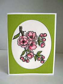
Containing this beautiful flowering branch, just screaming to be colored, the Indescribable Gift set can be found on page 35 of the Occasions Catalog (that expires June 2!!). Stampin' Up! intended the set be used for Easter, with sentiments, "Sharing the joy of His indescribable gift", "Happy Easter" and "Refresh, Renew, Rejoice", and the image definitely fits that occasion. But I think the lovely blooming branch also has uses for MANY occasions throughout the year.

Being May, when so many trees (here in the Midwest) are gloriously -- but briefly -- in bloom, I decided it would be perfect for Mother's Day. 

When the set was released, it was undeniably with the intent of using Blendabilities to color the image. Owning several sets of these markers made just that a possibility for me. But, since so many papercrafters don't or won't have the privilege of using the Blendabilities (as they are no longer available), I wanted to show just how beautiful these blossom are when colored in another way.

One more of my treasured Stampin' Up! supplies that I tend to hoard for special occasions is their White Vellum Cardstock (page 193) of the big catalog. 

Since it is extra-thick and sturdy, it takes to heat embossing very well. I stamped the blossom branch onto vellum cardstock with VersaMark and heat embossed it using Black Embossing Powder. (One thing I cannot stress the importance of enough is to use the Embossing Buddy on all your embossing projects. I did use my Buddy on this, but unfortunately some of the pesky embossing powder still strayed here and there anyway. Grrr)

Then I went to work with various pinks and greens of the STAMPIN' WRITE MARKERS. This method proved to be a great alternative to Blendabilities, as well as wonderfully easy. And the bold black outlines provided by the embossing almost gives the finished piece a stained glass effect.


Here is a closeup of a few of the blossoms:


Since vellum can be somewhat challenging to adhere to a card surface without the adhesive showing through, I opted for a great method of attaching it to my card. I simply cut the vellum cardstock a smidge smaller than the 4" x 5 1/4" layer. I attached it freely to the back of the oval cut mat, then just adhered the whole mat to the card base. 

I hope you enjoyed your virtual card. 
HAPPY MOTHER'S DAY!

Blossom
Smiles.

May 7, 2015

FOCUS FRIDAY: CENTERED

I am proud to present my very first
FOCUS FRIDAY!

Every Friday I will feature one of my recent Instagram photos. 

CENTERED

All of the photos I show in these FOCUS FRIDAY posts are my sole property. Please respect this.

Insta
Smiles.


May 5, 2015

FAUX TEARING BOAT

 Today's card has a distinctly masculine feel. Duh, Linda. It's a FATHER'S DAY CARD!

The set, Moon Lake, found on page 21 of the Occasions Catalog (which expires June 2!) has three truly lovely images, a Canada Goose going for a swim, a handsome bird (not sure what kind) atop its perch, and a rowboat pulled up alongside an ancient tree. All of these images are perfect for masculine cards. Or sympathy cards. Or just a Thinking of You card for anyone. Or for a nature lover on your card giving list. Gorgeous, serene scenes that just feel comforting.

I love the look of the Faux Tearing Technique, and thought I would try it on this card. My first faux tearing attempt was done just once, along the long edge. It looked cool, but I couldn't get my image to work well. It just looked awkward, no matter what I did.

Then, I hit upon doing it twice, once on each short side. That turned out to be the perfect solution, especially with this image.


The sponging was done with Lost Lagoon. And then I stamped the triangles from the Dotty Angles set on page 98 of the big catalog also in Lost Lagoon, at full strength. 

Since our newer foam ink pads are so moist, they take a little longer to dry. So, if you're quick, you can sprinkle some Clear Embossing Powder and heat emboss it for a little extra texture and interest.

In the photo below, I hope you can see some of the "shimmer" and bubbles of the embossing. It is subtle, but a cool effect in person.

For the sentiment strip, I used a portion of the triangle stamp, but stamped it off a few times first so it wouldn't overwhelm the words.


For the Lost Lagoon effect behind the image, I want to thank my upline, Patrice, for this idea. Thanks, Patrice! 

To do this, take the long watercolor swoosh from the Work of Art stamp set (page 165 in the big catalog), stamp it off once, stamp on the lower portion, then, without re-inking or stamping off again, repeating the stamping two more times. A sophisticated ombre look makes the image soft and trendy.


x x x x x x x x x x x x x x x x x x x x x x x x x x x x x x x x x x x x x x x x x x x x 

Starting this week, I am going to add a new feature to my blog. Each Friday I will post one of my recent Instagram photos. Thus, with this additional posting day, I will have posts published three times a week, on Sunday morning, Wednesday morning and Friday morning.

I decided to do this for a few reasons. 

I have always LOVED photography, at least, since I was nine years old, when I received my first Brownie Camera.

My first job out of high school was at a Color Lab, working with professional photography.

The emphasis of my Bachelor of Fine Arts degree is photography.

I have become somewhat too nonchalant and lax about my photography in recent years.

Finally having gotten a Smartphone last June, one of the first apps I added was Instagram.

This will force me to continue to be more creative photographically.

I love to share!

Just to give you a sneak peek of what I post to my Instagram account, 
here is an image I added just yesterday: 


So, watch for the premier of my new feature on Friday! I'm so excited!

x x x x x x x x x x x x x x x x x x x x x x x x x x x x x x x x x x x

My Faux Tearing card has been added to this week's Paper Players challenge:


Torn
Smiles.


May 1, 2015

SPRING HAS SPRUNG

A great color combination, one that I've been using quite often recently, is Pool Party, Calypso Coral and Crushed Curry. And it is a wonderful combo for anything SPRING! 


I am entering this card into the first ever TGIF Challenge:


And I'll even throw in a tutorial on how to make this spring-y card!

Supplies:
Flower Patch Stamp Set
Teeny Tiny Wishes

Pool Party ink
Calypso Coral ink
Crushed Curry ink
Pear Pizzazz ink

Whisper White cardstock
Calypso Coral cardstock
Pool Party cardstock
Crushed Curry cardstock

Big Shot
Flower Fair Framelits
Stampin' Dimensionals
1/2" Circle Punch
7/8" Scallop Circle Punch
Clear Buttons
Glue Dots

Instructions:
Fold a 5 1/2" x 8 1/2" piece of Pool Party cardstock in half, creasing well with a bone folder. Adhere a 4" x 5 1/4" piece of Calypso Coral cardstock to this card base.

Towards the bottom of a 3 3/4" x 5" piece of Whisper White cardstock, stamp the stems alongside each other. Stamp them twice, the first time full strength, staggering the image the second time and stamping off first before stamping.

On a scrap of Whisper White, stamp the larger flower in Calypso Coral, stamping off first on a piece of scrap paper, followed by the spiky flower over it in full-strength Calypso Coral. Use the matching Framelit to cut out the flower image. On a scrap of Crushed Curry, stamp the larger of the centers in Crushed Curry, punching this out with the 7/8" Scallop Circle Punch. Adhere this to the center of the flower with a Stampin' Dimensional. Center a clear button with a Glue Dot. Glue this flower atop the left stem.

Stamp the 5-petal flower in stamped-off Pool Party ink on the Whisper White scrap, overlaid by the small spiky flower in full-strength Pool Party. Cut this out with the appropriate Framelit. Stamp the smaller center in Calypso Coral on a scrap of Whisper White, punching it out with the 1/2" Circle Punch. Glue this to the center of the smaller flower. Attach this flower atop its stem with a Stampin' Dimensional, overlapping the larger flower.

With Calypso Coral ink, ink up only the "hello" portion of the Hello Baby stamp from the Teeny Tiny Wishes stamp set. Stamp this alongside the smaller flower.

Adhere this finished flower piece to the card front.

Spring-y
Smiles.