Navigation Bar

July 30, 2015

FOCUS FRIDAY: BROWN


On our walk through
Madison's 
OLBRICH BOTANICAL GARDENS
a few weeks ago,
Emily 
was
ANXIOUS
to find
the brown flower
that was in 
BLOOM.

Chocolate Cosmos
aka
COSMOS ASTROSANGUINEUS.

It actually 
smells like
DARK CHOCOLATE.

yum

All you need is love. 
But a little chocolate now and then doesn't hurt.
- Charles M. Schulz -


Please check out MY INSTAGRAM ACCOUNT.

Chocolate
Smiles.


July 29, 2015

BLENDED BLOOM BIRTHDAY

Do you remember a few weeks ago, while on a torturous long car ride, I kept myself busy and awake by cutting many many Blended Blooms stamped on Designer Series Paper prints? As a reminder, check out that all-important post here: The Most Effective Way to Conquer Car Riding Stress.

And this was the result:

One of the cut flowers sans center:

After cutting out this multitude of pretties, the next step was to stamp on coordinating DSP the centers.. Then, to cut all THEM out. I realize that I did not post any photos of that task in progress. But, just realize that cutting out those centers was much more time-consuming and eye-fatiguing than cutting the blossoms themselves. 

A couple of the flowers I actually cut in layers and stacked them for more dimension. The effect wasn't stunning enough to continue to do that, so I simply plan on using the majority of them as a single layer with a center added.

Anyway, I have not yet fitted all the flowers with their centers, but I did complete a few. 

Now, after all the difficult detail work has been done, comes the fun part: Using all these flowers in various projects.

Today is the birthday of a precious friend, so I put together this card for her:


In this particular card, I love the continued playfulness of polka dots throughout the card. Notice the dots in the center, the flower itself, the embossed background, and even in the layered dots alongside the sentiment:


Does this type of project -- where you do all the tedious detailed work ahead of time -- appeal to you? 

For me, as I've already said, it is a perfect task to do during long, boring periods of otherwise wasted, unproductive time. Then, it is wonderful to have an assortment of finished beauties to make quick work of a card when an occasion arises.

Centered
Smiles.


July 26, 2015

CHERRY ON TOP

If you look at page 144 of the Stampin' Up! Share the Fun catalog, you're in for a treat, if you haven't already discovered these darling 6" x 6" Designer Series Paper Stacks. Do you ever feel that a 12" x 12" sheet of DSP is just a bit intimidating, and you would be just as happy with a sheet of paper, say, oh, a quarter that size? 

So often, in cardmaking, I find myself using just a bit of a 12" x 12" sheet, and then the remainder goes into my leftover DSP container, only to sit there until I feel guilty and decide to riffle through this pile for use in another project. But, of course, by that time, the DSP is always retired. 

When I discovered these little perfectly-sized gems, I grabbed the Cherry on Top pad. 

For my most recent Stamp-In Workshop, on July 13, my girls had fun creating a card using portions of three of the designs found in this stack. To get the greatest impact, I cut these sheets into strips for triple the fun!


Usually when I use the Decorative Dots embossing folder, I place the dots raised side up. However, I thought it would add extra cuteness to flip it so the dotted dents are on the top. (Actually, being from Wisconsin, now that I look at this closely, it reminds me of a cheesehead. Eh, Wisconsinites?)

The Pool Party ribbon used on the card is some of the 1/4" Cotton Ribbon on page 159. Love this stuff!


To color the cake from the Endless Birthday Wishes set, I used an Aqua Painter and the ink right from the pad. So easy!


Following are the measurements, supplies and instructions to make one of your own Cherry On Top birthday cards.

Supplies:
Endless Birthday Wishes stamp set

Whisper White cardstock
Crushed Curry cardstock
Bermuda Bay cardstock
Cucumber Crush cardstock
Cherry On Top Designer Series Paper Stack

Black StazOn ink
Crushed Curry ink
Watermelon Wonder ink
Bermuda Bay ink
Pool Party ink

Aqua Painter
Big Shot
Ovals Collection Framelits
Decorative Dots Embossing Folder
Pool Party 1/4" Cotton Ribbon
Daffodil Delight 5/8" Satin Ribbon (retired)
Stampin' Dimensionals

Instructions:
Fold a half sheet of Whisper White cardstock in half, creasing well with a bone folder.

Run a 4" x 5 1/4" piece of Crushed Curry cardstock through the Big Shot inside the Decorative Dots Embossing Folder. Adhere this to the card base WITH THE RAISED DOTS TO THE BOTTOM.

Center a 3 1/2" x 5 1/2" piece of Cucumber Crush cardstock atop this.

Space 1" x 5 1/2" strips of three of the Cherry on Top DSP onto the green, leaving an even border between the strips and on the sides.

Notch both ends of a 4 1/4" piece of 5/8" piece of yellow ribbon. Notch both ends of a 3 1/2" piece of Pool Party 1/4" Cotton Ribbon. Use a piece of Scotch Tape to adhere these two pieces of ribbon, with the smaller piece on top, to the center strip of DSP, raising the ribbons somewhat above the center point of the card.

On a scrap of Whisper White cardstock, stamp the birthday cake in black. Use an Aqua Painter and the Pool Party, Watermelon Wonder and Crushed Curry ink to paint in the cake. Use the Ovals Collection Framelits to cut out the cake.

Adhere the cake piece to a Bermuda Bay oval cut with the next largest of the Ovals Collection Framelits. 

With a couple of Stampin' Dimensionals, adhere the cake piece over the ribbons.

Stamp "Happy Birthday" from the same set inside the card in Bermuda Bay ink.

There!

Cherry
Smiles.


July 23, 2015

FOCUS FRIDAY: FOUR PETALS


An idyllic afternoon
spent in the
OLBRICH BOTANICAL GARDENS
with my 
OLDEST DAUGHTER,
Emily.

One of the first flowers
we discovered:
BRIGHT
SPOTS OF
YELLOW
highlighted by
rays of
SUN.

WOOD POPPY

sigh

I believe in God, only I spell it NATURE.
- Frank Lloyd Wright -


Idyllic
Smiles.


July 22, 2015

HEY YOU THANKS

I have been so busy recently that I haven't had much time for creating. And you all know how desperately I need my creative fix each and every day. So, since I was running woefully low on my life blood, I decided to go downstairs to my Creation Station for a little infusion. And, the result was a lot of fun! And I felt so much better when I was finished!

A couple months back, Paper Pumpkin subscribers received the Love You A Lot kit. This is what the darling little cards would have looked like had you followed the instructions for the kit:


While I love all the separate components -- I mean, aren't those bows delicious? And the stamps that were included were outstanding (although I must admit that I can't quite come up with an occasion for which I would use the word "DUDE".) The cards themselves were awfully cute, as were their little kraft pouches. B U T, I simply wasn't inspired. 

I had used bits and pieces of the kit for other projects, but I was left with a lot of the components just waiting for a little inspiration. Wait no more! Last night it happened! And I came up with the weirdest most out-of-the-box and outside-my-comfort-zone card I've ever created:


I keep trying to catch peeks of the card since last night, not quite believing that it grew from MY imagination. Those little Paper Seedlings brought forth a pretty nifty creation.

The yellow portion of the card was one of the included card bases cut in half and used as a mat.

In the following photo, you can see a close-up of the top of the card. The "glasses" are what remains after you punch out the pieces for the bow. I simply cut off the white portions. The "hey" the "x" in the eyeballs, the "YOU" and the striped edge are all stamps that came with this kit. 


The "YOU" stamped on Whisper White was punched out with the Large Oval Punch. The striped Baker's Twine came with the kit.

I used several Stampin' Dimensionals to make this card pop even more.


The "THANKS" and the split chevron were from past Paper Pumpkin kits. The striped edges on the top and bottom of this piece were snipped from leftovers from the Love You A Lot kit. 


Hey YOU, what do you think? 

Hey
Smiles.


July 19, 2015

A DISCARD CHALLENGE

As you already know, I hold monthly workshops, which I call Stamp-Ins, in my home. At each of these Stamp-Ins, I have four projects, usually four cards, for my girls to create. I'd say 95% of the time, the projects are completely original. The other 5% comes from ideas I've seen somewhere, but have tweaked to make my very own.

I estimate that, in order to come up with an original card for my workshops, it takes an average of an hour and a half for just one card. During that 90 minutes, I am confronted by lots of trials and errors, more than I'd like. Of these trials and errors, I usually save those that are somewhat salvageable. I stack them in a plastic container. 

Recently, I'd noticed that my container seemed to be getting sort of full. Without looking through the contents, I decided that it was time I did something with all these salvageables. 

So, still without perusing the stack, I gave myself a personal challenge: Make something using mostly bits and pieces that were in my basket.

This is what my container looked like. It looks like it may be promising, right?


When I dumped out the contents, I wasn't as thrilled as I'd thought I would be. Pushing my way through it all, and feeling quite desperate, I grabbed a few white/orange/pinkish components, and decided that this would be the stash I would work with.


Below is the card I came up with. I can't say I'm in love with it, but it is, eh, OK. 

From the salvageable stash, I rescued the sponged and embossed poppies, the three circles in orange, pink and white, as well as the flagged banner in a matching pink. 

The pieces I added are the Calypso Coral card base and the Naturals White piece that matched the large white circle. I embossed this piece with the Modern Mosaic embossing folder. 

Once I had everything sort of lying in place, I decided it was waaaay too much stark white.. So I sponged the edges of the embossed piece as well as the white circle in Calypso Coral. I also tied an orange bow in place. 

While it bothered me to bring in a different color of embossing -- the poppies were embossed in gold -- I opted to emboss a simple sentiment in white, only because I didn't think the words would show up against that pink if I embossed them with a poppy-matching gold. I added a Basic Pearl also.


When I first finished the card, I liked it and thought I'd made good use of something that could potentially have been thrown away.

The longer I live with the card, however, the less I like it. 


Now, I'd like to challenge YOU! Grab some leftovers from a project or two or three that would possibly have been thrown out, plant some Paper Seedlings and create a whole new project from them. 

If you take me up on my challenge, include a link to your creation in my Comments section. Good luck!

I intend to do a personal challenge like this again sometime in the future. B U T, I am going to let my discard stash grow so I have more to pick from. Eh?

Discarded
Smiles.

July 16, 2015

FOCUS FRIDAY: INTO THE ABYSS


GREEN
Verdant Green.

The color of
GROWTH
 NATURE
NEW BEGINNINGS

But,
in this case,
MYSTERY.

If you fell into this
moist
mysterious
vertigo-inducing
abyss,
WHAT WOULD YOU FIND?

GOOD?
EVIL?

Imagine.


Logic will get you from A to B. 
Imagination will take you anywhere.
- Albert Einstein -


Please visit My Instagram Account. Follow me?

Green
Smiles.


July 15, 2015

CHOOSE HAPPINESS: TUTORIAL

At a recent Stamp-In Workshop, my girls created this fairly simple card for one of their projects:


There were supplies left over after the workshop to create another card. For this one, though, I delved into my past Paper Pumpkin stamps stash for the sentiment label. 


Using "hello" greetings from a Paper Pumpkin kit gave the center label a bit of a different look. I like it.


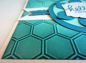
One of the things I really love about the Honeycomb Embossing Folder is how the outlines of the individual cells look when they are sponged over in a darker color than the embossing. It really makes the outlines of the honeycomb stand out prettily.


Wanna make one of these cards for your own use? Well, get going then, 'cause here's how to do it!

Supplies:
Choose Happiness stamp set

Naturals White cardstock (or Whisper White/Very Vanilla)
Pool Party cardstock
Island Indigo cardstock

Island Indigo ink

Big Shot
Circles Collection Framelits
Hearts A Flutter Framelits (or the Banners Framelits on page 173)
Artisan Label Punch (or Label Bracket Punch on page 166)
Fun Flower Punch
Honeycomb Embossing Folder
Stampin' Dimensionals
Basic Pearls
Island Indigo Ruffled Ribbon (or Island Indigo 1/4" Cotton Ribbon on page 159)
Stamping Sponge
Glue Dots
Tape

Directions:
Fold a half sheet of Naturals White cardstock in half, creasing well with a bone folder.

Run a 4" x 5 1/4" piece of Pool Party cardstock through the Big Shot inside the Honeycomb embossing folder. Sponges the edges and somewhat towards the center of this piece fairly thoroughly with Island Indigo ink, making the bottom portion quite a bit darker than the top. Adhere this piece to the card base.

On a scrap of Naturals White, stamp your chosen sentiment image in Island Indigo. Punch it out with either the Artisan Label Punch or the Label Bracket Punch. Add two Basic Pearls in the flourishes of the image if desired.

Punch out a Fun Flower from Island Indigo cardstock. Use the appropriately sized Circles Collection Framelits to cut circles from both Pool Party and Island Indigo cardstock. Adhere these circles together. With your fingers, curl up the ends of the flower petals. Use a Stampin' Dimensional to adhere the sentiment to the center of the flower. Using glue just in the center of the flower, adhere it to the middle of the circles.

Cut two banners from Naturals White using the Hearts A Flutter Framelits or the Banners Framelits. Cut pieces of the Island Indigo ribbon to measure about 1 1/2". Snip little banner notches in one end of each ribbon piece. Use Glue Dots to attach the ribbons to the banner pieces. Use Scotch Tape to adhere the two pieces to the back of the circle, being sure the ends of the banners extend to the edges of the card. Glue this whole piece to the card front.

Have fun!

Honeycomb
Smiles,


July 12, 2015

HOW TO USE THE HEXAGON PUNCH TO MAKE A FOLDED STAR

Are you as addicted to Pinterest as I (and a majority of the rest of the world -- or so it seems!) am? Some of it to me is simply eye candy and I dutifully pin it to my appropriate board for rediscovery at a later time. I try to pin only the things I truly love. OK, so I love a lot of stuff! 

However, I have my own special method of being able to access projects I discover on Pinterest that I want to try myself. I simply LIKE these. My LIKE list boasts almost 1,100 pins. So I'd better get going. Right?

Whenever I want to maybe learn a little something new or be inspired, I refer to my LIKE list. 

The other day I was doing just that, when I came across a darling card. The medallion-type focal point of the card would lend itself perfectly to a Christmas greeting. 

So . . .

Well, you know what month it is. July. CHRISTMAS IN JULY! Yessss. So, I went to work and came up with this:


Here is a little closer look at my card. You all know that I love echos. In that I like to echo -- repeat -- themes or elements in my cards. In this case I picked up the dots on the green side of the Designer Series Paper and repeated them by using the Large Polka Dot embossing folder (page 172 in the catalog) for my background. 

For the center of my star, I used one of the snowflakes that I found on the STAMPIN' UP! CLEARANCE RACK. I inserted a white brad in the center of it and attached it with a Glue Dot.

The sentiment is stamped on a label I created with my Big Shot using one of the Project Life Cards & Labels Framelits (page 173 of the catalog). 


The tutorial I used to create my star from six hexagon punches can be found HERE. Thanks, Carol, you did a wonderful job on the tutorial!

OK. Your assignment should you decide to accept it is to GET GOING ON YOUR CHRISTMAS CARDS! 

Seriously, have you started your Christmas cards yet? Have you even thought about them? 
Do you know what you are planning to do? Or are you waiting to see what wonderful seasonal goodies come out? Do you have a schedule? How many do you plan to make? 
Do you create the same number of cards each year?

Hexagon
Smiles.

July 9, 2015

FOCUS FRIDAY: FRED FUR


I'd like to introduce 
you to
FRED.
Well, at least,
part of 
FRED. 

A stray,
the vet
set Fred's birthdate as
6-06-06.
666? 

Well, 
he has lived up to
his
birthdate,
He is a curious
LITTLE DEVIL. 
And, yes,
TWICE
curiosity almost
killed 
THIS CAT.

My
PRECIOUS
little
Devil 
Cat.
FRED.

Life was meant to be lived, and curiosity must be kept alive. 
One must never, for whatever reason, turn his back on life.
- Eleanor Roosevelt -

Please check out My Instagram Gallery?

Here is a photo of the entire Fred:


Furry
Smiles.


July 8, 2015

THE MOST EFFECTIVE WAY TO CONQUER CAR RIDING STRESS

I am the first to admit it: I HATE RIDING IN THE CAR. No, it's not that I get carsick or anything horrible like that. 

It's just that, almost as soon as I settle in for a car trip longer than 15 minutes, I may just as well say to my husband, "Good Night." And I'm out for the duration of the ride. Not a very pleasant and lively companion in the car. 

Sometimes I'll scan through a magazine, figuring I can visit while I'm doing that. But . . . after three pages -- or if I try REALLY hard, five pages -- I am out like a light. Even sitting straight up. I don't need to be comfortable to fall asleep in the car.

This past 4th of July Weekend, my husband and I were heading down to Madison to spend the three days with our family. 

But, for this trip, I came well-prepared. Yes, I had the required magazines in my bag. But, the night before, I stamped a whole garden of Blended Blooms (page 115 in the Big Catalog) on scraps of old retired Designer Series Papers. I didn't count how many I was stamping. I just kept finding good candidates and kept on stamping until I thought I had enough to last the trip. 

After about five hours of work (and I'm so proud to say that I slept nary a wink!), I have 60 Blended Blooms, all cut out and ready for the next step to use on cards!


My original intent was to make layered flowers, so I stamped three flowers on each of the DSP designs. 

Some of them, once they were cut out, beg to just be left alone. 
No layering required. 
For example, look at this little darling:


And THIS little cutie -- subtle but adorable with its delicate yellow design.


Some turned out to be fairly sophisticated-looking:


Some I'm not so sure about. 
I thought the adorable little paisley design would work well. 
Now, I don't know.


A few of the papers have a multi-toned effect in the same colors, and look quite beautiful:


I love the subtlety against the startling blue:


Now, these darker ones just may find themselves in my circular file. 
When I initially saw these really old papers, I thought they would be rich as flowers. 
But they are so dark and busy that the stamping details are almost lost. 
Maybe these would be good candidates for layering.

Or, like I said, maybe they would be good candidates for the circular file.

We'll see.


My next step is to decide which ones WILL be layered, and cut up some of the excess flowers for the various layers, popping them up with Stampin' Dimensionals.

THEN, the toughest job: to stamp and cut out the centers. 

I will keep you updated over the coming weeks as I make progress on this humongous project.

In the meantime, I am happy to report that I have discovered a most effective way to conquer my car riding stress -- and STAY AWAKE -- and get something accomplished!

Now, let's start a little conversation here. Are any of you terrible travelers like I am? How to you deal with the ordeal? (Cute, huh?) I know that doing close work like this in the car WOULD make some of you sick, or at least give you a headache. Me? I'm so in heaven when I'm cutting up paper that the time simply flies! 

SHARE YOUR STORIES WITH US!

Conquering
Smiles.

July 5, 2015

SENDING SUNSHINE

The focal point of this card was created using a fun technique referred to as Distress Watercolor Dry Embossing by Splitcoaststampers.com. I had printed out the tutorial for this on July 31, 2012 --  gasp! -- almost three years ago, in hopes of using it someday.

Well, someday finally arrived. And here is the result of my experimentation:


If you'd like to give this a try, here are my directions for doing the Distress Watercolor Dry Embossing technique.
  1. Cut a piece of watercolor paper to fit inside the embossing folder you have chosen to use for your project. When choosing an embossing folder, make sure there are several areas that are enclosed that you can fill with ink.
  2. With the watercolor paper tucked inside the embossing folder, run it through the Big Shot 2-3 times to get a deep impression.
  3.  Ink up a brayer with VersaMark Ink. Cover the raised areas of your embossed image with VersaMark. Be careful to not press too hard because you don't want any of the ink in the unraised areas.
  4. At your Heat Station, cover the brayered watercolor paper with clear embossing powder. Be sure to use a fine paintbrush to rid excess embossing powder that may have gathered in the unraised spaces.
  5. Heat the embossing powder with the Heat Tool until it is melted. 
  6. Spritz the surface of the design with water. Be fairly generous with the spritzing so the inks run. If the paper is too dry, the inks will not blend and bleed. 
  7. Using an Aquabrush and 2-3 colors of ink, brush the ink into the embossed areas, letting the colors bleed and spread as desired. THIS IS GOOD -- IT IS SUPPOSED TO LOOK PAINTERLY. If your paper becomes too dry, spritz it again with water, and continue with the color until you are happy with the results.
  8. Wait until the piece is completely dry before cutting it into the desired shape. I used the Circles Collection Framelits for my card.
It's a fun and easy way to get unique looks every time you try this technique. Give it a try!

PLEASE NOTICE: Do you like the little label that forms the "sunshine" sentiment? It is the new Washi Label Punch found on page 166 of the current catalog. I love it -- and I know that I will be using this punch A LOT!

ONE MORE NOTE: The sequins and the twine on the card came from past Paper Pumpkin kits. Cool, huh?

Sunshiny
Smiles.

July 2, 2015

FOCUS FRIDAY: FLAMING ZIGZAG


Alas,
I have no
FIREWORKS
in my
Instagram
arsenal.
So,
I chose this
FLAMING GLORY
to 
represent
the wonder of
our
dear
U.S.A.

HOME:
The spot of earth supremely blest, 
a dearer, sweeter spot
than all the rest.
- Robert Montgomery -

Happy Birthday 
to the
BEST PLACE ON EARTH --
HOME.

Please visit me: MY INSTAGRAM ACCOUNT

Birthday
Smiles.