Navigation Bar

January 31, 2016

SPOTLIGHTED BLOSSOM

One longtime favorite technique that I haven't played with for awhile is the Spotlighting Technique. There are various ways of doing spotlighting, but I think the most striking path to take is framing the spotlighted area in a coordinating circle just a wee larger. It remains part of the whole, but brings it to the fore just perfectly.

I have always loved this sprig of spring blossoms. Although I'm never able to decide whether it is apple or cherry blossom. Whatever. I guess it doesn't matter. It is just so lovely. And -- as a matter of fact -- it is perfect for the spotlighting technique.

The individual blossom that I had chosen to spotlight seemed to be the ideal choice since it was the only flower fully facing the viewer. Also, I like the fact that its position is not quite centered, a spot that makes a composition more pleasing to the eye. I used to have a professor who always said, "There's a reason they call it DEAD CENTER." True, so true. 

To add color to my spotlighted flower, I brought out my beloved Prismacolor Pencils. And went to work with varying shades of pink. 

Unfortunately, I colored my flower first. THEN I was left with the task of matching the cardstock colors to the pinks I had chosen. Alas, none of the current Stampin' Up! pinks were quite right. So, I was forced to dig into my retired stash of cardstock for both the pink and the green. That's always OK with me because so many of those retired colors are still lovely in my eyes and I still am thrilled to be able to bring them into my creations once in awhile. 


I must admit that, with the exception of the Whisper White cardstock, the circle punches and the Project Life Cards & Labels Framelits, this card is basically created with retired product, including the pretty and versatile Fancy Fans embossing folder, the ribbons and the cardstock colors.


A little view from the side shows the beautiful contrast in dimension when the spotlighted portion is popped up with a Stampin' Dimensional right over the matching area that had been stamped in plain ol' black.


Do you have an oldie but goodie technique that you revisit on occasion? Share with us what that might be. 

Spotlighted
Smiles.

January 27, 2016

JUST FOR YOU

For my January Stamp-In Workshop, I featured some of the new product from the Collections Catalog, as well as possible freebies from the Sale-A-Bration catalog in my projects.

On one of my cards, I used the Botanicals For You stamp set, shown on page 4 of the Sale-A-Bration flyer. This set includes the huge sentiment, "Just For You", a few finishers for that sentiment, and five of these darling flowers and branches.

I also used a little of the Wildflower Fields Designer Series Paper on page 12 of the same flyer. This pack of paper has so many darling designs to choose from, it is difficult to settle on just one.


After the workshop was over, I needed a birthday card for my niece, who was turning 18. So, I revamped the original design a bit to hopefully appeal to the "grown-up-ness" of a new 18-year-old. I changed the DSP choice, the color scheme just a bit, and the embossing folder.


The sprightly stamped flowers in conjunction with the Decorative Dots embossing folder gives a truly winning look.


For a more "mature" look, I opted for the Arrows embossing folder combined with the flowers and branches.


And the two cards side by side:
It must be an optical illusion that the card on the right looks so much wider. They are identical sizes. Hmmm.


How about creating one of these cards on your own? Following are the supplies and instructions to make the card that was created at my Stamp-In Workshop.

SUPPLIES:
Wildflower Fields DSP (page 12 in SAB catalog)
Botanicals for You (page 4 in SAB catalog)

Old Olive cardstock
Calypso Coral cardstock
Whisper White cardstock
Basic Black cardstock

Lost Lagoon ink
Old Olive ink
Black ink
Calypso Coral Stampin' Write Marker

Big Shot
Decorative Dots embossing folder
Lost Lagoon Ribbon
1/4" Hole Punch

INSTRUCTIONS:
Fold a 5 1/2" x 8 1/2" piece of Old Olive cardstock in half, creasing well with a bone folder.

Stamp the flowers randomly close to the edges of a 4" x 5 1/4" piece of Whisper White cardstock in Lost Lagoon ink. Follow with the little branches in Old Olive.

Insert this finished piece inside the Decorative Dots embossing folder and run it through the Big Shot. Use the Calypso Coral Stampin' Write Marker to color in the centers of some of the flowers.

Wrap a 5" piece of Lost Lagoon ribbon around this piece so the bottom of the ribbon lands about 
1 1/4"  above the lower edge. Tape the ribbon ends onto the back.

Adhere this piece to the card base.

In black ink, stamp "Just for You" in the center of a 2" x 4" piece of Designer Series Paper of choice. Please keep in mind that your DSP should not be just too BUSY; otherwise the words will get lost in the busy-ness. Adhere this to a 2 1/8" x 4 1/8" piece of black cardstock.

Adhere this to the card base over the ribbon.

From a scrap of Calpyso Coral cardstock, punch two 1/4" circles. Adhere them to each side of the ribbon.

In black, stamp the rest of the sentiment inside the card. I used ". . . on your special day".

Just for YOU
Smiles.


January 24, 2016

BEAUTIFUL BOTANICALS

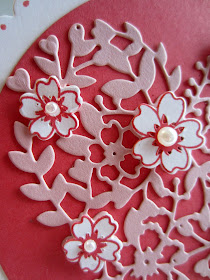
Of course, first on my wish list of goodies from the new Occasions Catalog was the bundle, Bloomin' Heart/Love, that could create the unprecedented detailed beauty to be found in this card:


Next on my wish list from the new Occasions Catalog was another incredible bundle: the Botanical trio found on page 26. Well, I ordered it with my last Stamp-In Workshop order. I could hardly wait for this to arrive!

The Botanical Builder Framelits Dies are phenomenal. An almost infinite number of combinations can be achieved by mixing and matching the dies as well as paper color choices. 

I had seen a suggested color palette consisting of Bermuda Bay, Pool Party, Pear Pizzazz, Daffodil Delight and Tangelo Twist, so decided to go ahead for my first foray into playing with these dies with this color combo:


I certainly haven't popped up these components as much as they could be, but don't you just love the dimension, even the way I did it??


Let me tell you a little <horror> story about the sentiment on my card. Now, don't be TOO scared, 'cause you see, the story does have a happy ending.

After planting my flowers along a two-edged border made from Washi Tape, I had intended for that to be the sole dimension on the card. To achieve that goal, I stamped the sentiment (from the Rose Wonder stamp set on page 18 of the Occasions Catalog) in Pear Pizzazz right on the card base. It looked . . . OK. Just OK. That vast expanse of WHITE WHITE WHITE below and to the right of the sentiment bothered me considerably. So I thought a few splotches from the Timeless Textures set (page 29 of the Occasions Catalog) here and there, also in Pear Pizzazz, might give it just the right finishing touch.

Now -- ARE YOU READY?? -- here comes the scary part. Not realizing that I had sloppily inked up my splotches stamp and gotten a little "u" of ink on the edge of the stamp, I transferred this completely UGLY "u" to my card base along with the desired splotches. This was after all the flowers were in place and the hard work was done!! I mean, really, Linda. How long have you been stamping??? You know better to be more careful.

O.M.G. How am I going to fix this?!? I needed to fill up quite a bit of space to cover my mess-up. I couldn't come up with any single element that would do the trick. That stupid little "u" of Pear Pizzazz ink kept sticking out and LAUGHING at me.

Finally, finally, I came up with a solution that turned out to be perfect.

I stamped the sentiment  on Whisper White and cut it out with one of the Framelits from Chalk Talk. All well and good, but the "u" was still there.

So, I added a bit of the matching Washi Tape to a scrap of Whisper White and punched it out with the Banner Punch. After adhering the little coordinating banner to the back side of my label, I popped the whole thing up with a few Stampin' Dimensionals, and VOILA!! It covered up the whole mess.

For balance, I added a Candy Dot to the bottom of the tag. I liked that because it was an echo of the Candy Dot I had added to the center of one of the flowers.


I simply adore the look especially of the many-branched center of the flower below. I am going to use that A LOT! I guarantee that.


Now, I am excited to play with the Botanical Gardens Designer Series Paper that comes with this bundle. There are some awesome things you can do with this DSP. Stay tuned . . .

Botanical
Smiles.

January 19, 2016

TWISTED RIBBON

The other day I was in the mood to play with some Paper Pumpkin. 

At times, I will do part of a kit, and then set the rest of it aside for another future play date. The October Paper Pumpkin kit is a perfect example of this happening. 

I had previously made up a few of the cards using components from the kit. 

The story of one of them, pictured below, can be found BY CLICKING HERE.


The post about this one can be found HERE.


So, to continue the saga of the October Paper Pumpkin kit, below is a photo of my latest card. 

For this card, I went a little crazy with the stamps that came with the kit. They are featured, of course, on the sentiment. I stamped the teeny tiny flowers and matching leaves all over the watercolor-look background that came in the kit. A portion of one of the stamped flowers formed a border arounnd the Lost Lagoon piece. I LOVE the stamps that came with this kit, knowing I will be using them often.

The watercolor background was actually a two-color piece, twice the size of that on my card. The other half was in Calypso Coral. Intending to utilize the entire piece initially, I stamped the double layer with the flowers and leaves. However, when it came to actually using it like that, I just could not make it work to my satisfaction.

I got out my trowel and planted some Paper Seedlings, and this is what grew. I simply cut the piece in half and set aside the Calypso Coral portion for a future card. Yay! Now I had much more to work with. So, that's when I went for the multiple layers. 

I loved the banners that came with the kit. But, for this card, I opted for a two-layered look by nesting two tags created from retired Framelits. This approach gave a bright and snappy look to my sentiment. It also gave me the opportunity to add in a little Calypso Coral to add one more pop of color.


I was happy enough with the way the card was coming together at this point, thinking that simply adding a little strip of Lost Lagoon ribbon would be the perfect finish.

When I laid that strip of ribbon in place, it somehow fell flat. No personality. 

To perk it up a bit, I did something I had never tried before. I TWISTED THE RIBBON. Just softly. I didn't want to flatten out the twists by making them too tight.

It's not perfect, but I really like the way it looks! And it was a good embellishment with some personality, as well as a pop of dimension.


As generous as these Paper Pumpkin kits are in the supplies included, I still have many pieces left from this kit alone to make up several more cards. Stay tuned to see what I come up with!

+ + + + + + + + + + + + + + + + + + + + +

Speaking of Paper Pumpkin, during Sale-A-Bration, Paper Pumpkin is ON SALE! A 3-month Prepaid Subscription is normally $59.85. But, during Sale-A-Bration, it is on sale for $55.00. When you set yourself up with a 3-month subscription, you qualify for ONE FREE SALE-A-BRATION ITEM!


Don't miss your chance to save on a 3-month Paper Pumpkin subscription and get a FREE Sale-A-Bration item. 
Contact me today!

Paper
Pumpkin
Smiles.


January 17, 2016

BLOOMIN' HEART

So, have you seen the beautiful, wondrous items on pages 16 and 17 of the new Occasions Catalog that went live January 5???? REALLY?? You HAVEN'T?? Get over there. (Click on the icon on the right!)

The moment my eyes fell on these pages, I knew I had fallen irretrievably in love! Just looking at the tiny pictures that accompany the information about the Bloomin' Heart Thinlits Dies made me think of a puzzle, just waiting for me to put it together. 

These items were the first thing I pre-ordered from this catalog. And, yes, I ordered the BUNDLE. Because, well, just because! I mean, did you notice the adorable stamp set that accompanies the set of Thinlits? Yup. They were mine. Bundle, here I come! And, besides, buying the bundle saves me 15% over purchasing the items separately. A no brainer, for sure.

I wanted to create a card with these items that would make my customers fall in love with it, just like I did! The girls created their own on Monday, January 11, at my monthly Stamp-In. 

And, this is the card I came up with:


A close-up view of the detailing:


I love the intriguing profile the card boasts when it is standing up. And the dimension! LOVE IT!


Showing what it looks like opened. Notice the neat little hinging at the top:


Would you be interested in re-creating this card for yourself? Well, you're in luck, because below you will find the complete directions to do so.

SUPPLIES:
Bloomin' Love stamp set (page 17 in the Occasions Catalog)

Blushing Bride cardstock
Calypso Coral cardstock
Whisper White cardstock

Calypso Coral ink
Calypso Coral Stampin' Write Marker

Big Shot
Circles Collection Framelits
Bloomin' Hearts Thinlits (page 16 in the Occasions Catalog)
Precision Base Plate (page 19 in the Occasions Catalog)
Scallop Border Punch
Stampin' Dimensionals
Basic Pearls
Simply Scored

DIRECTIONS:
With the Simply Scored tool, score a 5" x 10" piece of Whisper White cardstock at 5". Crease on the score line.

Cover the folded piece with the large scalloped Circle Framelit, making sure that the fold line is a bit down from the edge of the Framelit so it doesn't cut through at the fold. Run through the Big Shot.

Also with the Circles Collection Framelits, cut a 4" circle from Calypso Coral cardstock. Adhere this piece to the scalloped circle card base.

Draw dots insidee each of the scallops with the Calypso Coral Stampin' Write Marker.

Run a 4" x 4" piece of Blushing Bride cardstock through the Big Shot covered by the Bloomin' Hearts Thinlit, making sure you are using the Precision Base Plate. Run it through three times. Use the fine end of the scoring tool to rid the heart of the excess pieces of paper. (I do have the Big Shot Die Brush -- which I've heard is THE BOMB! -- on order, but didn't have it when I created this card.)

Adhere the heart to the Calypso Coral circle, using minute drops of glue.

On scraps of Whisper White cardstock, stamp two of the large flowers and three of the small ones in Calypso Coral ink. Using the proper flower Framelits, cut out each of the flowers. You can cut one large and one small at the same time.

Adhere the cut-out flowers into their places on the heart with a BIT of Stampin' Dimensional. Add an appropriately-sized Basic Pearl to the center of each flower.

Use the (retired) Scalloped Border Punch on a piece of Blushing Bride cardstock that measures 1 1/8" by 3/4". Use the Simply Scored tool to make a crease along the approximate center of this piece. Then, applying glue to both edges, adhere this piece over the fold at the top of the card.

Inside the card, in Calypso Coral ink, stamp the banner, followed by your sentiment of choice in the center of the banner.

NOTE: When I initially had my card completed, I simply HATED how it looked at the fold line. I tried several ideas, not liking any of them. Until I finally came up with the solution of the Scalloped Border punched hinge that I added. I am very happy with the looks of this! 


If you would like to make exquisite cards for all your Valentines, just click on the Occasions Catalog icon on the right column of my blog, and order all the essentials! While you're there, order the Big Shot Die Brush on page 19, instead of waiting like I did.

Have fun!!

Bloomin'
Smiles.


January 14, 2016

FOCUS FRIDAY: THAT'S LIFE


THAT'S LIFE.

Ponder on 
THIS PHOTO.

The various
ASPECTS
of it are 
graphically
representative 
of all the
FACETS
of  
LIFE
being
lived.

Is there any
DENYING
the various
TRIALS and TRIBULATIONS,
JOYS,
UNCERTAINTIES,
THORNY SITUATIONS,
HOPES,
BUMPS and BRUISES,
we all 
EXPERIENCE
as we make our way through this
LIFE
we've been given?

THAT'S LIFE.

It is your reaction to adversity,
not the adversity itself,
that determines how your
life's story will develop.
- Dieter F. Uchtdorf -

Please visit me on

Life
Smiles.

EDITOR'S NOTE: This is a photo of a wild cucumber, plants that quickly get out-of-hand. You can see further images of this plant HERE.


January 13, 2016

CALENDAR ENHANCED

Do you remember my NEW YEAR NEW CALENDAR  post of January 3, 2016? I'd really appreciate it if you could click on the link to take you to that post before you continue reading. Check out the photos. 

Notice that at the end of the post, I'd told you that I was going to treat my personal calendar as an adult coloring book, and "finish" coloring each of the months with my Prismacolor Pencils.

OK. Did you check it out? Good!

It took me about nine hours to complete the entire year. But, for the most part, I am pleased with the results:


Back, when I was in college, I used my Prismacolors A LOT! In fact, I had been hoping to go into children's book illustration. (Side note: That is exactly what my daughter, Emily, does!) But, when bad arthritis in my hands interfered with my drawing, I turned my emphasis to Photography instead. I have dabbled a little bit here and there with my Prismacolors in the intervening years, but, because of the hands, not very much or very often.

Coloring in the small images on these calendar pages re-ignited my love for this medium. It took me several days to complete this small project. But, I am seriously considering trying my hand at drawing once again.

Even though I do not have the vivid imagination that my Emily has, I can draw. But, I need a reference from which to be inspired. 

I've been digging through some of my nature photos in the past few days in pursuit of the perfect image with which to begin. As of yet, I'm not quite satisfied with my findings. But, I'm going to keep looking, and maybe I'll run across just the perfect photo to jumpstart my drawing once again.

We'll see how it goes.

I will keep you posted.

Enhanced
Smiles.


January 10, 2016

MY VALENTINE

Sometimes I get a hankering to try something "old" again. 

For this card, I used what is sometimes referred to as the sunburst technique, OR  the starburst technique. Whatever you call it, basically you are making a background using spear-shaped pieces of patterned paper. 

If you do a search on Pinterest for either sunburst technique or starburst technique, you will discover a plethora of examples. Most often, wider spears of paper are used to make up the pattern. 

For my card, however, I went a little crazy and used much thinner spear-shaped pieces of DSP. 


I ended up using a total of 54, yes FIFTY-FOUR, slivers of paper to create my design. 

You start with a punched-out circle adhered somewhere on a scrap of background paper, and having the narrowest end of each strip fall onto that circle. The base paper that you use can be any color because it will be completely covered with the strips.

When you finish adhering all your spears, you end up with something of a mess, especially when using such a vast amount of paper as I did. The sweet part of the technique is that you choose a sentiment or focal point that is larger than the mess you made. Once that is in place, it neatens up the whole thing completely. No one needs to know the disaster that is really under that sentiment!


Other than ending up with fingers that are a little gluey, and being a bit time-consuming, it is a really fun technique to try. When using thin thin pieces like I did, you will never know ahead of time exactly how it will turn out.


When you do your Pinterest search for sunburst or starburst, you will find that there are templates and samples available for doing full backgrounds as well as partial backgrounds. Check it out! https://www.pinterest.com/

It's really a crazy fun project that yields a truly eye-pleasing card.

-burst
Smiles.

January 7, 2016

FOCUS FRIDAY: THE ROAD AHEAD


THE ROAD AHEAD

No one knows what the
FUTURE
brings. 

Maybe that is a
GOOD
thing.

One certainty:
there will be lots of
VARIETY:

an often
DARK ROAD
or two,
BUMPS
here and there,
many
CLOUDS,
some 
RAIN,
even
STORMS. 

But, also some
RAINBOWS.

Enjoy the
JOURNEY.

Never let the future disturb you.
You will meet it, if you have to,
with the same weapons of reason
which today arm you against the present.
- Marcus Aurelius -


Certain
Smiles.

January 5, 2016

COLORED EMBOSSING

Grab your Thankful Forest Friends stamp set and your Hearth and Home Thinlits. 'cause we're gonna do something fun!

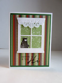
Isn't the expression on this bear's face truly CARING?? Well, since I thought he looked especially sweet, I decided to have him peeking into a window. Y'know, not seeming at all threatening or anything. Just CARING.

The little sentiment, "Dropping In To Say Hi", from the Acorny Thank You set was simply perfect for this curious, CARING bear. I used this phrase to show my Stamp-In Workshop attendees in November how to make heat embossing any color you want.


But, first, back to our bear in the window. The window from the Hearth and Home Thinlits lends itself to so many darling uses. Among them, to show a CARING bear peeking into the house.


I wanted the sentiment to match the CARING bear. (Does that make him a Care Bear??) But I didn't have any Early Espresso embossing powder. In the instructions below, you will discover where I found some. 


By snipping off a portion of a paper doily, I created a lacy valance for my window. I had mounted the bear against a green patterned paper that was to resemble foliage. The window was adhered to DSP that resembled wallpaper so it looked like the card viewer was standing inside the house.

Using Stampin' Dimensionals to adhere the window frame gives the scene a little dimension.


Anyway, why don't you come along on this journey of the discovery of colored embossing when you don't have the proper color on hand!?!

SUPPLIES:
Acorny Thank You stamp set
Thankful Forest Friends stamp set

Whisper White cardstock
Garden Green cardstock
Whisper White cardstock
DSP scrap to resemble foliage
DSP scrap to resemble wallpaper

VersaMark Ink
Early Espresso Ink
Early Espresso Stampin' Write Marker

Paper Doily
Paper Snips
Big Shot
Home and Hearth Thinlits
Stampin' Dimensionals
Clear Embossing Powder
Heat Tool
Embossing Buddy

INSTRUCTIONS:
Fold a 5 1/2" x 8 1/2" piece of Whisper White cardstock in half, creasing well with a bone folder.

Layer a 4" x 5 1/4" piece of Garden Green cardstock on top of that.

Rub the Embossing Buddy over a piece of striped (wallpaper) DSP that measures 3 3/4" x 5".
Towards the bottom, stamp the sentiment: First ink it up with VersaMark Ink, followed by Early Espresso ink. THIS IS THE WAY YOU CAN GET EMBOSSING IN ANY COLOR YOU CHOOSE!

At the Heat Station, dump Clear Embossing Powder over the stamped area, tapping the excess powder back into its container. Heat to emboss.

Adhere this piece to the card base.

Cut a Whisper White window frame with the Hearth and Home Thinlits.

On a scrap of Whisper White cardstock, stamp the caring bear in Early Espresso. Carefully cut ou the top portion of the bear. Cut the bottom of the bear off where it extends beyond the bottom of the window ledge.

Adhere the cut-out bear to the lower left portion of the window frame so it looks like he is peering in the window.

Adhere a green patterned piece of DSP that resembles outdoor foliage that is slightly smaller than the window frame to the back side of the window. This is meant to look like the bear is outdoors, looking indoors. Add claws to his left hand with the fine end of an Early Espresso Stampin' Write Marker.

Adhere the curtain, cut from a white paper doily, to the window top.

Attach this whole piece to the card front with Stampin' Dimensionals.

Caring
Smiles.

January 3, 2016

NEW YEAR NEW CALENDAR

I made six little calendars this year, one for myself, the other five for gift-giving. 

The stack of the 12 months fits inside a darling little floppy disk holder that measures about 3 3/4" x 3 3/4". Just like the more traditional CD holders, this one snaps open and flips backwards to form a sturdy stand. 

Here is how it looks open, and all ready for the new year:


The calendar pages themselves measure approximately 3 1/4" x 3 1/4". I debated for quite awhile how I was going to decorate each month.

Of course, I wanted to do some stamping. I thought maybe some little seasonal background stamps, a bit of Washi Tape, maybe a simple watercolor wash background. Unfortunately, nothing truly clicked.

I started rummaging through all my Stampin' Up! stamps for ideas, and as soon as I saw this nefarious bunch of snowmen, I knew exactly what I wanted to do: One detailed image per calendar page, starting with this gang.

The natural way to progress through the year is to do them in order. Yeah, right. That somehow didn't work. As I was shuffling through the stamp sets, I would come across one that would be perfect for such and such a month. But not the one I was currently on. Instead of simply setting each of my new finds aside for when I reached the designated months, I decided that I DID NOT HAVE TO DO IT IN ORDER.

So, that's how I ended up choosing and stamping each months' image -- haphazardly. The way I do a lot of my creating.

As I finished stamping each of the month's six images, I started to line them up in order along a table edge, leaving spaces for the months I still needed to complete.

This process took me a few days. I have to admit that it took longer than I'd wished to fill in a few of the months' blanks.

In my search for the perfect images, I knew I definitely did not want to use the traditional images for each month, such as spooky for October, hearts for February, etc. I just wanted each month to represent a seasonal feeling.

One thing to keep in mind when viewing my selections is that I live in central Wisconsin. These images obviously would not work for someone living in Hawaii, for example. Just sayin'.

Since I was taking an inordinately long amount of time to get this project finished in time for Christmas giving, it didn't leave me with much wiggle room to get the images colored. Thus, I decided to give each page a hint of color. And that would suffice. And that is what I did.

Of course, first up is January:


February proved to be one of my more challenging months. I did not want to make it blatant hearts and flowers, you know, Valentines, etc. So, I finally hit upon this cute paisley design:


March in Wisconsin can be windy and blustery. The image I chose was actually from a Christmas set. I guess it was meant to be a dove of peace or somesuch. I decided it would simply be a bird being tossed in the wind:


In Wisconsin, even though our beloved robins start to show up in March, I chose to use him for my April page since by then, they are around all the time:


I will always remember the only time I went fishing while wading in a stream with my husband and father-in-law on opening day, early May. Even cooler than the fishing experience though was the discovery of a nest of newly-laid eggs. So, in memory of that occasion, I chose a nest full of eggs:


Being a June bride myself, I decided that my June page would reflect a bridal choice of image:


During July in Wisconsin, it is wonderful to witness all the beautiful butterflies:


August, while often being hot and humid, brings to my mind the serenity and coolness of some sort of waterfowl (in this case, a Canada Goose) drifting lazily among the reeds of a quiet shadowy pond:


September is when the farmers markets are full of newly-picked apples:


Of course, colorful fall foliage is always the focus of October in Wisconsin:


This sheaf of bundled wheat represents to me the abundance of Thanksgiving:


And, finally, a precious chickadee among holly branches is perfect for my December page:


OK. Now that we've reached the end of the year, and after looking closely at each month once again, I think I have made a decision to change a few things. After all, that is a woman's prerogative: to change her mind.

I'm sure you are all aware of the amazing success of the adult coloring book fad. I have decided to make my little calendar my own personal adult coloring book. I plan to "finish" each page by further coloring the images with some of my Prismacolor pencils, in addition to the marker coloring I've already done. 

Stay tuned. I will share my "new" pages with you in a future post -- when I get them finished!

With that said, the other five calendar recipients are welcome to do the same with their own personal copy!

Seasonal 
Smiles.