Navigation Bar

July 31, 2016

FRAMED GOOSE

The other night, I was feeling uninspired, so I decided to delve into my box of Project Life cards that I keep for just such an occasion. My random pick turned out to be a 3" x 4" card that was white in the center, bordered with thin strips of color: Bermuda Bay, Old Olive, Daffodil Delight, Tangerine Tango and Melon Mambo, ending with an outer layer of black. 

After inspecting this choice, and feeling even MORE uninspired, I set it aside. Lotta good THAT pick for inspiration did me, huh?

The next day, I encountered my lonely little card sitting on my work table. I'm sure it was feeling unloved and neglected. Well, I couldn't have THAT, could I? 

I had instructions on how to do these cute photo corners, so chose a scrap of DSP containing a color I needed to match the card, and created four corners. I slipped them in place, but was not impressed.

Do I keep that black edge??? With orange corners, does it look too Halloween-y?? I really debated cutting off the black border. But, I think my hesitation to do so led me to the right decision.

Once I decided to retain the black border, the card came together readily. And I am, oh, so happy with the end result!

I am so thrilled with the new Seaside embossing folder on page 195 of the catalog! You see, it measures 6" x 6" rather than the 4 1/2" x 6 3/16" of the normal-sized embossing folders. And do you know what that means? You can use a 4" x 5 1/4" piece of cardstock in it either vertically or horizontally! Yes! That makes the folder ever so much more versatile. 

If this folder is used horizontally, it gives the definite impression  of  "Seaside". But, if used vertically, as I did in my card, it gives more the effect of echoing the reeds and/or grasses at our goose's feet. 

Underneath the embossed white piece, I added a thin strip of black before adhering it to my Pool Party card base. There, now I have a trilogy of black. And I am HAPPY! 


The beautiful stately Canada Goose from the Wetlands set fit within the white space perfectly. So, I cut a piece of Whisper White cardstock to 2" x 3" so it would sit right over the empty space on the card. I stamped the goose in VersaMark ink onto that piece and embossed him in black. Nice. Now, I'm bringing that black border into play!

Now, I COULD have cut a mask of the goose and adhered it temporarily over my embossed goose for this next step. But, I opted to leave him unmasked just to see what I'd get.

To create the variegated background, I took one of my acrylic blocks and scribbled in disorganized lines onto the block with the brush end of Stampin' Write Markers in Bermuda Bay, Old Olive and Daffodil Delight. I then spritzed the block with water lightly and stamped the block right over my goose. Without masking him first, I got a few little blobs of the Old Olive on his belly. But, that's OK. I really like that effect. It seems to make him more incorporated into the design than against it. If you know what I mean?


I love doing backgrounds in this fashion. You never get the same look twice. But, whatever results you get, it will never be wrong! Always always cool. Why don't I think to use this technique more often???

Spritzed
Smiles.

July 29, 2016

NOCTURNE


Nocturnal
Smiles.

July 27, 2016

RAINBOW SPLASH

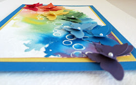
Recently, in getting ready to plan the projects for my upcoming August Stamp-In Workshop, I had it in my head that I wanted to create a card using the Stampin' Up! butterfly punches, coordinating "watercolor-y" splashes of color, the new stamp set, Playful Backgrounds (page 121) I'd gotten, and incorporating a resist.

Initially, I rubbed my piece of Whisper White cardstock well with my Embossing Buddy, followed by inking up the open bubbles from the stamp set with VersaMark ink, and embossing them using Clear Embossing Powder.

My first attempt involved sponging the proper colored inks in a swath across the embossed circles. Very unpleasing result. Next try, I used the Aqua Painter and the colors once again. Nearly as disappointing.

ROYGBIV. ROYGBIV. ROYGBIV.

The third try turned out to be a winner. But, messy and unpredictable. Something I always sense that the girls at my workshops get frustrated with.

For this try, I wetted down a 4" x 5 1/4" piece of 140-pound coldpress watercolor paper well with water. (Using this size, I still thought it could be used as a traditional A2 sized card.) Then, utilizing the Aqua Painter once again with the reinkers, I dropped color along the rainbow spectrum. A desperate need to work quickly minimizes the dark splotches of color you can get otherwise.

I then punched out each of the two sizes of butterfly in every color: Real Red, Tangerine Tango, Daffodil Delight, Garden Green, Marina Mist, Pacific Point and Elegant Eggplant.

After gluing the butterflies together and in place along the colors, I added Basic Pearls to each of the butterfly bodies. Once the glue set, I tilted the wings of both butterflies slightly upwards to mimic flight and motion.

At this point, I felt there had been too much time, care and dimension in the piece to become a mere card that the recipient may just throw in the trash. G. A. S. P. ! !


So . . . 

After matting it with thin edges of Daffodil Delight and Pacific Point cardstock, the size had swelled to 6" x 4 3/4". The obvious choice from here was to mount it onto an 8" x 10" piece of the same watercolor paper. 


Since 8" x 10" is a standard size for a framed piece, I plan to find the perfect frame for it and nestle my butterflies within, but, of course, without glass. Unless I am able to search out the perfect shadowbox frame that would enable it to be covered with glass that rises above the artwork so the wings can stay unfurled.

Wish me luck on this final step!

Rainbow
Smiles.


July 24, 2016

COZY QUILTED CHRISTMAS

I guess I'm still on a little bit of a kick: using the "stained glass" die that I first introduced in THIS POST. 

Since the first several cards I'd made with that die utilized traditional cardstock, I decided to give it a try with Designer Series Paper (DSP) to introduce a little more interest. Of course, since it is still July, I opted for a combination that was a bit Christmas-y in its looks -- CHRISTMAS IN JULY! 

The DSP was a little tougher to work with because it is a thinner paper than the cardstock. It just gave me a bit more grief. 

But, the end result had a quilted-looking stained glass appearance, so I decided my sentiment would reflect this feeling. 


Then, to add to the cozy look, I added a bit of quilted Cherry Cobbler ribbon from a few years back underneath my sentiment. 


Just a side note: I don't know if this is something scientific, or what could cause this phenomenon, but I discovered that, even though the DSP pieces were created with the very same die as the black cardstock base, I found it more difficult to fit the pieces within the black grid. Most of the spaces showed a bit of the white at the edges from the white base underneath. (Notice this in the above photos.) Does anyone have any practical explanation for this?

Quilted
Smiles.

July 22, 2016

TOMORROW


Tomorrow
Smiles.

July 20, 2016

APOTHECARY NOSTALGIA

How many times have you experienced the rush? That feeling that you get when you spot something that you just know you have to have as part of your life? The excitement. The I GOTTA HAVE IT syndrome! That NEED to add something to your stash. The realization of the virtually endless POSSIBILITIES?

Well, that's EXACTLY the feeling I got when I first set my eyes on the Apothecary Art stamp set introduced by Stampin' Up! a few years back.

When I finally got it in my hands, I cherished it, and used it time after time after time. The gentle perfection of it was just so precious.

Imagine my chagrin when it was retired WAY BEFORE ITS TIME! Oh, woe is me! I was CRUSHED!

I happened upon these wondrous images the other day, and, I must tell you, I could not resist using it once again.

I really don't care that my favorites are retired and not considered CURRENT PRODUCT. If I love it, I love it, and I WILL use it! Unlike many demonstrators out there who immediately rid their stash of retired product, I hang onto forever those things that I love. Retired or not. 

Thus, on occasion, I will be sharing with you creations I have made with -- OH NO!! -- retired products. 

Bear with me -- and ENJOY!

For the card in today's post, I stamped the beautiful design in Memento Tuxedo Black ink onto 140-pound cold press watercolor paper. I then used an Aqua Painter and retired -- GASP!! -- inks in my attempt to make an old-fashioned cabbage rose concoction. 


I wanted to come up with an old-fashioned color scheme for my card also, finally incorporating shades of the primary colors.

To add to the nostalgic look, I used current product -- well, sort of -- in the form of the gorgeous tissue paper that comes in my monthly Paper Pumpkin box. I love that tissue and will never never throw any of it away!

Faux Silk was the technique I chose to utilize this beautiful tissue paper by crumpling it and pressing it against a Glue Stick (oh no! Glue Sticks are retired too!) covered piece of white cardstock.

I layered the blue background against a 4" x 5 1/4" piece of white cardstock that I edged with RETIRED Washi Tape. I love how this adds to the nostalgic feel. 

I must admit that ONE thing on this card is current product from the catalog! Yessss!! That is the lovely 5/8" Organza Ribbon on page 178 of the catalog. This classic ribbon has been a staple for several years now. And that makes me so happy!


The texture and dimension of this card is luscious -- if you ask me!


The moral of this post is this: If you fall in love with a product -- ANYTHING! -- enough to go ahead and purchase it, don't give up on it just because it becomes retired. If your love remains long after retirement, keep it and USE IT! 

As demonstrators, we are expected to use current product in the hopes that our customers will buy what we share. Yes. This is important. But, what about those wonderful things you were convinced to buy? Just because they retire does not devalue their worth. You love it! Use it!

Nostalgic
Smiles.

July 17, 2016

"LETTERPRESS" BUTTERFLY

I am sure that you recognize the background of this card as having been created with the Fluttering embossing folder (page 195). But, wait! Something's different!


By brayering ink, in this case, Mint Macaron, onto the embossing folder before running it through the Big Shot gives you an elegant look, not unlike the look of letterpress.


And by adhering the large butterfly diecut (Butterlies Thinlits, page 194) by his body only, and letting his beautiful wings tilt gently upward, you achieve the look of a butterfly having lightly landed and about to take off once again.


 I think the overall effect of the components of this card is one of gentle elegance.


Following I include a tutorial to remake this lovely -- sans stamping -- butterfly card on your own.

SUPPLIES:
Whisper White cardstock
Soft Sky cardstock
Island Indigo cardstock
Crushed Curry cardstock (in this case, I used textured cardstock that I had in my stash)

Mint Macaron ink

Big Shot
Fluttering Embossing Folder
Butterflies Thinlits
Brayer
Basic Pearl
Island Indigo Ribbon

DIRECTIONS:
After scoring at 5" on the Simply Scored tool, fold and crease well with a bone folder a 5" x 10" piece of Whisper White cardstock.

Ink up the brayer with Mint Macaron ink and gently brayer across the RAISED butterflies side of the Fluttering Embossing Folder. Get the butterflies as evenly inked as possible without letting the ink stray beyond the butterflies themselves. Use a gentle touch.

Run a 4 1/4" x 4 1/4" piece of Soft Sky cardstock through the Big Shot inside the folder, making sure the paper is square inside the folder so the butterflies flutter in perfectly straight lines. When the embossed piece emerges, the butterflies should be green, while the background remains Soft Sky.

Lay a length of Island Indigo ribbon about 1 1/4" from the bottom of the butterfly piece, anchoring the ends of the ribbon to the back of the piece.

Adhere this to a 4 1/2" x 4 1/2" piece of Island Indigo cardstock, then to the card base.

Cut a large butterfly using the Butterflies Thinlits from Crushed Curry cardstock. Add a large Basic Pearl to the center of his body.

Adhere the butterfly to the embossed piece with adhesive only on its body. Tip the wings gently upward for dimension and interest.

Because this card ends up being 5" square, you will want to create your envelope with the Envelope Punch Board (page 84), an indisposable tool that I turn to frequently.

Butterfly
Smiles.

July 13, 2016

STAINED GLASS GREETINGS

When I discovered this intriguing die on Clearance at a very handsome price, I could not resist adding it to my shopping cart. 

Don't you agree that it is just so interesting and inviting and full of possibilities?


And here is a little closeup of the die, complete with paper residue after being used many many times:


Since the die is not Stampin' Up!, I hesitated to use it in one of my Stamp-In Workshop creations for my participants to make. But, in all honesty, it was just too cool not to share with others. 

And they LOVED it! 

In fact, I provided the black and white base and asked them to choose their own color palette from a stack of cardstock selections. So, basically their card would be completely unique -- their very own! Their cards turned out to be so distinctively wonderful that I took a picture of them holding their cards and posted it to my Facebook page. Unfortunately, it was an unusually small group that day, but, even so, they had lots of fun with the project.

Anyway, another reason I hesitated to have the girls do this project was because, when I was creating my sample, I made such a mess of things. You know what they say: Experience is the best teacher. And, boy, did I learn from my girls!

I'm not sure Spellbinders would agree with my method for putting together a card of this sort. But, I created my base from black cardstock, discarding all the "puzzle pieces" within the grid. I then ran it through my Big Shot three more times, with each of the three colors I had chosen for my design. But this time, I kept the puzzle pieces, as I planned on filling in the grid with my color selections. 

Now, here is where I made my HUGE mistake!

I dumped all of the colored puzzle pieces in a heap in front of my black grid. It truly WAS like putting together a puzzle because I was so disorganized. It took forever to find the needed pieces and complete my card

But, when the girls proceeded on their journeys to making this card, I told them the difficulty I'd had. So they were much more organized, and the process went much more quickly and easily.

This is the card I used as my sample for the workshop:


As I observed the girls putting together their own creations, my fingers itched to go through that pile of prettily colored papers and do another one.

Well, towards the end of the workshop, I had actually chosen three jewel-toned colors to make another of my own. The colors, when put together, looked fairly Christmas-y. So, when I realized that it was JULY, I decided to  . . . you guessed it: Make a CHRISTMAS IN JULY card! 

To proceed more easily with my next creation, I was a bit smarter than my first time. I gently removed the cut-out puzzle pieces from the die in as close to one piece as possible, re-inserting any of the pieces that had fallen out. I then had three separate puzzles within their grids in each of my chosen colors to work from. The difference this small bit of care and organization made was incredible. And I whipped through my first card in minutes!

You see, the first time I made my sample card, you will recall that all three of the colored pieces were in a heap, some right side up, some upside down. A proverbial mess. That had me frustrated right off the bat. Every time I picked up a piece for a specific area of the grid, it turned out to be wrong because it was upside down, or some such nonsense. Thus my hesitation to have my girls create one, much less ME even creating another one.

Anyway, as I previously said, this next one came together crazily wonderfully! I simply chose from the colored pieces IN THEIR OWN GRIDS THAT MATCHED MY BLACK GRID. So easy. When I was finished, I still had those three neat-looking colored puzzles sitting there, just begging for more. 

So, I quickly diecut another black grid and went to work on a third creation, simply using other pieces in this card that had not been used in the first. When the second card came together even more quickly -- and I STILL had lots of puzzle pieces left, I hurried over to my Big Shot and cut ANOTHER black grid base.

And proceeeded to create a THIRD card in the same color combination. I could probably make a fourth card from the leftovers, but I've decided that three was enough. I must admit that I am truly in love, and cannot wait to choose some more color combos!

To complete the Christmas-y effect of the cards, I cut my words with the Christmas Greeting Thinlits (page 192 of the catalog). Since the words resting against such an incredibly busy background did not make them stand out enough, I simply adhered the colored words to Whisper White cardstock and cut them out with a slight white border. Perfect!


These are the three cards I completed with my one color combination:


Please keep watching my blog in the coming weeks. 
I will have a giveaway of your choice of one of these cards to commemorate a special occasion.

Gridlike
Smiles.

July 10, 2016

HEY THERE


This card is something of a departure for me, isn't it? Even so, I am very happy with the looks of it.

I had noticed the darling Hello Lovely Project Life Accessory Pack on page 163 of the new catalog, and was especially excited that the matching stamp set was actually included in the kit. It was something of a "grab bag" though, in that only a smattering of the accessories are shown in the catalog, So, not knowing what they all looked like, I ordered it anyway, fully realizing that I would be able to make use of whatever was in there.

When it arrived, I was not disappointed. Sifting through all the components was truly like opening a treasure chest of marvels! 

I immediately set to work, mainly because three 2" x 2" squares of black-and-white struck me especially. Initially, I planned to use the entire pieces on one card, but three 2' squares were a bit overwhelming for a single card. So, I decided to use these squares on two different cards. How? Yup. I cut each square in half, so I had six 1" x 2" cuties. 

I really wanted to add a color or two to the black-and-white palette, but which? 

So, I grabbed my trusty box of assorted Project Life cards that I had used numerous times in the past for random picks. Not quite randomly, I came upon a card with a black background and a mini print in white, Bermuda Bay and Calypso Coral. Perfect color combo!

I was on my way!

One of the components included in the Accessory Pack was the little circle sticker that says "Hey There". Not being anything I would say, I decided to use it anyway as my sentiment. The rest of the card came together easily once those initial decisions were made.

The "feathers" in the other two rectangles are really leaves created with the Botanical Blooms stamp set (page 142), cut out with the Botanical Builders Framelits (page 194). By flipping them opposite each other, I was able to add a little interesting whimsy.

I love how the whole card pops with dimension:


I liked the card and the layout so much that I decided to recreate it for my monthly Stamp-In workshop. However, since I did not have enough of most of the components, i.e., the "Hey There" sticker, the black-and-white pieces, and the background from the Project Life cards to have multiple people make the cards, I was forced to come up with an alternate color combo.

In an upcoming blog post, I will share that card with you.

Have you ever ordered anything without knowing every single component in the kit? If so, have you always been pleased -- or did you feel disappointed, wondering what in the world you are going to make with these alien pieces? 

I love the  unknown of opening up a treasure chest!

Lovely
Smiles.

July 8, 2016

July 6, 2016

HAPPY DAY

The June 2016 Paper Pumpkin kit, Banner Surprise, is truly adorable. It contains everything you need to create six banner cards and envelopes. It's a really clever concept in card-making/banner-making!

The banner portion of the kit involves sequins inside triangular-shaped cellophane bags which you decorate, string together, and wrap around the card. The recipient then unwinds the banner to reveal the rest of the card underneath. And he/she has a cute "happy" banner to display forevermore!

I decided -- once again -- to march to that drummer inside myself for a card I created from various of the Paper Pumpkin components. 

For my card, I used the striped card base, some sequins, diecut circles and several of the stamps that were included in the kit. Other than that, I departed and used materials I had on hand, including the color combination. The inks that came with the kit (TWO SPOTS!) are Tip Top Taupe and Mint Macaron. And I used Bermuda Bay and Watermelon Wonder on my card.

This is the result:


The "happy", "day" and circle and lined edges stamp inages come from the kit, as well as the white circles on which I used the stamps. 

The circles are mounted atop a scrap of retired DSP that I rounded on the corners to echo the circular motion of much of the rest of the card.


How many of you are Paper Pumpkin subscribers? Isn't it just the best day each month when that orangey/red box arrives in the mail containing all the secrets of the universe? OK. Maybe not all the secrets to the universe, but something extra-wonderful all the same! I LOVE it!

Banner-less
Smiles.

July 1, 2016

KISSED HELLO

A little kissing went on to make this card!

See the "hello"? Isn't it cute with its little added red stripe-ys? In the following tutorial, I will tell you exactly how to get this nifty effect.

This is a card that my girls made at the June Stamp-In Workshop. It is fairly simple and comes together easily.


Just a close-up of the "hello" to entice you:


The following photo shows the color combo a bit more clearly, as well as the various products that were used in the card.


Ready to try a "kissed hello" (or any other kissed-) of your own? Here goes:

SUPPLIES:
Hello stamp (from Sale-A-Bration 2016)
Stamp A Bag set (retired)
Timeless Textures set (page 120)
Work of Art set (122)

Cherry Cobbler cardstock
Whisper White cardstock
Pool Party cardstock

Pool Party ink
Cherry Cobbler ink

Basic Rhinestones
Pool Party Cotton Ribbon
Various Washi Tapes in Pool Party/Cherry Cobbler/Whisper White (or a color combo of choice)
Stampin' Dimensionals

DIRECTIONS:
Fold a 4 1/4" x 11" piece of Cherry Cobbler cardstock in half, creasing it well with a bone folder. You get a much better crease if you score the cardstock first with the Simply Scored (page 185).

In Pool Party ink, stamp the varied lines across the top of a 3 3/4" x 5" piece of Whisper White cardstock. Leaving a little space, add three strips of Washi Tape, then another row of the stamped lines. Finish up this piece by stamping the grungy border several times across the bottom.

Adhere this finished piece to the card base.

* Ink up the "hello" stamp with Pool Party ink. Ink up the thicker zig zag lines stamp with Cherry Cobbler ink, and "KISS" it right onto the inked-up "hello" stamp. Huff on it a bit; then stamp it onto a 2" x 3 1/4" piece of Whisper White cardstock. Adhere this to a 2 1/4" x 3 1/2" piece of Pool Party cardstock.

After flagging the ends of a 4 1/2" piece of Pool Party ribbon, adhere this to the back of the "hello" piece. Pop it up atop the Washi Tape stripes with a few Stampin' Dimensionals.

Add two basic Rhinestones at an angle in the corner.

* I apologize that the focal point of this card featured a retired stamp (hello). Other current stamps that would work equally as well for this card include: 

the "celebrate" stamp from Party With Cake (page 14)
the "happy birthday" stamp (page 16)
the "happy" from Celebrate Today (page 18)
several of the stamps from Oh,What Fun (page 31)
"thank you so much" from Thankful Thoughts (page 39)
the "yum!" from Me = Grateful (page 43)
two of the stamps from Layering Love (page 71)
the "spending" stamp from B.Y.O.P. (page 81)
"congrats" and "oh happy day" from Scenic Sayings (page 103)
three of the stamps from Friendly Wishes (page 105)
"art" from Painter's Palette (page 119)
the large numbers and letters on pages 136 and 137

To replace the retired zig zag stamp from Stamp a Bag, you could use:

the banner from Birthday Fiesta (page 11)
the row of hearts from Birthday Blooms (page 12)
the string of lights from Confetti Celebration (page 12)
the two border stamps from Ready to Pop (page 17)
the borders from Sweet Stack (page 19)
the border from Peace This Christmas (page 27)
the dots from Helping Me Grow (page 40)
the ornate border from Moroccan Nights (page 67)
the dotted border from Watercolor Wings (page 68)
the border from Floral Phrases (page 77)
the lines or a row of stars from Better Together (page 83)
the two borders from Tin of Cards (page 86)
the border or designs from Beautiful Banners (page 88)
the borders from Seaside Shore (page 93)
any of several from the Lovely Stitching set (page 98)
the two borders from Sunburst Sayings (page 99)
the double lines from the swing or the shadow border from Sitting Here (page 100)
the cool tire tracks from One Wild Ride (page 115)
two of the borders from Gorgeous Grunge (page 123)
several of the borders from Mixed Borders (page 123)
the border from Awesomely Artistic (page 144)
the stem from Garden in Bloom (page 146)
the little pebbles or the line from Live, Love, Grow (page 147)
a couple selections from Perfectly Wrapped (page 159)
OR
you could have a workshop and get Basket for You (page 198) for the lines!

You could also replace the stamped lines above and below the washi tape with any of the aforementioned stamps.

THERE! Lots and lots of inspiration for you! Give it a try! It's so easy and looks so great!

P.S. If you need to order any of these products (or anything else!), I would LOVE to be named your demonstrator! Just click on the catalog on the right side of my blog . . .

Kissed
Smiles.


HAPPY BIRTHDAY USA


HAPPY BIRTHDAY TO OUR BELOVED
USA!