Navigation Bar

April 29, 2017

STAINED GLASS DAISY

I have such mixed feelings when the Stampin' Up! retiring list is released. This year, the fateful day fell on April 10. So it's been a couple of weeks that I've had to get over it. But it's tough.

Why mixed feelings? As so often happens, many of my favorites land on that list, only to disappear forever. At least, from current catalog offerings. Heartbreaking. But, on the other hand, retiring product means that Stampin' Up! is making room for more cool and new product! Yay!

Anyway, one set of Thinlits that I thought was too cute to only spend one season in the Occasions Catalog is the Timeless Tags Thinlits Dies set, found on page 23 of the Occasions Catalog. 


I wanted to use this bundle while it was still considered current, 
so my girls made the following card at the March Stamp-In:


The "leading" for the stained glass daisy is diecut from Basic Gray cardstock. 
Then the background, daisy center and leaves are "painted" in. 


Do you like the embossed background? With the Petal Burst embossing folder, NOT retiring, 
thank you very much, I embossed Vellum Cardstock (page 175 of the big catalog). 
I love the look of embossed vellum! Don't you?


Not a whole lot of dimension in this card, but just pleasingly enough. 


How would you like a tutorial on how to re-create this card? Are you ready? Yeah? OK, let's go!


SUPPLIES:
Whisper White cardstock
Island Indigo cardstock
Daffodil Delight cardstock
Basic Gray cardstock
Vellum cardstock

That's the Tag set (page 23 in the Occasions Catalog -- RETIRING!)

Daffodil Delight ink
Island Indigo ink
Wild Wasabi ink

Aqua Painter
Big Shot
Timeless Tags Thinlits Dies (page 23 of the Occasions Catalog -- RETIRING!)
Stitched Shapes Framelits (COMING IN THE NEW CATALOG! June 1)
Petal Burst embossing folder (page 195 of the regular catalog)
Baker's Twine
Stampin' Dimensionals

DIRECTIONS:
Fold a 5 1/2" x 8 1/2" piece of Whisper White cardstock in half, creasing it well with a bone folder.

Run a 3 3/4" x 6 1/4" piece of Vellum Cardstock through the Big Shot inside the Petal Burst embossing folder. Fold the top and bottom of the vellum tightly to the back of a 4" x 5 1/4" piece of Island Indigo cardstock, adhering it on the back.

Wrap the short edges of a 1" x 5 1/2" piece of Daffodil Delight cardstock around the edges of this piece about 1 1/2" down from the top of the vellum, adhering it in the back. Repeat this same process across the top of the yellow piece with a 1/4" x 5 1/2" strip of Island Indigo cardstock, and then a piece of Island Indigo baker's twine, adhering both on the back of the larger piece.

Towards the bottom of this piece, wind a length of matching baker's twine twice around, tying it into a bow about 1" from the left side of the vellum.

NOW you can attach this piece to the white card base.

WHEW.

From Basic Gray cardstock, die cut the daisy in an oval. Adhere this to a 2 1/4" x 3" oval diecut from Whisper White cardstock. Using an Aqua Painter dipped in ink that had been pressed into the lid, color in the sky, flower center and leaves in Daffodil Delight, Island Indigo and Wild Wasabi ink respectively. Adhere this oval to a large Stitched Oval die cut from Island Indigo.

Use Stampin' Dimensionals to attach this to the card front.

On a scrap of Whisper White, stamp the sentiment in Island Indigo and the frame around it in Daffodil Delight. Die cut this piece using the center of the other oval frame. Attach this to the card front over the double baker's twine with a couple Stampin' Dimensionals.


Even if you don't make this specific card, be sure to remember on occasion to grab some vellum cardstock and emboss it! It is such a glorious look.

Retiring
Smiles.


April 26, 2017

COLORING CRAZE TROPICAL HELLO

The adult coloring craze is still in full swing. Scrumptious coloring books of all price points are everywhere you look.

During Sale-A-Bration, Stampin' Up! jumped on this bandwagon with their Inside the Lines Designer Series Paper. The 12" x 12" sheets of line drawings came in four different designs. I've seen lots of variations on the treatment of this paper being incorporated into greeting cards and packaging. 

In fact, for one of my monthly workshops during Sale-A-Bration, I had cut up two of the designs into 3 1/4" x 4 3/4" pieces for my girls to work on a specific card, which can be seen in THIS POST. The girls enjoyed choosing their sometimes weird composition -- when you cut a 12" x 12" sheet of paper into random pieces, the composition is not always wonderful -- and then figuring out whether they wanted to add stamped ferns and/or dragonflies, which portions they wanted to color, and finally, the color combination they wanted to use for their card base, depending on the colors they'd chosen in the coloring process.

Anyway, there was a small stack of these pieces left after the workshop that the girls hadn't chosen. GASP! Rejects!! 

Yesterday was my day at the 319 Gallery. I love my once-a-week stints as hostess of the Gallery, and I always bring along a big tote bag filled with projects (and homework) to do in between customers. As I was leaving for the Gallery,I tossed the stack of unused pieces left over from the workshop and grabbed an assortment of my Copic Markers. And blissfully went to work coloring the piece I'd chosen randomly.

I was so excited with the vibrant results that right after dinner, I dashed down to my Creation Station to incorporate it into a lushly-colored card.

And this is the result:

COLORING CRAZE TROPICAL HELLO

 How a portion of the coloring looked when I was finished.


The lack of color intensity in these photos does not do it justice, I am sorry to have to admit. 

I decided to preserve most of the coloring and not disturb it too much with extraneous embellishments, wanting to spotlight as much of it as possible. So, I opted for a simple "hello".

I die cut the word twice, once in a bright red and again in black. Then I created a slight shadowing effect with the black behind the red by offsetting the two words just a bit.

You know, I really MISS using brads. Besides adding color, they provide a bit of dimension that is just fun to look at. SO, I dug out an old container of Stampin' Up! brads and chose three of the red ones to line up underneath the word for a final definition.


As I'd mentioned, I wanted all my diligent coloring to be the star of this card. So, I added a tiny sliver of black and then white behind the colored piece. I finally mounted this onto a card base made from a long ago Stampin' Up! color -- Taken With Teal. Do you remember that color?? It complemented the Copic colors I'd used, so it was the perfect choice.


You can see the finished card lying atop a couple of other random pieces of the Inside the Lines paper -- just waiting for me to grab my Copics and bring them to life. Maybe next Tuesday?


Now, if you have any coloring pages around, or snippets of Inside the Lines DSP, grab your markers and go to work. The little creations make lovely additions to greeting cards.

Colorful
Smiles.

April 23, 2017

MAKE A SPRING TENT TOPPER CARD

Tent topper cards are so much fun to make and they provide just a little added oompf in that they are not quite the traditional card.

Do you see how just a bit of the focal circle extends beyond the top of the card base? That's what makes it a tent topper card.

MAKE A SPRING TENT TOPPER CARD

Over the past year or so, I have made a practice of stamping lovely images onto Designer Series Paper and then fussy cutting them out. So I have a generous stash of these lovelies that I can dip into whenever the whim hits me.

One word of warning about stamping onto DSP: The paper you choose for your images must not be too busy or too colorful. You see, if that is the case, you lose all the details of your stamping. Not a good thing at all. You want to be able to enjoy the loveliness of the stamped image against a softly-designed Designer Series Paper. Otherwise, what's the point, eh?

The flowers in the photo below are examples of fussy cutting images that are stamped on DSP. Can you see that the designs on the papers are quite subtle? That way, you have the best of both worlds.

The bumblebee in the center is also stamped and fussy cut, but simply done on Whisper White cardstock. I had added Clear Wink of Stella to the buzzy guy's wings, but I could not capture that in a photo. You'll just have to believe me that they do sparkle and glitter in real life.


 I'd wanted to create a spring-y wreath. So, in tribute to the retirement of the Wondrous Wreath set (page 32 of the big catalog), I decided to use this lovely wreath image in a springlike green (Pear Pizzazz).

I love this time of the year when trees are just starting to bud out. The landscape looks so new and fresh, almost pastel.


This card measures 4 1/4" wide by 4 3/4" tall. So, almost a square card. But, with these dimensions, it fits beautifully inside a traditional A2 envelope.The card base is a square 4 1/4" x 4 1/4". But, the circle extends 1/2" beyond the top of the card. This is what constitutes a tent topper card, the extension beyond the boundaries of the card base. The completed circle is popped up against the card base with Stampin' Dimensionals, to give it even more interest and importance.

The challenge of creating a tent topper card is in making it fit the dimensions of an A2 envelope, unless, of course, you want to create your own envelope with your Envelope Punch Board. The proportions of the finished card will depend on the size of your focal element.


Another peek at the fussy cutting. And, nope, you still can't perceive the shimmer on the bumblebee's wings.


Another farewell to a retiring item is the label and matching frame. They are part of the Star Blast Edgelits Dies on page 11 of the Occasions catalog. I fell in love with this die set as soon as I spotted it in the catalog, and retired or not, I refuse to stop using it. It is appropriate for so many happy occasions! And, once May 31 arrives, it will be gone, gone, gone. Sob.

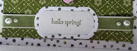
Another sadly retiring item is the Basic Pearls (and the Basic Rhinestones) shown on the ribbon strip below. The pearls and rhinestones have been around for so long and have served as a staple on a multitude of my cards. Unfortunately, through the retiring process both these items have already sold out. I am so glad I have several packages in my possession. So, I'm sure you will see them pop up on my creations now and again into the future. 


One other thing that I was excited about regarding this card was mixing several Designer Series Papers together. Besides the papers in the flowers, notice that I have two green combo DSPs comprising the card base. It is such fun to find two papers -- not even from the same set or the same YEAR! -- that work so well together. They add to the fun and whimsical look of the card, working well with the green in the wreath.


And, here is my tent topper card once more, this time in the spring-y sun spotlight!


Go ahead! Make any card just a little bit more special by turning it into a tent topper card! It's fun and easy!

Spring-y
Smiles.

April 21, 2017

GELLI PRINT CARD

As you all know, I have become a fiend when it comes to Gelli Plate printing. 

I shared my first batch of experiments with you in THIS POST and then I thrilled you with my second installation of my joys of Gelli Printing series HERE

A few of you have asked me what I plan to do with the many many prints I have been producing. At this point, I'm still not positive. But I thought I'd better try SOMEthing at least. Most of the prints I've been making and am half satisfied with have been done with my 3" x 5" Gelli Plate, so the prints are fairly small. 

This yellow polka dots on pink print silently begged me to turn it into a card. So, that's just what I did. It's probably not the best use for something that took so many pulls and layers. But, I like how it turned out nevertheless.

GELLI PRINT CARD

In Black Tuxedo Memento Ink, I stamped the daisy-like flower and butterfly. I then added color to the images with my Copic Markers. After that, I fussy cut the images out and adhered them to the Gelli background.


To carry the black of the stamped images into the card a bit more, I added black dots here and there with a Sakura Pigma pen.

I debated whether I should add it or not, but I ended up putting a perky little hemp bow on the stem of the flower. It seemed just a little naked without it.


I also added a few paper dots to the right of the sentiment to complement the dots in the background, but also to echo the brightness of the colors in the coloring and card base.

The card is small in size: just 3 1/2" x 5 1/2". 


The bright sunlight today made it quite a challenge to get colors that are properly saturated. Working with Photoshop, I did the best I could. The colors are actually much more vibrant than they appear in these photos. If you are Stampin' Up! aficionados, the colors of cardstock I used are Melon Mambo and Crushed Curry. 

Gelli
Smiles.

April 18, 2017

MAKE YOUR OWN STAMPS

Are you ready to add another use to your diecut repertoire? For my foray into this new world, I used the Thinlit by Sizzix shown in the photo below.

One more thing that you will need to try this technique is a piece of Fun Foam. You know, that squishy stuff that little kids like to make things like magnets and door hangers out of? Well, grab yourself a sheet, one that has a sticky backing.


First of all, the photo below shows what the lovely diecut butterfly looks like. Really pretty cut from a thick paper, right? 

But wait! Forget the paper! We are going to make a STAMP.


Ready??

OK. Now, cut a piece of that Fun Foam sheet to approximately the same size as the die. NOTE: The Fun Foam I used was 2mm thick. And -- don't ask me why -- the sheet I chose was white in color.

Pretend that this little piece of foam is cardstock and run it through your Big Shot using the same sandwich as you would when using a piece of cardstock with the pretty butterfly die. Place the cutting portion of the die over the back of the foam, against the paper that protects the sticky. Since this die is so fussy, rather than just a frame-style die, I used my Precision Base Plate. 

Being my first attempt at this, and using such a detailed die besides, I was not at all sure what to expect. I truthfully did not think it would work. 

But IT DID!

However, even though the foam sheet was only 2mm thick (there was also one that was 3mm), it was squished down even further by the compression of the Big Shot.

A.N.D. It came out of the die super easy! 

I peeled the protective paper from the sticky surface and carefully mounted it to a spare wood block I had on hand. (See??!!? That's why I save everything! You never know when you will need it!)

Because there was very little depth to my new stamp, I was concerned about inking it up. I used Dapper Denim since it is a foam pad, as all the new Stampin' Up! ink pads now are. I chose that because those foam pads are super juicy and I thought it would be easier to ink up such a fragile low profile stamp. 

I was very careful in the inking process. Even so, you can see by the ink on the wood block how difficult it is.


I was so anxious to stamp it onto Whisper White cardstock. Gulp. Carefully stamp. And voila! Look at the beautiful image my new stamp made!


I seriously thought I was only experimenting by stamping this first impression. And, as I previously said, I really did not think it would work. 

But the stamped image turned out so beautifully, I decided to create a card from this very first attempt. Woo hoo!


I am in love with the look of this stamp!


To add a bit more to my final creation, I placed a few Basic Rhinestones in important spots, a white gel polka dot edge on every other scallop and a little tag with my sentiment. The base of the card is also created from Dapper Denim to match the ink color.


So, what do you think?? Are you going to be making your own stamps now? I haven't had a chance to play with any other dies. But I surely am going to! I can't wait to make myself a whole new set of stamps! 

I would love to see what you do with this fun and easy technique! Please send me any images of this -- or ANYTHING at all -- to my email address, which is lidna52@gmail.com. Perhaps I will use your share(s) in an upcoming post -- or two or three! 

Foamy
Smiles.

April 15, 2017

EASTER CHICK

EASTER CHICK

Just dropping by to wish you and yours 
a happy, safe and blessed Easter!

Easter
Smiles.

April 12, 2017

EMBOSS RESIST SPRING BLOSSOMS

This particular stamp set has been featured on my blog numerous times. Why, you ask? Because it is so beautiful for this time of the year -- and I LOVE it! It is so much fun to work with because there are virtually endless possibilities for it. Techniques, I mean.

And, once again, having endured a Wisconsin winter, we are all so ready to see these beautiful blossoms appear in person. I'm just getting a head start.

EMBOSS RESIST SPRING BLOSSOMS

The other night, I was really in a mood to work with an emboss resist. But I wanted to do it a little differently than I had any time in the past.


Using Whisper White cardstock, I first of all, ran my Embossing Buddy over it to remove any static and prevent stray embossing powder where I didn't want it.


I stamped the image carefully in VersaMark ink. Then, at the Heat Station, I covered the sticky stamping with white embossing powder. 

Although watching embossing powder heat up and turn shiny and raised is always a cool magic to witness, for some reason, it is especially gratifying to watch this particular stamped image go through the embossing process.


Once the white embossing was cooled sufficiently, I used Sponge Daubers with Pink Pirouette ink on the blossoms, Wild Wasabi on the leaves and Crumb Cake on the bit of stem that shows.

Since the Sponge Daubers were larger than the blossoms I was inking, especially on the stem, leaves and buds, and even though I was being super careful in my inking, some of the ink -- no surprise -- went outside the lines. Oh no!!


INTERMISSION. 

WARNING: PHOTO BOMB! While I was taking my photos this morning, my Fred decided to check out the action.


INTERMISSION OVER.

To rectify the outside the lines situation -- although it didn't bother me all that much -- I grabbed my Prismacolor Pencils and went to work with about 12 different colors of pencils. I used the colored pencils sort of like you would use Copic Markers when coloring an image.

My first layer was my light coat of inked color. Working with that base color, I added lighter and darker shades of similar colors. 


The green of the leaves showed so much around the leafy areas, I decided to play with that green and I incorporated some of the same hue into my shading on the flowers. Because green and pink combined make a sort of brown, it worked wonderfully.


INTERMISSION TWO. 

Once Fred checked everything out and knocked down my trifold for photographing, he settled in and became part of the photo shoot.


To work everything together into a cohesive unit, I added the green all around the image, fluffed out my colored pencil marks and gave the finished piece a delicate, dreamy appearance. 


Although the finished piece measures the same as a traditional card front, 4 1/4" x 5 1/2", I decided not to create a card from it. So, right now it is settled on an easel.


Have your creative endeavors brought you anything a little different lately? Can you share with us?

Blossom
Smiles.

April 9, 2017

A BASKET FULL OF PEEPS

PEEPS! Did someone say PEEPS?? What is springtime and Easter without the presence of PEEPS?

The extra-precious bundle Stampin' Up! calls Basket Bunch Bundle (page 18 of the Occasions Catalog) has so many wonderful components to build a springtime scene. Just to prove my point, there are 29 stamps and 22 dies! Talk about a LOT OF FUN! And so many options!

As soon as I received my bundle (and it was the FIRST thing I ordered from the Occasions Catalog!), I started to create a card that I could use for an upcoming Stamp-In Workshop. That card happens to be this one. 

That particular card took me a loooong time to create. And I thought maybe my Stamp-In girls wouldn't be too happy with me if I had them creating this card. So, a few days later, I decided to head back down to my Creation Station, determined to come up with an equally cute card, but one that would be easier to put together.

Much to my chagrin, it turned out to be even more complicated and time-consuming than the first one. But I liked it. This is what I ended up with:

A BASKET FULL OF PEEPS
 Aren't these Peeps just irresistable? And hidden behind all the Easter grass . . .


And isn't this bunny simply adorable? Doesn't he make you SMILE??


And look at this chocolate bunny I put inside the card!


 I love the dimension of the card. The addition of the white fringe on the right edge continues with the grassy look and adds a little interest to the side of the card.


Now, how do you think the girls felt when they had this card to create at the Stamp-In? We'll never know, because . . . 


This is the card they ended up making:


Yes, I went back to my original card. The only change I made was instead of the stamped and diecut bow on the top of the basket handle, I simply had them choose baker's twine to coordinate with the colors they'd selected for their eggs. It was one less trip to the Big Shot.

I must add that, before the class, I did a lot of the work for them. And, I ended up stationed at the Big Shot for awhile die cutting the egg pieces. No worries. It all turned out good. And the girls liked their creations, saying that it was worth it. They also liked being able to dig through my stash of Washi Tapes to add their own choice behind the sentiment. It was a great option to use instead of a strip of ribbon, DSP or cardstock. 

Do you make your own Easter cards? Are your cards more cute-sy like my two are or do they really represent the "reason for the season"? I guess that, after a long and dreary winter in Central Wisconsin, I am ready for bunnies, peeps and colored eggs!

WISHING YOU ALL A BLESSED, 
SAFE AND HAPPY EASTER! 

Peep-y
Smiles.