Navigation Bar

October 31, 2017

FAUX LINEN TECHNIQUE

Are you familiar with the term "faux" (pronounced FOE)? According to the Merriam-Webster Dictionary, the meaning of the word is "imitation". Uh huh. Another word I always think of when I hear the word "faux" is "FAKE". 

Imitation/fake, whatever, anything faux is not the real thing, simply something created to look like the real thing.

Have you heard of the Faux Linen Technique? Just as the name implies, it is a technique made to look like real linen. And I love that technique. 

The Faux Linen Technique is one I haven't visited in some time. But, the other day I was reminded of it, and was immediately inspired to use the beautiful old fashioned Santa Claus in the Father Christmas set on page 114. 

By incorporating the Faux Linen Technique as a background for my Father Christmas figure, I was hoping to achieve an equally old fashioned piece, something that may hark back to the Victorian Era. 

I measured the stamp, and determined that a 2 1/2" x 3 3/4" piece of cardstock would be a good size for this focal point. But, you can't use just any old cardstock for this technique. Glossy cardstock is a must for it to be successful.

The technique is really very simple. Cut your glossy cardstock to size, and with a sanding block (I used an old one that Stampin' Up! carried at one time), lay the sanding surface flat against the cardstock, and drag it straight to the other side. Drag the block with some pressure while sanding because you are scratching off the surface of the glossy cardstock. Do this first vertically, then horizontally. Once you are finished end-to-end in both directions, you should have a fairly even sanded grid on the paper.

The next step is where you will make some decisions, depending on the look you are hoping to achieve. If you want it to look like aged linen, choose a lighter neutral color of ink. In my case, I used Crumb Cake. With a stamping sponge, I sponged the Crumb Cake from just beyond the edges towards the center, all around, concentrating a little more on the the edges.

The photo below was my first attempt. I did an initial layer in Crumb Cake, followed by another in Soft Suede. It looked okay, just maybe a bit dark.


My second try, below, was perfect as far as I was concerned. Where I think I made my mistake was when I stamped Father Christmas onto the Faux Linen piece. I did a great job of stamping him in Early Espresso, but maybe a bit too great. It was just too pronounced. I wanted a softer look to go along with the softly aged look of the Faux Linen I was using for the background. 

NOTE HERE: I maybe could have done a little sanding over the stamped image. Not having tried it, I'm not sure if it would work or not. Just a thought.


My third attempt was quite different in that when I did my vertical and horizontal sanding, I overdid it. I pretty much succeeded in removing all of the glossy surface of the cardstock through my diligent sanding. When it came to inking, the paper was much too porous to take the sponging evenly. In real life, this piece feels pretty cool. But it is just too distressed looking for my taste.


Back to the drawing board once again. I returned to the softer sanding as shown in my second sample. Remember, in that sample, the only thing I didn't like about it was that the Santa was stamped too darkly.

So, in this last sample, I made a concerted effort to not stamp Father Christmas as carefully and with not as much pressure. I was so happy with this result that I ended up making it into a card.

PLEASE NOTE: Do you see how beautifully the scratches in the Glossy cardstock made with the sanding block pick up and absorb the ink just the right amount so you can actually envision this as a fine linen cloth?


Anyway, as I said, I liked this guy so much that I created a card using the piece. I decided to use this card for my next Stamp-In Workshop on November 13. Thus, I don't want to expose the entire card so my girls will be surprised when they come to the workshop!

Grab some Glossy cardstock, a sanding block and neutral ink and a sponge and get to work manufacturing Faux Linen! If you've ever done the technique, share your experiences with us!

Faux
(No, REAL!)
Smiles.

October 28, 2017

HAPPY HALLOWEEN!

Happy Halloween!


Spooky
Smiles.

October 24, 2017

WATERCOLOR AUTUMN

I know I've talked about this technique in several of my posts. You know, the technique in which you ink up an acrylic block, spritz it with water and stamp it onto watercolor paper? It's probably one of the most unpredictable techniques you can do. No two will ever be the same. Ever.

Anyway, I've done this with smaller clear blocks, but never the E Block (page 217), which measures 3 7/16" x 4 7/16". This is the perfect size to use as a background for a card, because it encompasses so much space.


For this card, I used two of the new In Colors of ink: Berry Burst and Lemon Lime Twist. I brought the ink pads directly to the clear block, and using as small of a portion of the ink pad as possible, I randomly stamped the ink onto the block until most of the block was covered with ink. If course, when you combine green and red, which essentially this combination is, you will get brown where the colors overlap.


I was going for a fall-ish look for this background, so even a bit of rustiness, tans and browns was perfect for my purpose. 

After I spritzed the inked-up block with water, I stamped it down onto thick watercolor paper. I left it dry almost completely naturally because I love the look that is achieved with air drying. However, I did finish up the drying process with my Heat Tool. 


When I got my first look at the dried piece, I just wasn't sure if I liked it. There was a lot of white space, and not the near complete color coverage that I'd hoped to achieve. See? I mentioned that this is a very unpredictable technique, didn't I?


Gradually the look grew on me, and I set out to turn it into a card. In fact, I ended up liking it so well that I didn't want to cover up too much of it! Now, how much sense does that make anyway??

So, I grabbed some non-shiny gold metallic cardstock and went to work on a few elements for my card. Do you recall the splendid diecut leaves I used in the card in this post? Gorgeous, aren't they? 

For today's card, I used the same Thinlit, 
but I didn't remove the diecut pieces from the leaf. 


Using the same gold cardstock, I die cut a little "hello" for the bottom of the card.


Below is a larger picture of the intact gold leaf. Isn't it just wonderful?!?


This way of making a watercolor-look background for a card is so much fun -- and, of course, unpredictable. But, I don't think you can ever make a "mistake" with this technique. Each and every one of your attempts will possess a special beauty all its own.


Give this technique a try! 

Just a summary of how to do it: Choose a clear block. Cover it with ink in whichever manner you choose: ink pad direct to the block, as in my example, coloring on the block with Stampin' Write Markers, sponging the ink on. 

Once you have the block inked, spritz it gently with water so the ink starts to bead up and bleed a bit. You don't want it to be a sloppy wet mess, just get that ink moving with a little bit of personality. 

After spritzing, tip the block over and press it into watercolor paper. You can either lift it straight up immediately, or you can let the block sit on the paper for a few beats. Experiment! 

Then, if you are patient, you can let it air dry. If ink/water tends to gather at the edges, gently sop it up with a corner of paper towel. If you are not the patient type, grab your Heat Tool to finish up the drying process.

Watercolor
Smiles.

October 21, 2017

LIFE IS A BEAUTIFUL THING

On Monday, October 16, my Stamp-In Club ladies experienced a little bit of a challenge in making this card at the workshop. You see, it's a two-step card. Why do I refer to it as a two-step card? Because FIRST they had to create their own stamp. Only after having completed this first step, could they continue on to making the actual card.


The card also featured a couple of the gorgeous diecut leaves from the Seasonal Layers Thinlits on page 216. They were done in Peekboo Peach and Berry Burst cardstock.


We also used some of the beautiful new Designer Series Paper, Painted Autumn, which can be found on page 49 of the Holiday Catalog. This paper is truly exquisite, almost too pretty to cut and use.


The following two photos show the use of the handmade stamp the girls made in the leafy impressions stamped in Peekaboo Peach and Berry Burst.


I'd love to share with you the tutorial on how to make this card. Keep reading -- and have fun!

SUPPLIES FOR THE STAMP:
Big Shot
Seasonal Layers Thinlits
Fun Foam with adhesive backing
Black ink
A wood block

INSTRUCTIONS FOR THE STAMP:
Using a small piece of adhesive-backed fun foam, run it through the Big Shot with the small maple leaf die from the Seasonal Layers Thinlits dies, cutting out a leaf shape.

If you desire, stamp in black ink an index image onto the wood block. You might want to cut a separate leaf to do this step. You'd hate to have black on your stamp when making your card. Mount your new stamp onto the wood block.

THE MOST IMPORTANT THING TO REMEMBER WHEN USING YOUR NEW STAMP: 
Since the stamp is sooooo thin without any cushioning, it is somewhat difficult to ink it up without getting ink on the wood block. Remember that if you have wet ink on the block, it will transfer to your paper when stamping. It works easier if you use one of the new juicy ink pads, and then just gently tap the ink onto the stamp.

Use this stamp on the Life Is A Beautiful Thing card.

SUPPLIES FOR THE CARD:
Painted Autumn Designer Series Paper
Very Vanilla cardstok
Peekaboo Peach cardstock
Berry Burst cardstock

Colorful Seasons stamp set (page 147)
Handmade stamp

Berry Burst ink
Peekaboo Peach ink

Big Shot
Seasonal Layers Thinlits (page 216)
Paper Snips
Blue Cord
Stampin' Dimensionals
Scotch Tape

INSTRUCTIONS FOR THE CARD:
Fold an 8 1/2" x 5 1/2" piece of Very Vanilla cardstock in half, creasing it well with a bone folder.

Adhere a 4" x 5 1/4" piece of Peekaboo Peach cardstock to the card base.

Using the new stamp you just made, first of all, gently ink it up with Peekaboo Peach ink. STAMP IT OFF FIRST ON SCRATCH PAPER to lighten the image and stamp it randomly on a 2" x 5" strip of Peekaboo Peach cardstock. Repeat this step in several random spots. Then, carefully ink it up with the Berry Burst ink, AND STAMPING OFF FIRST, fill in blank spaces on this strip with the darker leaves. The leaves can overlap somewhat. PLEASE NOTE: I didn't always get a clear impression of the leaf, nor did I get the leaf stem every time. But it doesn't need to be perfect. It just has to have the effect of falling leaves.

When you are satisfied with the look of your strip, wrap blue cord three times around the strip and tape the ends on the back. Then add to the right side a 1 1/2" x 5" strip of the fall DSP so about an inch of the DSP extends beyond the edge. Center this piece onto the card front.

Cut two detailed leaves, one from Peekaboo Peach cardstock and one from Berry Burst cardstock, with the Big Shot and the appropriate die. Adhere the leaves to the stamped strip. I glued the darker leaf down first, then added a piece of Stampin' Dimensional to the large part of the lighter colored leaf, and popped it up overlapping the first leaf a bit.

On a scrap of Very Vanilla cardstock, in Berry Burst ink, stamp the sentiment. When the ink is completely dry, fussy cut, but not all that carefully, around the sentiment. Add a scrap of Peekaboo Peach cardstock to the back of the sentiment, and fussy cut this also, leaving a thin margin of peach showing.

Use a couple of Stampin' Dimensionals to adhere the sentiment to the lower portion of the DSP strip.

I should mention here that the Painted Autumn Designer Series Paper used in this card is on sale! Through October 31, there is a special promotion during which you can order three packs of DSP and get a fourth pack for free! Here is the flyer all about the promotion and the DSP packs that are included. Just click on the Shop Now button to go shopping!

Two-Step
Smiles.

October 17, 2017

SUCH A CUTE LITTLE WITCH

 As I'm sure most of you know, Saturday, October 7, was World Card Making Day.

Every year as the first Saturday in October starts rolling closer on the calendar, I get a hankering to do something really special to commemorate the day. This year, I was hoping to teach a cardmaking class.

But, then something more important showed up on the calendar! Our daughter and son-in-law were invited to a wedding in our area on that date. So, we were designated babysitters of our precious grandson, Enzo, who is eight months old!

Through a couple of attempts during the day to at least create one card, I did succeed in finishing one late that night.

I'd been flipping through my smaller GelliArts Press prints, and when I came across one in particular, it seemed to have something of a sinister aspect to it. I thought it would be perfect as the background for a Halloween card.

So, on the premise of my gel print being my background, I built a card around it.


I searched through my Halloween-y stamps for something that would work well with the gel print. I was sort of in the mood to do some paper piecing, so as I was looking, I kept that idea in mind.


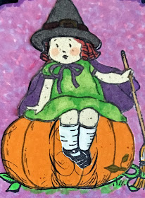
I came across a set from several years ago, but, even though it's been retired awhile, I have never lost my love for Greeting Card Kids. The little witch girl from the set was not just too spooky-looking, but I opted to feature her on my card anyway.

Do you see the yellowish-greenish and white piece matting the gel print? That was from a project I'd tried recently, but was not happy with how it turned out, so set if on the pile of future possibilities. Creepy green? Yes! And it was the perfect relief from all the other darkness of the rest of the card.


And the best part is that I did get to do some fussy cutting with paper piecing! The pumpkin, her body, her clothing and her hat were all fussy cut, and glued in place. 

I wanted to pick up the faint purples in the gel print, so I used a combination of a couple of Copic Markers to create the background around my cute little witch. I did the same with the sentiment below her.


I used Stampin' Dimensionals to pop up the little witch as well as the sentiment. That is the extent of the dimension to this card.


I had this great stamp set, retired from Stampin' Up!, naturally, of ghoulish images that included a wonderful grungy brick wall. Stamping it in White Craft Ink onto black cardstock made it look properly creepy, and complemented the rough texture of my gel print.


Even though it's not all that spooky, I actually got a card created for World Card Making Day. And that's what counts. Right?


Did you do anything special on World Card Making Day?

Ghoulish
Smiles.


October 14, 2017

NOT SO SCARY GARLAND

My daughter, Sarah, and her little Enzo recently spent a few days with us. It was so great having them! Sarah, who is adamantly NOT a papercrafter, actually agreed to do a few fall projects with me. 

One of our projects was a really scary Halloween garland. Digging out my Halloween cuties from last year, we went to work on our scariness. Sarah opted to use only the mummy stamp, and it took 30 mummies to make up her garland! She used the Cookie Cutter Builder punch (page 208) to punch out not only her mummies, but also my 18 figures. We both used Stampin' Write Markers in orange, purple and green to color the white edge left after the punching. 

I regret not having taken any photos of her cute mummy garland, but suffice it to say that it was a scary success. She punched two holes in the head of each mummy and strung them on black and orange baker's twine.


I, on the other hand, didn't get my garland completely finished while they were visiting. Mine was a bit more involved in that I used not only the mummy, but the vampire -- sans ears -- and the adorable skeleton. I also added something else. More on that . . .


Our truly spooky living room with the garland on display. Doesn't it just give you the creeps?


While Sarah was here, we went fall decor shopping and she discovered the glittery chain garland that we both purchased and put together. She was the first one to combine the chain and the scary garland when she did her decorating at their house. When I saw how great hers looked, I had to be a copycat and display mine together too.


Not that using three characters as opposed to Sarah's mummies made my garland more involved. No, what took a little more time on my part was that I punched out orange, green and purple tags on which my ghoulies could rest. A Stampin' Dimensional in the center of each one popped them up quite nicely.


Well, are you properly scared now?


I think this skeleton is so incredibly cute. Do you think we all look so cute inside?


Have you created any fresh decor for the upcoming Halloween celebrations? If so, share with us what you did!

Scary
Smiles.

October 10, 2017

LOVE IS BLUE

Recently I was commissioned to create an anniversary card for a former co-worker's parents. When I asked her if I should use the beautiful heart diecut from Bloomin' Hearts Thinlits (page 215), she readily agreed. My next question was whether she wanted me to use any particular color scheme. Her answer: light blue. So I set to work and did just as she requested.

You may wonder why I named this post as I did: Love Is Blue.You see, when I was in high school, one of my favorite songs was called Love Is Blue (1968 -- yes! I was in high school in 1968.) As I was ready to start my post, the first thing Blogger asks for is the title. Hmmm. Michelle had asked for light blue. And it's an anniversary card. Yes! Love Is Blue!

For your listening pleasure, I have included a link to the original song below. (I hope it works. I have never done anything with a video link in my blog posts before.) It's not a long song, so please take a few minutes and listen to some beautiful music from the olden days.


Back to the anniversary card I created for Michelle to give to her parents. She had asked for light blue. To give the heart some contrast, I laid it over a slightly darker blue cardstock, then fussy cut around it. 


Thanks to strategically placed Stampin' Dimensionals, 
the card has a pleasing profile.


The backdrop for the diecut heart is a 4" x 4" piece of Vellum Cardstock that I embossed with a hearts embossing folder. So using vellum for the flowers on the heart as well as on the sentiment was a natural choice.


For the large flowers on the heart, I used the heart die that came with the set. However -- and I am devastated to have to admit this -- but somehow I lost the small flower. Do you remember that punch with a row of three five-petal flowers that Stampin' Up! had some time ago? Well, of course, being the professional product hoarder that I am, I still have mine. And that's what I used for the little flowers. All the flowers were die cut from previously embossed Vellum Cardstock. I love the added interest the random embossing offers to the flowers. Basic Pearls for the centers of the flowers were perfection on this gentle card.


In the following photo, you can see the embossing on the flowers a little better.


Alongside the embossed Happy Anniversary, 
I added matching flowers on either side.


The pretty ribbon strip is ribbon that I swear was still in the current catalog. But, upon looking, I discovered it's NOT! Oh no! I love that ribbon for certain cards. Oh well, I will keep on using it anyway. Retirement doesn't bother me.

With a little gap between, I added a narrow strip of the pre-embossed Vellum Cardstock I'd used to punch/die cut the flowers underneath the ribbon. I love how this ties it all together.


I hope Michelle (and her parents!) like the end result.


I should just mention here that I do accept commissions for greeting cards. Just let me know if you are interested!

Love-ly
Blue
Smiles.