Too busy or not too busy? That is the question.
I must admit that I don't always finish my Paper Pumpkin kits in a timely fashion. Rare, but it does happen. One example is the cute kit from a few months ago. Flowers, flowers, and more flowers!
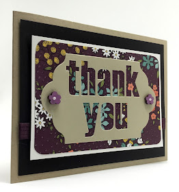
To make my first card, I utilized only one element from this kit. That is the diecut piece that proclaims Thank You.
I searched through my scraps of Designer Series Papers and came across this one that featured a lovely background in BLACKBERRY BLISS.
Did I tell you that Blackberry Bliss is making a grand re-entry into the catalog, this time not as an In Color, but as one of our BASIC COLORS! Hooray! That is the greatest purple ever!
After I had punched out the letters that spelled out the sentiment, I was left with a stencil-like piece that looked wonderful when I placed it over this pretty DSP. Thus, I built my card around that . . .
Pictured below is the piece that I was working from.
Do you see how the "stencil" appears after removing the letters?
Well, thrifty crafter that I am, I was not about to waste the letters that I'd removed. No no no!
So, I took the letters themselves that spelled out THANK YOU, and added them to another piece of the pretty DSP I'd used in the previous card.
This look was blah. Just blah. How could I make it more attractive?
I took a white gel pen and outlined the letters. Uh uh. Yuk.
So I took one of the tiny flowers that was in the Paper Pumpkin kit, and stamped them all over the blah beige letters in Blackberry Bliss. Yuk.
I grabbed the gel pen and added little white centers to the purple flowers. Maybe a little better?
Back to the gel pen again and I added white polka dots to the letters themselves. Uh oh. Not great.
To add to the busy-ness of the card, I opted to emboss a yellow background with a flowery splash. Ouch.
So I peeled a couple of the white and yellow daisy-type flowers off the sheet and added them to opposing corners. Yuk again. So, for good measure, I threw in a little blue flower to make it a bit more asymetrical. Oh my.
OK. Here's the question: Too busy or not too busy to ever use??
Has this ever happened to you? You have a vision. OK. Maybe not exactly a VISION. But you want to come up with a way to use a component rather than waste it. Your initial attempt was less than stellar. So, you continue to add elements to try to save your creation. But, then, at the end, you wonder if you should have just let those poor letters slide into the wastebasket and put them out of their misery rather than subject them to all these atrocities.
Share with us!
Busy
Smiles.


Those are both beautiful! My personal favorite is the black background because I think it really makes the little flowers pop.
ReplyDeleteAw, thanks! I love hearing from you. You always make me smile.
DeleteWow! So beautiful. What a work of art. :) #embracingchangelinky
ReplyDeleteOh my. Thank you so much, Jennifer!
DeleteYes, I like the one that isn't so busy too. Thanks for sharing with SYC.
ReplyDeletehugs,
Jann
Thanks, Jann. I so agree!
DeleteI love purple & this is a beautiful color! The card is beautiful! Thanks for sharing at Merry Monday. Hope to see you at the party next week!
ReplyDeleteThank you, Jenny! You are so sweet!
DeleteI love both cards.The first is more elegant with a plain design.The second is cheerful.They are great!
ReplyDeleteAw! What a wonderful way of putting it. Thank you!
DeleteYou make me laugh! I prefer the 'not so busy' card but the other one is mot awful by any means! I know how it is when you have something you are working on and the more you add the less sure you are. It's often a good idea to sleep on it and come back later with fresh eyes. At the end of the day, no one would be upset to be thanked with a pretty card !
ReplyDeleteAw! And YOU make me smile! Thanks for that!
DeleteYou can have the money you require without remaining in line, pay your bills without leaving the solace of your home, and trade out your finance rapidly and effectively. check cashing san diego
ReplyDelete