Navigation Bar

June 30, 2018

DSP CARD

I think we all are aware of just how yummy Stampin' Up! Designer Series Paper (DSP) is. Right?

To demonstrate that fact, I created a card using some of the Stampin' Up! DSP as my focal point. In other words, everything else becomes secondary, just playing up the DSP a bit. But, really the card is ALL ABOUT THE DESIGNER SERIES PAPER.


So you can have access to even MORE of the ever-lovely DSP, Stampin' Up! is hosting a promotion from July 1-31, whereas you buy three packs of Designer Series Paper and get one free. Check out the Stampin' Up! website on July 1 
to see which packs are included in this promotion. I can't wait!


Just to prove how wonderfully a card turns out when using a section of DSP as the focal point, my Stamp-In Workshop attendees made the card shown above as one of their four projects. Even though this particular design of Designer Series Paper is now retired, check through the wide assortment of DSP designs on pages 188-191 of the catalog. There are so many truly striking papers in this catalog!


Following is the tutorial on how to create a card like this, which works up so easily and quickly. Simply replace the DSP I used with a new favorite, which, remember: 
JULY 1-31, BUY THREE GET ONE FREE! Then change up your cardstock and ink colors to coordinate with your DSP.

SUPPLIES:
Crushed Curry cardstock
Tangerine Tango cardstock
Your choice of Designer Series Paper

Playful Backgrounds stamp set (page 141
Happy Birthday Gorgeous stamp set (page 72)

Crushed Curry ink
Tangerine Tango ink

Big Shot
Rose Garden Framelits (retired now, but I will list several current options at the end of this tutorial)
Stampin' Dimensionals
Stamping Sponges
Adhesive-Backed Sequins
Crushed Curry Ribbon (or ribbon that coordinates with your DSP)
White 5/8" Ribbon 
Scotch tape

INSTRUCTIONS:
Fold a 5 1/2" x 8 1/2" piece of Crushed Curry cardstock in half, creasing well with a bone folder.

Adhere a 4" x 5 1/4" piece of Tangerine Tango cardstock over this base.

Layer a 1/2" yellow ribbon over a 5/8" piece of white satin ribbon and add this above the center to a 3 3/4" by 5" piece of Designer Series Paper, securing the ends of the ribbons on the back with tape. Adhere this piece to the card base.

With the open circles stamp from the Playful Backgrounds set, inked up in Crushed Curry ink, stamp off first on scrap paper, then stamp onto a scrap of Whisper White cardstock. Do this a few times. DON'T FORGET TO STAMP OFF FIRST; OTHERWISE, IT WILL DOMINATE OVER THE SENTIMENT. Add the sentiment in Tangerine Tango over the circles. Cut out with the appropriate die at the Big Shot. Sponge the edges of this piece with Crushed Curry ink. Use two Stampin' Dimensionals, one at the top and one at the bottom, to adhere it over the ribbon.

Add three of the adhesive-backed sequins to the DSP.

In place of the Rose Garden Framelits, if you don't own it, you can cut out the sentiment with any of three punches on page 211: Tailored Tag, Everyday Label or Pretty Label. Dies from other current sets that would work include: Bottles & Bubbles Framelits (page 216), Foliage Frame Framelits (page 217), or one of the Layering Ovals Framelits (pge 218).


DSP
Smiles.


June 26, 2018

CELEBRATE WITH CAKE

Oh no! I can't believe I'm going to say this. 

I was not crazy about this month's Paper Pumpkin kit. Just not my style at all. 

However, a lot of the components that came in the kit were simply adorable, and they were begging me to play with them.


Below is the picture of what the Paper Pumpkin cards are supposed to look like 
if the included instructions were followed:


To answer the call of the kit components, I proceeded as follows.

Basically, I grabbed two of the card bases, the lime green/white and the black/white stripe, and sliced them in half. Using only one half of each of the bases, I proceeded to cut these into 3/8" strips. 

I'm sure it's obvious what I did with these strips. Yup! I wove them together to make a completely new-looking background. 

This piece measured 4" square. I mounted it onto a 4 1/4" square of black cardstock, then onto a Whisper White card base that measures 4 1/2" square finished. (My card base actually measured 4 1/2" x 9".)


I wanted to show off the looks of my woven background, so taking that into consideration, I was careful about finishing the card.


In black ink, I stamped the "celebrate" from the cool Calligraphy Essentials stamp set on page 11 of the new Annual Catalog. After fussy cutting a whimsical border around the word, I mounted it onto a piece of black cardstock, then mimicked the fussy cutting to give a good border so it showed up well enough against my busy woven background. I added bright pink polka dots to the wider portions of the letters.

Hmmm. What are we celebrating?? Oh yeah! A birthday! 

So I grabbed one of the diecut birthday cakes that came in the Paper Pumpkin kit, added a sticky-backed candle from the kit and colored the flame of the candle in the same pink. The cake was mounted onto black cardstock, and, once again, the black was trimmed to leave a border around the cake.


I popped up both the sentiment, as well as the cake with Dimensionals. 

I also added three of the adhesive-backed sequins from the retired Occasions Catalog. However, they seemed a bit lonely. So I grabbed my paper punch, and from the excess surrounding the "hooray" stickers that came in the kit, I punched two shiny gold "sequins", which I added to the cake and the upper left hand corner of the card. Unfortunately, no matter which way I positioned the card for its photo shoot, I could not get them to look anything other than black. Really. They are shiny gold.


Do any of you subscribe to Paper Pumpkin? If not, check it out by clicking on the button on the right side of my blog!

Celebration
Smiles.

June 23, 2018

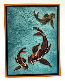
KOI

This is a very important post. Really. 
You see, it is my 700th post! Can you believe it!?! 

Also, I am introducing to you a wonderful stamp set, All the Good Things, which can be found on page 151 of the new Annual Catalog. I love this set. As soon as I saw it, I put it at the very top of my Wish List. 

My husband and I have a history with koi. I'd been seeing other stamp companies come out with koi stamp sets, but I'm glad I waited until Stampin' Up! released one of their own, because it is exquisite.

Two of the stamps in this set come with the sentiments attached to the image. The large koi and the bonsai tree were both like that. Since I don't always want to use a sentiment with my images, I simply carefully cut off the sentiment so the sentiment and the image can be used separately. I feel that this gives me even more options with a stamp set.

At the end of this post, I will tell you a story about why I love koi so much.


To make the watery base for my card, I crumpled up some of the pretty turquoise tissue paper that comes inside our Paper Pumpkin boxes each month. It is such a lovely shade and makes for exquisite water. 

The Faux Silk technique, which is how this water environment is created, is so much fun to do and is really quick and easy. You can find a few of my other projects utilizing this technique HERE, HERE, HERE, and HERE, just to give you a few examples. I love this technique so much that it shows up in my blog posts and my Stamp-In Classes on a frequent basis. 


I finished up the water by adding sponging in the new ink color, Balmy Blue. I made the sponging heavier in places to add a bit of depth and "real-ness" to the water. 


To make the koi, I stamped in Memento Tuxedo Black ink the large koi once and the smaller koi twice, on varying shades of orange-y cardstock. I then fussy cut the fish and glued them in place in the water. 

If you've ever watched koi swim -- for example at a botanical garden -- they swirl around each other in such a peaceful and graceful fashion. I tried to mimic that in the placement of my koi. 

Also, koi come in a huge variety of color combos of oranges, white and black. So, to add a bit more realism to my fish, I added some areas of white gel pen to them.


Since I meant for this card to be more of an art piece, I decided to forego a sentiment of any sort. I just wanted the tranquility of the scene to speak for itself.


In fact, I don't plan to send this card to anyone, so I'm not even sure why I made it into a traditional card. 


I did add some Wink of Stella to my koi, but that was terribly difficult to capture so I could share the look with you. The following photo, I suppose, does it the most justice of any of them I managed to take.


Are you ready for my koi story? 

At the house we lived in until three and a half years ago, we had a gorgeous waterfall built into the downhill landscaping in the back. We had water plants, a little metal guy "fishing", rocks, plantings alongside the waterfall. To finish it off, we had three koi in the top pond. They loved their environment. It was all so beautiful. 

One of the koi we purchased when it was quite small, only about five inches long. He was gorgeous, similar in coloring to the large one on my card. Each fall, we would bring him inside the house and let him live in a giant Rubbermaid container, complete with pump, heater and all the accessories to keep him healthy and happy throughout the cold winter months. 

The other koi didn't last like this guy did. So, we were thrilled when, each spring, we were able to re-introduce him to his new outdoor environment. I think we did this three winters. After these three years, he measured about two feet in length. Our treasure. We'd also added two other koi to join him each spring. They never made it through the season, but our big guy always did.

One summer, when he was about three years old, there was a loud ruckus in the middle of the night. My husband went outside with a flashlight to check on what was going on. All he found were three fish heads lying in and around the water. The raccoons had had a feast. He saw them waddling away off into the woods.

We were simply heartbroken, especially at the demise of our big guy. From that time on, we put no more koi in our pond. That area was never the same again. 

So, this card is my tribute to our long-gone koi.


One last mention: The koi in my card actually show up as way more orange in tone than my photos reflect. So, picture them in real life as more orange than black as depicted here. Boo hoo.

Fish-y
Smiles.


June 19, 2018

HYDRANGEA LOVE

The last week or so, my daughter, Sarah, and I were horrendously busy getting ready for a village-wide garage sale at our home. Needing somewhere to display all our goods we had for sale, I lost all my work tables from my Creation Station. Boo.

On Saturday evening, after the sale was finally over, I got two of my tables back. Whew. Too tired and crabby at this point, however, to do any Creative Therapy. But at least, I had a work space. Yay.


Sunday, however, was a different story, and I was ready and raring to get some creating done. And what did I have a hankering to do?

Emboss resist!


I am in love with hydrangeas -- can never get enough of these beauties! -- so grabbed an old hydrangea stamp and embossed it in gold on Whisper White cardstock.. 

In my card, I feature several of the new Stampin' Up! colors. 

A beautiful color combination for some hydrangeas includes blues and purples. So . . .


The flower portion was carefully sponged on with Balmy Blue and Highland Heather. 

For the leaves, I combined Granny Apple Green and a new In Color, Call Me Clover. 


I have discovered that the ink in the new ink pads requires a bit of care when it comes to sponging. To make a smoother transition between colors and within the colors themselves, after I ink up the sponge, I tap it quickly and lightly on scrap paper before taking it to my good cardstock. 


I didn't want a definitive break between the colors of the flowers and the leaves, so I crept a little of the colors as invaders into the "wrong" space. 


The emboss resist piece is matted on a layer of Call Me Clover cardstock. The card base is made from the yummy Balmy Blue. Matted onto the blue base is a piece of Designer Series Paper that complements my color scheme and offers a subtle graphic interest.


Not a lot of dimension in this card. The diecut love is adhered directly onto the oval that frames the flower and adds some separation in the large sponged space. Thus, the only real dimension comes from adding Stampin' Dimensionals to the matted main piece before adhering it to the DSP.


To get the oval frame, I nested two sizes of oval dies together on top of the gold brushed metallic cardstock. I then used sticky notes to hold the dies in place to ensure a frame with an even edge, then ran it through the Big Shot. It worked really well. And I love the way it still allows the main piece to be completely sponged, but yet separates the flower itself a little to increase the awareness of the hydrangea as the focal point.


If you ever have any emboss resist questions, please ask me! I love this technique, and I'd love to get others obsessed about it too!

Hydrangea
Smiles.

June 16, 2018

LOVE WHAT YOU DO

Today I have for you a fairly easy card, one that spotlights a few new Stampin' Up! products from the Annual Catalog that went live on June 1.


The stars of the card include the darling stamp set, Love What You Do, which can be found on page 177. Also featured are inks in two of the new In Colors, Blueberry Bushel and Pineapple Punch. I love the combination of the two colors, a medium blue and a very appealing yellow.


I've seen lots of cards created with this stamp set. I find that the flowers are usually colored in somehow, either with the smallest blotch stamp from the set, or handcolored in some fashion. I, on the other hand, chose to utilize the flowers in their sheer simplicity of line art.


Keep reading for the Supplies List and Instructions to re-create this easy, but standout card.

SUPPLIES:
Blueberry Bushel cardstock
Whisper White cardstock

Blueberry Bushel ink
Pineapple Punch ink

Love What You Do stamp set (page 177)

Stampin' Dimensionals
Blue dot embellishments

INSTRUCTIONS:
Fold a 5 1/2" x 8 1/2" piece of Blueberry Bushel cardstock in half, creasing it well with a bone folder.

On a 4" x 5 1/4" piece of Whisper White cardstock, randomly stamp the open berries branches in Blueberry Bushel ink -- STAMPING OFF ONTO SCRAP PAPER FIRST! Fill in the empty spaces of this piece with the solid berries branches in Pineapple Punch ink -- DON'T STAMP OFF FIRST; OTHERWISE THIS COLOR IS TOO LIGHT.

Adhere this piece to the card base.

Stamp the large splotch in full strength Pineapple Punch ink onto a 2 3/4" x 3 1/4" piece of Whisper White cardstock. Over the yellow, stamp the trio of flowers in Blueberry Bushel ink. Adhere this piece to a 3" x 3 1/2" piece of Blueberry Bushel cardstock. Using Stampin' Dimensionals, attach this piece to the card, lifting it up a bit from the center point.

On a 1 3/4" x 1 1/2" piece of Whisper White cardstock, stamp the smaller splotch in Pineapple Punch, followed by the sentiment over it in Blueberry Bushel. Adhere this to a 1 7/8" x 1 5/8" piece of Blueberry Bushel cardstock. Add two Stampin' Dimensionals to JUST THE BOTTOM PORTION of this piece, and overlapping the larger piece, attach it to the card. (Since the larger piece is already popped up with Dimensionals, the top portion of the smaller piece simply lies atop the larger portion.)

Add three blue dots to the background.


Loving
What
Do
Smiles.


June 12, 2018

YOUR OPINION PLEASE

There are cardmakers who always always always put a sentiment on the front of their cards.

Personally, I have a love/hate relationship with the presence of a sentiment gracing the outside of the card.

Especially if you are making cards to sell.

What if you'd put "Happy Birthday" on the card front? Your customer loves the card, but was hoping to find one that instead said "Thinking of You". So she walks away.

If you leave the outside blank and let the gorgeous-ness of the card design sell itself, the buyer can add personal sentiments and notes inside the card before sending it out. That way, it says EXACTLY what she wants it to say.

Well, I am looking for opinions on this subject in this post.

I made a card two ways: one with an outside sentiment, one without.

Presenting the card WITH the sentiment:


The same card sans sentiment:


Lots of nice dimension on this card due to the fussy cutting I did and adhering the fussy cut pieces with Stampin' Dimensionals.


Think about it: When creating a card, do you add a sentiment to the outside? Or, when you're looking to purchase a handmade card, do you look for one that is for a specific occasion, thus featuring the sentiment on the outside of the card? Or, doesn't it matter -- if the card is right artistically for the occasion you have in mind, and doesn't have a sentiment on the front, do you prefer that?


Once more, 

same card, with sentiment:


Same card, without sentiment:


I seriously would love to hear some opinions and/or discussion about the presence of a sentiment on the front of a card. 

It seems like sort of a trite subject, but as I noted earlier, I truly have a love/hate relationship with this quandary. Let's hear your thoughts!

Sentimental
Smiles.


June 9, 2018

CUT AWAY

 I love discovering new things to share with you, my readers!

Recently, I was perusing a book, The Rubber Stamper's Bible, by Francoise Read. Although this book is sort of an oldie, 2005, it is definitely a goodie, with lots of great ideas in it.

Long about page 74 in this book is a little article, called Cut Away. In this technique, part of the main design is cut away from the rest of the card through the use of a craft knife.

Below is a photo of the card I made loosely 
following the instructions published in the article:


For my card, I used a stamp from Stampin' Up! of a few years ago. It wasn't around very long, but I've always thought it was so charming, so I decided to hang onto mine forever and ever. If you look closely, you will notice that the image is generally in the shape of a maple leaf!


By perching my card on the ledge of this easel, 
you can see a little better the cut away piece.


To begin my process, I cut a piece of Whisper White cardstock to 5 1/2" x 8 1/2", the traditional size for a card. I lightly marked off the halfway point, at 4 1/4". Once I had my center line, I inked up the stamp with Fresh Fig ink and stamped it so part of the stamp ended up above the line, as shown below:


I am not very talented when it comes to using a craft knife, much rather preferring to use a pair of scissors for any intricate cutting I need to do. However, in this case, where the entire piece of cardstock needs to be cleanly and crisply cut, without any discard, a craft knife is essential.

OK, so once I had my image stamped, I used my Simply Scored tool to score the pencil lines on either side of the stamping. I then carefully trimmed out the portion of the image that fell above the halfway point.

Once the cutting was done, I folded the card on the score lines. The trimmed out piece stands up straight over the fold line.

Unfortunately, once I got to this point, I did not like the size of the card. So, after taking off a bit here and a bit there, I came up with a piece of cardstock that measures 7 1/2" x 4 3/4". Folded, the card itself measures 3 1/4" x 4 3/4", but with the portion that extends beyond the fold, the measurement is 4 1/4" x 4 3/4". I wanted it to fit nicely into an A2 sized envelope.

The photo below shows the finished card in the open position. 
Notice how the trimmed out portion of the image lies nicely within the open space.


Shown at an odd angle that focuses on the side and back of the card, 
you can see where I trimmed out the top of my stamped image.


If a creator doesn't care for the cut-out space, it would be very easy to cut two pieces of Whisper White cardstock that measure 3 1/4" x 4 3/4" and glue one inside the card and one on the back of the card to hide the cut-out area. I decided to leave mine as is, without the two added pieces, so I could show you exactly how it looks.

One more view that shows how the card looks when it's in its display position:


Just a close-up of the stamping and subsequent cutting away, 
as well as the score line.


To complete the card, I cut a 1 1/2" x 4 3/4" piece of Whisper White cardstock, and, after stamping off first, added the dotty area from the Touches of Texture stamp set (on page 153). Since I'd wanted to add a sentiment over this area, I didn't want the sentiment to get "lost" among all the dots. Thus, my reason for stamping off first.

I then mounted this piece onto a 1 3/4" x 4 3/4" piece of Fresh Fig cardstock, then added this whole piece to the card front.


So, what do you think of the Cut Away technique? Do you anticipate ever giving it a try? One word of advice: make sure you have a very sharp blade in your craft knife!

Cut
Away
Smiles.

June 5, 2018

REGAL BRUSHO BUTTERFLY

Have you been having lots of fun with your Brushos?

Brushos are so delightful -- and unpredictable! -- to work with. 
So, if you haven't tried them yet . . .


In the card pictured below, both the butterfly, 
as well as the background surrounding it, 
were created with Brushos.


The butterfly is actually embossed in gold, 
although it looks in the photo to be black or another really dark color.


The Brushos give the butterfly a distinctive stained glass look. 
Don't you agree?


I finally succeeded in capturing the gold embossing in the shot below:


Following you will find the Supplies List and the Instructions on how to make a card similar to this. As said before, working with Brushos will always give you a unique look. You will never be able to duplicate an exact look. So, that's why I say "similar". Don't be disappointed if your card doesn't look exactly like mine -- chances are it will turn out much BETTER! 

Here goes:

SUPPLIES:
Lemon Lime Twist cardstock
Whisper White cardstock
Tempting Turquoise cardstock (retired now, but many other current blues will be just as lovely)
Watercolor Paper

Beautiful Day stamp set (page 134)

VersaMark ink
Brushos in blues, greens and yellows (page 202)

Embossing Buddy
Gold Embossing Powder
Heat Tool
Aqua Painter
Big Shot
Butterfly Embossing Folder (retired now, but try any of a number of the new embossing folders!)
Stampin' Dimensionals
Adhesive-Backed Sequins (page 198)
Paper Towels

INSTRUCTIONS:
Rub the Embossing Buddy over a 3" x 4" piece of watercolor paper. Stamp the butterfly image centered on the piece in VersaMark ink. At the Heat Station, sprinkle the butterfly with gold embossing powder. Heat to emboss. There is a possibility that the lines of the butterfly are not consistent. If you have some white spots showing, dab these areas lightly with the writing end of a VersaMarker (if you still have one!), sprinkle more embossing powder on it, and heat it once again.

With an Aqua Painter, fill each section of the butterfly with water. The water should entirely fill each spot, almost looking like a big bubble. You can separate the colors in your butterfly's wings as you wish. But start with either the blue or the green and work with one color at a time. 

CAREFULLY sprinkle your chosen first color within the appropriate areas of the wings. Just a little bit of powder. Then come in with the Aqua Painter and spread the color like you are painting. 

Wipe off the Aqua Painter on a paper towel until it runs clean, and continue with the second color in the same way. 

You will let this dry naturally. As it is drying, check frequently to see if the color is pulling away from the edges and forming white spots. With a clean Aqua Painter for each color, gently push the color to the edges of the embossing so you have no uncolored areas.

Once the wings are completely dry -- naturally -- if you would like the look of a blotchy butterfly, spritz some water into your hand, and with the fingers of your other hand, flick water onto the dried butterfly. At this point, you could use the Heat Tool to dry it if desired.

To create the background. sprinkle just a bit of the yellow and the green Brusho around the butterfly. With very little spritzing, activate the color with water. Gently pat the wet areas with a paper towel. You can also use the Aqua Painter to move the color around just a bit. Be careful with this stage -- you still want your butterfly to be the star!

Fold a 5 1/2" x 8 1/2" piece of Lemon Lime Twist cardstock in half, creasing it well with a bone folder.

Run a 4" x 5 1/4" piece of Whisper White cardstock through the Big Shot inside your chosen embossing folder. Be sure that the paper is situated horizontally so the butterflies are flying upright if you are using the Butterfly Embossing Folder! Adhere this to the card base.

Adhere the dried butterfly piece to a 3 1/4" x 4 1/4" piece of Tempting Turquoise cardstock. Using a Stampin' Dimensional at each corner and one in the center, adhere this centered on the card front.

Add a few adhesive-backed sequins to the background. Always remember that, when adding embellishments, to keep them at an odd number!


Brusho
Smiles.