Navigation Bar

September 29, 2018

TIN TILE BIRTHDAY

There are a couple of items in the new Holiday Catalog that I personally think are extra exquisite. 

The first of these items is the Tin Tile Dynamic Textured Impressions Embossing Folder found on page 43. One of the fairly new Dynamic Textured Impressions Embossing Folders, they are capable of a beautiful display of deep deep embossing. The embossing becomes even deeper and more pronounced if you first spritz both sides of the cardstock a bit before adding it to the embossing folder. Spritzing with water helps to break down the fibers in the paper, enabling the deeper embossing. 

To make this embossing folder even more wonderful, Stampin' Up! has released what they refer to as Galvanized Metallic Paper, found on the same page as the embossing folder. A quote directly from the description in the catalog states: "Paper finish looks like galvanized metal. Pair it with the Tin Tile Dynamic Textured Impressions Embossing Folder for an eye-catching effect." Boy, did they get that prediction correct!

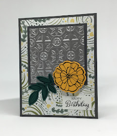
The card below features the two products, 
the embossing folder and the galvanized paper, 
to yield a truly eye-catching effect. 
Don't you agree?


This is one of the cards that my Stamp-In girls created for the September 2018 workshop. I was excited for them to experience this combination. Thus, I designed the card so the embossed area was really the star.


Shown at an angle, the texture is especially apparent:


And a close-up of the embossed galvanized paper:
Isn't it simply gorgeous?
It's even BETTER in real life!


Following is a tutorial on how to re-create this card.

SUPPLIES:
Basic Gray cardstock
Tranquil Tide cardstock
Mango Melody cardstock
Designer Series Paper 
Galvanized Metallic Paper (page 43 in the Holiday Catalog)

Basic Gray ink

Falling Flowers stamp set (page 168 of the Annual Catalog)

Big Shot
May Flowers Framelits (page 218 of the Annual Catalog)
Tin Tile Dynamic Textured Impressions Embossing Folder (page 43 in the Holiday Catalog)
Stampin' Dimensionals

DIRECTIONS:
Fold a 5 1/2" x 8 1/2" piece of Basic Gray cardstock in half, creasing it well with a bone folder.

To this card base, adhere a 4" x 5 1/4" piece of the Designer Series Paper.

Run a 3" square piece of the Galvanized Metallic Paper through the Big Shot inside the Tin Tile Embossing Folder. Adhere this to a 3 1/4" square of Basic Gray cardstock. Adhere the finished tile flat onto the card with equal margins on the sides and the top.

On a scrap of Mango Melody cardstock, stamp the flower in Basic Gray ink. Also, stamp the leaves in Basic Gray on some Tranquil Tide cardstock. Use the appropriate dies to cut out these two pieces at the Big Shot. You can cut them both at the same time.

Adhere the leaves flat to the bottom of the embossed piece. Follow this with the flower attached with a Stampin' Dimensional.

On a 3/4" x 1 1/2" piece of Whisper White cardstock, stamp the sentiment in Basic Gray ink. Adhere this flat to the lower right corner of the card.


Galvanized
Smiles.


September 25, 2018

HAPPY FALL, Y'ALL PART 2

In my PREVIOUS POST, I welcomed in the fall season with a couple of paper pumpkins I'd made. 

The day after I posted the story about my two paper pumpkins, I decided to go one even smaller. So, using 12 circles in varying papers, I made a little pumpkin that is only about 2" tall. My favorite, by far!

Last week, while I was browsing all the cool Halloween/Autumn items in the Target Dollar Spot, I came upon two wooden leaves, a maple and an oak. 

The maple leaf is about 5 1/2" in either direction, while the oak leaf measures 4" across and 5 1/2" tall. Both leaves have gold-painted edges that measure 1/2" thick. Both leaves had a hole in the top with a piece of twine/rope tied in a knot. The wood finishes were sort of neat too -- the maple was a dark brown, and the oak leaf was a very different-looking lighter brown/tan streaky look. 

I loved the leaves the moment I discovered them. Not sure what to do with them exactly, I took them home with me anyway, since they were only $1 each. 

Yesterday, in need of a little Creative Therapy, I grabbed my wooden leaves and prepared to dress them up appropriately for the fall season. I dug through my fallish Designer Series Papers, and came up with two that I thought would look great.

I carefully traced each leaf on its own DSP. Then, even more carefully, I cut the leaves out. Using my Green Glue, I adhered the cut-out leaves to the wooden leaf bases. Before adhering the paper, I removed the twine from the holes and covered the holes up with the DSP. I am very happy with the way they turned out.

Pictured below is the new little pumpkin 
accompanied by the freshly-dressed wooden leaves.


And the littlest pumpkin, all on its lonesome:


With the pumpkin in the foreground, it looks a bit bigger than it is in real life.


And the two DSP-covered leaves.


The trio once more:


And the trio in a little bit of an overhead shot:


I plan on putting all five pieces -- three paper pumpkins and two fall leaves -- into a little vignette in my front entryway. They can easily stay on display until I pull out the Christmas decor.

Have you done anything decorating-wise to celebrate the arrival of the fall season?


HELLO FALL!

Fall
Smiles.

September 22, 2018

HAPPY FALL, Y'ALL!

Hey!
Happy Fall, Y'All!

Today, the official first day of Autumn, I wanted to share something fallish with you. So, I present to you these two punkins made from Stampin' Up! Designer Series Paper.

I am a paper hoarder. Did you know that about me? Stampin' Up!'s DSP is so exquisite that I have a tendency to hang on and hang on and hang on. I'm sure many of you know firsthand what I'm talking about. I am especially bad about seasonal paper. Sure, I'll use SOME of it, but the rest? Hang on -- just in case.

Well, I'm glad I hung on to fall/Halloween DSPs I've owned over the years. Because this project took a lot of sheets of different designs. And I had to be extra careful that the oranges blended well, and that the neutral in the papers was Very Vanilla as opposed to white. 

These are the two pumpkins I made. One takes six sheets of DSP, while the other -- smaller -- one requires 12 sheets. 


This next photo shows the two of them sort of from the top.


I made the first pumpkin a couple days ago. For this one, I used a 4" circle die to cut out six different fallish Designer Series Papers. I then folded each of the circles in half precisely. In making these, or any other similar project, it is so so important to be precises in folding,  matching, etc. It is too easy to be a little haphazard when doing these projects, and then the final result is a little wonky, and/or doesn't sit up straight. So, be careful!

When I was using stripes, I was absolutely sure that the stripes went exactly up and down. Once I had all six of the 4" circles folded in half, I realized that I should have folded the good sides -- the sides I wanted facing outwards -- together. So, I refolded my six circles, creasing each one well with a bone folder.

Then, I carefully looked at all the prints and decided the order I would add the circles together, in hopes that the papers would be differing enough if they were to be right next to each other. If you know what I mean. Once I had my circles stacked the way I wanted them to appear, I started with the first circle folded in half, adding Tombow Multipurpose Glue (Green Glue!) to one side, being careful to not get glue too close to the folded edge. Being precise once again, I took the next circle in line, and matched up that half. Each time I added another folded circle, I clunked the folded flat edge against the table to be double sure that it was all straight and even. I continued on in this manner through my entire pile of circles. 

At this point, I made a critical mistake. Yes, I was sort of making this up as I went along. OK, here's the mistake: I finished the pumpkin circle by gluing together the first and last circles so I had a complete pumpkin shape. Great. This presented me with two problems.

When I set the pumpkin up, it was wobbly. Of course, the bottom was ROUNDED. What did I expect?!? I folded the pumpkin flat, and went to my trusty old Stampin' Up! guillotine papercutter, and trimmed a bit off of one end. Happily, it was only six layers of paper, and the cutter handled the job. Whew.

Now, another problem I then discovered:

I needed to add the stem, leaves and curlicue. How was I going to do that??? Luckily, I'd had the foresight to not glue too close to the folds on each of the circles. So, there was just enough of a gap at the top of the pumpkin to do some weird insertions. 

For the stem, I took a piece of cool kraft packing material that came in my Young Living box, cut it to the appropriate size, and rolled it tightly, gluing the end to the stem. I added glue to the bottom of the stem and wiggled it into place.

Next I did the same with the diecut leaves and the squiggly. I did carefully undo that last gluing to slip them into place, keeping my fingers crossed that nothing would tear or buckle in the process. I lucked out, and it worked just fine.

The first pumpkin with mistakes and only six pieces of paper:


That pumpkin seen from above.
It doesn't have a whole lot of character, in my opinion.


This afternoon, I'd had my heart set on creating a smaller but fuller pumpkin. For this one, I needed to go into my stash again to find more fallish prints that would work well with the six I'd used on the first pumpkin. As luck would have it, I was able to manage it.

I then die cut TWELVE different papers into 3 1/4" circles. Once that was finished -- you know, they say that experience is the best teacher -- I took my folded half circles to my papercutter, and one by one, tucked the straight folded edge against the top of the cutter, moved the pumpkin to the 3" mark, and snipped off that much. By being so careful, I was able to get through all 12 circles and have them all match.

Experience again: I learned to fold my circles in half by putting the "good" sides together. The only exception was when it was a stripe or a distinct design. Then I needed to put the "bad" sides together for the first fold so I could match things up. At that point, I turned it "inside out" and used a bone folder to crease my folds. 

I proceeded as with the first pumpkin then. After sorting to get a good combo of designs, I started to glue it together. But . . . I DID NOT GLUE THE PUMPKIN TOGETHER. Yay me!

For the stem, I did the same thing, but could comfortably glue it in place with the pumpkin lying in an open state. I used a different leaf die to cut the two leaves for this pumpkin, and glued them in place. It was a little tricky to get it glued back together with the extra bulk, but I got it to work.


The smaller,, but fatter, pumpkin from above:


And the two of them side by side together once again:


Now, here's the question: Do you prefer the pumpkin with fewer circles or the fatter one with twice the number of circles?

I love learning from my mistakes. When working with more expensive paper like Designer Series Paper, it is heartbreaking if you make an error and are not able to work with it to rectify the situation. Then it gets garbaged. Grrrr. But, I lucked out, even though I'd had a few errors on the first one, and was able to salvage the situation.

Fall
Smiles.

September 18, 2018

TROPICAL CELEBRATION

I hate to admit this, but I purchased the set of dies, Tropical Thinlits, really based on just one of the dies, shown in the card below. I thought that square of fairly intricate tropical leaves was just the best thing ever and couldn't wait to create with it!

PLEASE NOTE: Since I got this die set, I have fallen in love with every single one of the dies. Now, I don't feel so guilty about my initial reason for ordering it. Because I use them all!

At last month's Stamp-In, the girls created this card. Although the photo makes the embossing look a little weird, it looks great in real life; but the background cardstock, in Granny Apple Green, has been embossed with the Subtle Embossing Folder (page 223 in the Annual Catalog). As the name of the folder implies -- Subtle -- that's exactly what it does: adds simply elegant subtle embossing. 

The little square of DSP behind my favorite diecut is from the Tropical Escape 6" x 6" Designer Series Paper stack, found on page 191.


By popping up the focal point with a couple of Stampin' Dimensionals, 
it gives just a hint of dimension. Great for going through the mail!


If you keep on reading, you will find the tutorial for making this simple card.

SUPPLIES:
Whisper White cardstock
Granny Apple Green cardstock
Tropical Escape Designer Series Paper (page 191)

Big Shot
Tropical Thinlits (page 221)
Celebrate die or your choice of small sentiment die
Subtle Embossing Folder (page 223)
Stampin' Dimensionals

DIRECTIONS:
Fold a 5 1/2" x 8 1/2" piece of Whisper White cardstock in half, creasing it well with a bone folder.

Run a 4" x 5 1/4" piece of Granny Apple Green cardstock through the Big Shot inside the Subtle Embossing Folder. Adhere this to the card base.

Run a 3" square piece of Whisper White cardstock through the Big Shot with the square thinlit of leaves. Adhere the 3" square of two-toned DSP to the back of this piece. Mount the finished piece to the card front, with even margins at the sides and the top, with Stampin' Dimensionals.

Snug your chosen sentiment, cut from Whisper White cardstock, into the lower right corner of the green portion. Adhere it in place.


Tropical
Smiles.

September 15, 2018

BIRDS ON A WIRE

I'm sure you all know how tricky it is to work with vellum. It is a <lovable> beast all its own.

This charming sextet of birdies on a wire is one of the vellum sheets that comes in the Graceful Glass 6" x 6" Designer Vellum pack found on page 188 of the annual catalog. Just check out the wonderful array of designs in this pack! So diverse.

Even though I recently added a few more duos to my selection of Stampin' Blends, my collection is still not huge -- at least, compared to the colors that are now available! Even in the new Holiday Catalog. So many to choose from. 

So, to color these birds I didn't have all that much to choose from. The stripes in the background  alternate between the Light and the Dark Crumb Cake Blends. One thing that I did notice about working on vellum with the Blends, especially when using the darker hues, is that they streak and produce darker areas in splotches. I tried to even them out, but to no avail. I simply embraced this phenomenon and went with it. 


Now, if you take the time to color one of these sheets, you are going to want to use it. Right? I decided to use mine on the front of a card. In the first place, the sheet was 6" x 6", too large for an A2 size card. So I trimmed off the top and bottom of the design so it measured 4" x 5 1/4". 


A common vellum problem is attaching it to anything. If you use any of the traditional ways of adhering it, it will most certainly show through. I have tried all the specialized vellum adhesives out there -- that I could find -- but have never discovered one that does the job the way I would like it to. 

Thus, you need to get creative.

Since I was placing my birdie vellum over a Poppy Parade card base, I needed to first attach it to a matching size piece of Whisper White cardstock. The way I opted to attach it was to use a very thin -- 1/8" -- gold metallic washi tape. I simply wrapped it around each of the four corners, securing the ends on the back of the white cardstock. I then adhered the Whisper White as I normally would, with my fave green glue.


In the photo below, the splotchiness of the Dark Crumb Cake ink is apparent. 
You can also see how I put the washi tape over the corner.


Since the design outline had a very subtle embossed look, I echoed that feeling by embossing my sentiment in black. To tie things together, I secured a bit of the matching washi tape across one end of the sentiment before attaching it to the card.


The past few days, I have used the Blends to color in four of the sheets that are background designs. I plan to cut them into 3" squares and use them on cards. I will be sure to share them with you when I have something to show!


Have any of you gotten this beautiful vellum set -- and used it yet? What are your thoughts?

Blended
Smiles.


September 11, 2018

ENCOURAGEMENT

Sometimes life seems a little dark. Wouldn't you agree?

I created this card with just this thought in mind, wanting to get the feeling of hopelessness across.

My original intent was to emboss the row of leafless trees on Smoky Slate cardstock. So I did just that -- in silver. I started to sponge on grays and gray-blues as a resist. No matter what I did, the sparkle of the silver embossing seemed just too cheerful. Blech. Not at all what I was hoping to accomplish.

The answer to the quandary seemed so simple. Stamp it in black. Right? Black/dark mood, feelings

. When I sponged across the black image with gray and the retired Bordering Blue (gosh, I miss that color!), the mood seemed to darken. Perfect!

A helpful reminder to try to put that dark mood behind comes in the beautiful words, Just Breathe.

I embossed the phrase in black onto vellum, then wrapped it around the tree trunks before adding it to a 4 1/4" x 5 1/2" piece of black cardstock.

I think I know just the exact right person to which this card needs to go:

me. 

Dark
Smiles.

September 8, 2018

WINTER WOODS

This blog post will go in a little different direction than usual. 

You do realize that the premise of my blog, Paper Seedlings, is "planting creative paper ideas", right? The blog is now six years old, and I think I've been holding up to that promise fairly well. Don't you agree?

Well, in this post, I am counting on all of YOU to help plant those Paper Seedlings. 

The 2018 Holiday Catalog went live a few days ago, September 5, to be exact. I love the contents of this catalog! Outstanding products, ideas and projects all around. 

A set, Winter Woods, found on page 27, especially intrigued me. Tanner Smedley, from the Stampin' Up! home office, gives some interesting details about this set, the Framelits that coordinate with it, and the history behind this and other tree-dedicated sets in THIS SHORT VIDEO, if you'd like to watch it. Interesting stuff.

Anyway, as I've said, I was immediately intrigued by the set, Winter Woods. The realism of the stamps and the peaceful feeling they convey especially appealed to me.

As yet, I haven't done any creating with the set. That's where you will come in. You are going to HELP me! YOU are going to help plant those Paper Seedlings for all of us!

Following are a few photos of the image stamps that come in the set. 

I think this row of stark winter trees is the one that most caught my eye. 
I can see a dreary winter day depicted on a card using this image. 
Perhaps a gray ink on top of Smoky Slate? 


I haven't yet decided what the narrow strip at the upper left is meant for, 
so I stamped it in a green. Any ideas? 
The pine cone was stamped in Soft Suede. Isn't it REAL LOOKING? 
The neat little piece of evergreen branch is stamped in Shaded Spruce. 
The lovely birch tree trunks are stamped in black ink.


Then we move on to the incredibly lifelike evergreen tree. In the following images, it has been stamped in various greens. The first three trees are stamped with our new-style of ink pad. I was truly disappointed to discover how much of the detail is lost with this type of ink. Because the ink is so juicy, details just disappear and blend together.

The first one is stamped in Tranquil Tide:


Next we have Shaded Spruce:


Then, it is stamped in Mossy Meadow.


They are all beautiful trees, but the loss of detail, as I've already said, is sorely disappointing. I even tried stamping off first. But that removed waaaay too much ink, and I got a very unpleasant image that would not be conducive to cardmaking whatsoever.

This last photo shows the tree stamped in my old-time linen pad in Garden Green. 
Although it doesn't show the density of the foam pads, 
a lot more of the detail manages to shine through.


Following is a photo of the front of the package for the Winter Woods stamp set (page 27 of the 2018 Holiday Catalog). You can see that, besides the images I have shared with you, there is a lovely sentiment, "Thinking of You this Season", included in the set.


Now that you've seen all that Winter Woods has to offer, what sorts of ideas do you have for utilizing them in card making? Also, what are your feelings about the detail or lack thereof with the various inks? Do you have any advice on that problem? Or don't you see it as a problem? 

C'mon, put those thinking caps on, and share with us the Paper Seedlings you would like to see grow!

The following photo shows how excited Fred is about the 2018 Holiday Catalog. 
He could hardly wait to get his paws on it!


To browse the catalog, click on the image in my right column. You can do your shopping directly from my Shop Now buttons! Thanks in advance.

Now, let's hear from you!

Winter
Smiles.

September 4, 2018

VASES ON A LEDGE

For several weeks this summer, we had had beautiful -- might I even say "gorgeous"? -- weather and I was constantly drawn to spend time on our surrounded-by-trees deck. Of course, I always needed something to keep me busy while enjoying my deck time. Right? 

So . . .

I have scraps galore of Stampin' Up!'s wonderful Designer Series Papers. I never throw ANYthing away that I might be able to use for a project in the future. So, I sifted through all of these scraps in search of patterns that would be conducive to making lovely vases. I stamped and stamped and stamped. Vases upon vases on DSP. After a little bit, I started making sets of three matching vases on scraps of DSP that were large enough to accommodate all the vases.. 

I do have the punch that punches out the vases. But, I was sitting on the deck, and needed something more time consuming. So, what did I do? I fussy cut every one of the vases. It was incredibly enjoyable -- basking in the loveliness of a summer day, doing one of my favorite activities: fussy cutting. It was pure creative bliss.

Now, I had a real conundrum. What was I going to do with all those vases? I did not count the sets I'd made. But I'd estimate somewhere between 30 and 50 of the sets of three, plus various unmatched vases. I came up with an idea for using a handful of the vases.

I created this card for my next monthly Stamp-In Workshop:


I wanted my girls to have a good selection of vases to choose from for their own creations. Well, between my sample and the eight sets that got used at the workshop, I used up SOME of them. 

Anyway, would you like to learn how to make this simply darling card? Read on!

SUPPLIES:
Whisper White cardstock
Black cardstock
Designer Series Paper scraps that are vase-y looking

Varied Vases stamp set (page 45)

Black ink
Black Stampin' Write Marker

Black Rhinestones (retired, but if you were lucky enough to order them, dig them out!)
Fussy cut vases

INSTRUCTIONS:
Fold a 5 1/2" x 8 1/2" piece of Whisper White cardstock in half, creasing it well with a bone folder.

Adhere a 1/4" x 4 1/4" black "ledge" with the right side to the edge of a 3 3/4" x 5" piece of Whisper White, and about 1/2" from the bottom.

Choose your set of vases. I had all the like-colored vases within a plastic bag for each one. If you prefer your vases to be dissimilar, there was a larger bag of varrying vases, as well as some cut from wood DSP. I asked the girls not to separate the sets of three.

If you prefer not to fussy cut your set of vases, simply use the coordinating punch.

Whichever combo of vases you choose, adhere them to your liking along the right side of the ledge.

Choose your flower stems. Make sure the stamps are clean clean clean! Estimate how much of the stem will be showing above each of the vases, then proceed to ink up ONLY THAT PORTION. You could also ink up the portion of the stamp you want to use with the brush end of a Black Stampin' Write Marker. Don't forget to HUFF on it before stamping if you go this route! Carefully stamp each flower onto its appropriate vase.

PLEASE NOTE: The reason I have a black jewel in a weird place on my middle vase is to cover up some bad stamping, Having learned from my mistake, I am passing on my advice about CLEAN stamps to you.

Add an uneven amount of black jewels as you wish.

In black ink, stamp the sentiment in the upper left corner.

Adhere this piece to a 4" x 5 1/4" piece of black cardstock, then onto the card base.


Varied
Smiles.


September 1, 2018

BEAUTIFUL BAUBLES

A couple weeks ago, I introduced a new stamp set, Beautiful Baubles, that appears in the soon-to-go-live Holiday Catalog. That was in THIS POST, in which I featured the large single ornament in the set. 

I showed the ornament in two separate cards, one of which showed the ornament colored in the dark colors of sets of Stampin' Blends,, while the second card showed how the ornament looks colored in the light colors of the same sets.

The other main stamp in the set is also ornament-based. But, this time it is a cluster of six ornaments hanging together, and the image has a somewhat vintage feel to it. 

Once again, I colored the ornaments the same way as in the previous post -- one with the darks, the other with the lights. I used the same color palette for both sets of cards because those are the only main colors I possess in the Stampin' Blends.

Update: I just ordered three more sets of the Stampin' Blends last night! I can't wait to get them! I'm adding to my collection slowly but surely.

Back to business:

This time, however, since I used Pool Party in the backgrounds of both cards, I mounted them on Pool Party cardstock. And, I mounted the darker of the Blends card onto Mossy Meadow cardstock, while the lighter of the Blends card was mounted on Old Olive. 

Side by side, the difference is obvious:


The card featuring the lighter of the Blends mounted on Old Olive cardstock:


And this card features the darker Blends mounted onto Mossy Meadow cardstock:


The sequins I used on both cards -- strung behind the ornament piece, as well as three separate sequins on the ornament images themselves -- are from a retired Christmas card kit from last year. Two friends and I were making the cards in this set the other day, and I didn't use all my sequins, so I thought they would add to the festive look of these cards.

Side by side again, which is your preference? 


When you get a chance to check out the Holiday Catalog, be sure to go to page 10 to get a look at the rest of this great set, Beautiful Baubles.

This was a fun experiment. I hope you don't mind being a part of it. Both of the ornament images are wonderful to color with the Stampin' Blends. 

Why not grab the set and a couple pairs of the Stampin' Blends and do your own experimenting!? 

Bauble
Smiles.