Navigation Bar

December 29, 2018

WINTER WOODS THANKS

As you know from past posts, I love the stamp set, Winter Woods, that can be found on page 27 of the Holiday Catalog, which expires January 2. Yes, only a couple days from now! However, I say, HOWEVER, if you love it too and haven't gotten it yet, it will still be available after that date. Some of the products from the Holiday Catalog will be carried over past January 2, and that is one of them!

The large evergreen tree that is part of the set is so realistic, it blew me away when I first saw it. Did you see me fly by? Being blown away?

Before the winter season -- and all our warm gushy feelings about it -- disappears, I wanted to use it another time for a Stamp-In. So, that's what I did for the December workshop.

I figured that, once the Holidays were over, my girls would possibly need to write out a thank you note or two. Below is the card I created for one of their projects:


The nice thing about a simple design like this one is that it can be used for many many occasions, including sympathy or a masculine-looking birthday card, to name a few.


I did the "sky" on watercolor paper and fussy cut the evergreen:


Keep reading, and I will share with you exactly how to make this card.

SUPPLIES: 
Watercolor Paper
Balmy Blue cardstock
Whisper White cardstock

Winter Woods (page 27 in the Holiday Catalog)
Thanks from the Varied Vases set (page 45 in the Annual Catalog)

Balmy Blue ink
Tranquil Tide ink

Clear Block D (page 205)
Water Spritzer
Paper Snips

INSTRUCTIONS:
Fold a 5 1/2" x 8 1/2" piece of Balmy Blue cardstock in half, creasing it well with a bone folder.

Ink up the Clear Block D with Balmy Blue ink. When it is nicely covered with ink, give it a few spritzes of water. Then immediately stamp it with even margins on the sides and the top of a 3 3/4" x 5" piece of watercolor paper. If you have too much ink puddling in one spot, dab it with paper towel to remove some of it. If you wish, you may use the heat tool to hurry the drying. It turns out nicer, however, if you let it dry naturally, which you can do while you are involved with the next step.

On a piece of Whisper White cardstock, stamp the large evergreen in Tranquil Tide ink. This ink is quite potent, so if you over ink it and over press while stamping, you will lose a lot of the tree's detail. So, be careful when inking and stamping with this image.

Once the ink has dried, fussy cut the tree.

When the background is dried and the tree is cut out, adhere it to the watercolor paper so the tree is far to the left and about 1/2" - 3/4" from the bottom of the paper.

In Tranquil Tide ink, stamp "thanks" on the lower right portion of the watercolor paper.

Adhere this finished piece to the blue card base.


Thank-ful
Smiles.

December 25, 2018

MERRY CHRISTMAS 2018

Unfortunately, the Holiday Bug, a.k.a. the flu, hit me on Christmas Eve. That prevented me from completing the last two days of my Christmas Challenge. <sad face> 

Sunday afternoon, December 23, after all our family left, I went to my Creation Station, and made one final card for the Challenge. 

Which is the perfect one to leave you with:


The greeting on the front of the card is especially apropos:


MERRY CHRISTMAS TO YOU ALL!

Wishful
Smiles.

December 22, 2018

CHRISTMAS CHALLENGE WEEK 6

Six week of my Christmas Challenge down, and only a few more Christmas sets left to work with.

 All of the sets that I used this past week and the few that are remaining are the "older" sets. It's funny, but the design and "feel" of these older sets is completely different from more current ones. Thus, they are somewhat different to work with. If you have any idea of what I mean. You'll see what I am referring to in this week's offerings.

I have always loved this first set. Only one of the stamps, however, is Christmas-y. It's a pretty cool quote, accompanied by a skinny stylized Christmas tree. Long and thin, it lends itself to being the main focal point on a card front. 

I embossed the quote and tree in black, adding a bit of Stampin' Blends color to the tree. It is always fun to work on kraft cardstock, so I followed through with that on almost the entire card. 

Before I added the thin green strip of tree paper with the black rhinestones at the bottom, I'd had the red and white baker's twine to bring a little red into the composition to balance a bit with the tree ornaments. After looking at it a long time, I decided to add the green strip. That bit of baker's twine showing on either side of the strip was just right.


The set from which the tree stamp that I used in this next card came from was a set of gift tag types of stamps. 

Before I even randomly chose this set, I had decided that I wanted to use Brushos for the background of whatever card I was creating that day. I ended up using greens and turquoise in the Brushos on glossy cardstock for my background, then stamping the tree in black against it. 

In my stash of old old old DSP, I discovered this piece that complemented the splashy Brusho background nicely. It is so old that it is thin and only printed on one side. That's old.

Of course, when I die cut my "Merry" in -- whoa, remember Taken With Teal?? -- a dark turquoise, it blended in too well with the stripes of the DSP. Shadowing the letters with black worked admirably to make the little sentiment stand out.


This next card is simple and subtle, but, I think, effective, given the sentiment I chose to use.

A one-layer card with no embellishments, I think it speaks softly, but powerfully. 


I had chosen to purchase this next set of crocheted snowflake stamps in honor of my mother, who has made many gorgeous crocheted snowflakes for my Christmas tree over the years. 

Since the snowflakes were so detailed and lovely in and of themselves, I wanted them to be the only real feature of the card. Setting the omff center succeeded in giving it a snowy asymmetrical look to each of the popped up squares. 

Blue and white. Ahhh. 


My next card is something of an experiment that I am not sure is successful or not. 

This happy and jolly ho ho ho banner toting Santa is so fun. I thought he would look cute set against a snowflake background. So, I looked through my stash of DSP and found this adorable subtle paper that I thought would be perfect for my great experiment.

What I did was to stamp Santa dear in Memento Tuxedo Black ink right onto the light-colored DSP. I then proceeded to color it in with Stampin' Blends and a white gel pen. It was fun to do, but I am just not sure about the end result. 

Feeling a little disgruntled at this point, I finished it off simply and in an old-fashioned manner. Not my favorite of my Christmas Challenge cards. 


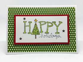
This next card I love completely. It is so uplifting and jolly looking, both in the stamp and the polka dotted paper, finished off with the three star sequins, a viewer just can't help but smile. 

Once again, the black stamped image is colored with Stampin' Blends. Have I mentioned lately that I just LOVE those Blends??? They are ever so much fun to work with, and they always do a great job.

The card measures 5 1/2" wide by 3 3/4" tall. 


Finally, I feel fortunate to have gotten today's card (as well as this blog post) finished. You see, today was our family Christmas. It is now almost 9:30 at night, and I am just writing this all. I am lucky that it was an easy card to do because I had very little time this morning to crank it out.

Gladly, it was a set that I have always been in love with. Maybe you even remember it. It consists of a row of reindeer (today's card, of course), a row of funky snowmen, and a row of cool-looking elves. It is impossible to choose a favorite from these three. 

Thinking about Santa's sleigh taking off within a few days, however, and maybe good ol' Rudolph leading the way, coerced me into choosing the row of reindeer -- Rudolph along with the eight other resentful reindeer.

I also decided to give them all a little bleach job in their hair. And added a Wink of Stella to Rudolph's glowing proboscis. 

Set against some more of the polka dot DSP that I used in yesterday's card, and then on top of a knitted looking red and white background, I love the look and feel of the card. It's another one that just makes me smile.


That means that, as of today, I have completed 42 cards for this challenge. I think there are three stamp sets left, which will bring me right up to Christmas Day. 

What did you really think about this Challenge and the fact that I posted a week's worth of cards each Saturday during the Challenge time? Was it a complete bore? Or did you have as much fun looking at them as I did creating them?

Either way, thanks for your patience!

Challenging
Smiles.

December 18, 2018

STAINED GLASS WINDOWS

Have you ever noticed the cool Graceful Glass 6" x 6" Designer Vellum on the bottom of page 165 of the Annual Catalog? If you haven't, take the time to go to that page. Look at a few of the samples on page 164 to see how the Stampin' Up! designers used some of these papers. Exquisite, huh?

So my girls could get a taste of these lovely vellum papers, I cut a few of the sheets into quarters, giving them two designs from which to choose for their project at the October Stamp-In.

I'd made up sample cards for each of the designs so they could see possibilities. When I am doing a workshop (class), I encourage my attendees to do whatever they'd like to a project to make it their very own. Just because I did it one way doesn't mean that is the best or only way to create it. 

Using the Stampin' Blends to color the stained glass window looking designs, I pointed out in my two samples the difference: in the first one, I colored in every bit of the design, while in the second sample, I colored in some of the features, but left lots of white space. In my opinion, they are equally beautiful. No right way. No wrong way.

Unfortunately, at the time we did these cards, I had a very limited palette of Stampin' Blends from which to choose for their creations. I have since discovered that I love love love Stampin' Blends and as of right now, I can report that I possess 16 sets of the lights/darks plus the Bronze pen. So I have 33 to color with! More to come I am sure. 

Anyway, back to the cards. I felt that since the "windows" were lovely and striking enough on their own that I wanted them to be the stars. So I kept the rest of the card at a minimum.


A close-up of my first sample in which I colored in every part of the design.


The second design where I left lots of white spaces:


A close-up of the second sample.


If you would like to follow along with how I put together the rest of the cards, please read on for the tutorial.

SUPPLIES:
Graceful Glass 6x6 Designer Vellum (page 165 of the Annual Catalog)
Black cardstock
Whisper White cardstock

Stampin' Blends (page 204-205 in the Annual Catalog)
Black ink

Wishing You Well stamp set (page 35 of the Holiday Catalog)

Big Shot
Subtle Embossing Folder (page 223 of the Annual Catalog)
Circle Die
Black Rhinestones
Stampin' Dimensionals

INSTRUCTIONS:
Color your chosen design using Stampin' Blends. Color on the side that is embossed.

Fold a 5 1/2" x 8 1/2" piece of Whisper White cardstock in half, creasing it well with a bone folder.

With equal margins on the top and sides, use the circle die to cut out an opening in a 4" x 5 1/4" piece of black cardstock. The circle should be of a size that nicely encompasses the design. Once you have your opening, run it through the Big Shot again, this time inside the Subtle Embossing Folder.

On a 1/2" x 2 1/2" piece of Whisper White cardstock, stamp the greeting in black ink. Add black rhinestones to either side of the sentiment. Adhere this to the black portion about 1/2" beneath the cut-out circle.

On the back side of the black piece, attach the vellum. I used tape to adhere mine. Just be sure to keep whatever adhesive you choose outside the open circle area.

Attach a Stampin' Dimensional to each of the corners of the black piece, as well as one in the center below the bottom of the open circle. Add it to the card front.


Stained
Smiles.

December 15, 2018

CHRISTMAS CHALLENGE -- WEEK 5

Here I am, just having completed Week 5 (!) of my personal Christmas Challenge. 

During this Challenge, I randomly (blindly) "choose" a Christmas stamp set that I have in my possession, many of them never even having seen ink. To make myself feel a little less guilty, I am forcing myself to create a card from each and every one of these sets.

As of today, I have completed using the "newer" stamp sets, in other words, those sets that come in the DVD type of case, not the plastic clam shell cases of days of yore. Now, I just have a handful of the older sets. These sets, for some reason or other, I have decided to never get rid of. Each of them possess some sort of charm that I find completely irresistible. 

This first card, created last Sunday, features a gorgeous poinsettia from a few years ago. The appeal of this set for me is the fact that I can do two of my favorite things with it: color, then fussy cut it.

I love those poinsettias that seem spotty with a few pinks, reds, whites on their petals. I tried to emulate that look in my coloring, which was done, by the way, with Stampin' Blends. 

The white background on which the poinsettia rests was embossed with a retired embossing folder that is filled with little poinsettias. Appropriate, eh?

The sentiment was simply stamped in black, then fussy cut and adhered to the embossed background.


I must admit that I redid the branch of holly on this next card. 

Using Blends once again, I ended up making the berries and the leaves much too dark the first time around. This was the result of the the built-in lines that simulate a woodcut print. I put the card together anyway, but every time I looked at it, I was almost depressed looking at the darkness.

So, after re-coloring the image with lighter versions of my colors (Poppy Parade and Granny Apple Green), it was vastly improved. My first attempt had been done with Cherry Cobbler and Old Olive. The background is colored with the light version of Smoky Slate. 

I had on hand some non-Stampin' Up! cardstock that was a subdued textured silvery color that melded so well with the Smoky Slate. 

Even though my touch of red in the matting is Cherry Cobbler, it still works very well with my newer lighter color palette.

Not showing up, of course, is the Wink of Stella I used on the berries.


When I randomly picked this next set, which also features a peaceful dove, I was a little lost. That particular day I guess I wasn't feeling all that creative.

So I opted to work with the snowy house and surroundings, and, since it seemed so peaceful to me, I chose my sentiment to help convey this feeling. The sentiment also was part of the set.

I did the stamping in Basic Gray. I thought that looked a little more "peaceful" than a more stark black. 

Since I wanted the snowy scene to seem welcoming, I decided to make it into a gatefold card. The two white embossed panels were, of course, embossed with the Softly Falling embossing folder, found on page 223 in the Annual Catalog. Against a Balmy Blue backdrop, I love the way the blue and white just seem so -- well -- peaceful. 

Of course, I added Wink of Stella to all of the snowy portions of the top image. But no show in this photo. 


Another faux pas that I must admit to making is the next card. 

Whenever I see this stamp set with its elegant swirly Christmas tree, I feel it screams to be embossed. So that's what I did. And proceeded from there. I had used the retired Pewter Embossing Powder against a new color for Stampin' Up! -- Gray Granite. I love the way the embossing powder and the gentle tannish gray complement each other so beautifully. 

To finish the card, I continued with more of the Gray Granite, as well as some white ribbon. Ew. Ew. Yuck. I spent more time looking at that horrid finished card, hating it more each and every time I looked at it. 

Thinking maybe I could salvage it, I started to cut it apart to have a whole new start, since I was very happy with the embossed piece, shown below. 

Nope. So I ditched the embossed idea and remade the entire thing. Please see the next photo.


With a fresh new start, using the same two stamps I'd used in my first attempt, I was happily pleased to have come up with one of my favorite cards yet during this Challenge.

Even this card went through a couple of evolutions before it ended up the way it did. 

To create the cool tri-colored background, I grabbed three of my acrylic blocks, each a different size. The largest block was inked up with Poppy Parade ink, spritzed with water, then stamped onto the background. I followed that with Balmy Blue and Granny Apple Green, with both of those colors overlapping the red. Scary, I know. Because red plus green equals brown. While that is true in my card, it is not ugly.

This background piece with the colored squares and the tree in black was originally meant to measure 4" x 5 1/4". After the background blocks of color were dry and I added the tree in black ink, that size background was too too much. 

I hated to cut off portions of my dappled colors, but I did it anyway. So that focal point piece ended up being kind of a weird size: 2 5/8" x 3 3/8". 

A few well-placed blocks of the solid colored cardstock finishes it off just fine.


The stamp set I used on the next card consists of four stamps, the snowman with the words, the deer, the tree, and the snowflakes and dots combination. 

I thought it would be cool to make a little snowy setting with all three, the snowman, the tree and little deer, all clustered together. Add some "snow" around the scene, and turn it into a snow globe.

Setting out to make a snow globe, that's exactly what I ended up doing. To get the three of them together so it looked like a scene took a little masking. But it turned out really well. Although I don't like the fact that little deer loses his right antler and mr. snowman lost his left arm, both among the branches of the tree. 

I cut a circle from some of our woodgrain DSP, then cut that in half, to be used as the "wood" base for my snow globe.

I added three white snowflake sequins and centered three Pool Party sequins in the center of them. I also added a drop of Dazzling Diamonds glitter to the center of each of the stamped snowflakes "inside" the globe. 

The whole snow globe is popped up with Dimensionals against a 4" x 4" card base of Pool Party that had been embossed with the Softly Falling (again) embossing folder. 

I must mention that the inside of the card looks pretty cool too because I kept the card closed when running it through the Big Shot. So the inside of the card looks like it has measles or something.


The next card, fairly simple and straightforward, was fun to create. The rows of deer, trees and snowmen all comprised one single stamp. 

After stamping the image in Memento Tuxedo Black on Whisper White, I had lots of fun coloring it all with Stampin' Blends.

Once the coloring was finished, I added Wink of Stella to the saddles on the deer, the stars on the trees and the hats and scarves of the snowmen. Of course, that little twinkle does not show up in the photo.

To provide a little divider between the busy colored piece and the busy DSP I chose to surround it, I added a very thin margin of black before adding it with Dimensionals to the DSP, then to the Pool Party card base.

After I had the card all put together, I realized that a simple addition would maybe have improved the overall look of the creation. Before adding the colored piece to the black margin, I think it would have been cute to run red and white baker's twine across the white space between the three different images. Thoughts?


Finally, today's card, shown below, was super fun to do. And fast!

I liked the colored and spritzed backgrounds of the red/blue/green card so much, I decided to do that same thing to create a background for these snowflakes. (More snowflakes!!) I used the smallest Clear Block, Block A, to do my "stamping" on the background. 

The blocks were inked up with Balmy Blue, Highland Heather and Granny Apple Green, spritzed with a small mist of water, then stamped randomly over the background. After the squares had dried naturally, I stamped the snowflakes in Memento Tuxedo Black ink over them. 

Since the card was so busy, I made my sentiment fairly simple, giving the eye a little break from all the fun going on in the background.


I still have more stamp sets to go into Week 6. I hope that's OK with all of you and that I'm not boring you. Hopefully I am succeeding in planting a few Paper Seedlings in your creative brains!

Thank you for sticking with me on this journey these past few weeks. I'm having a lot of fun -- hope you are too!

Challenging
Smiles.

December 11, 2018

STRING OF LIGHTS GIFT CARD HOLDER

Yesterday, December 10, was the Christmas Edition of my Stamp-In Club. This gift card holder was one of the projects the girls worked on.

At this time of the year, aren't we all looking for cute ideas for gift card holders? The stamps in the Making Christmas Bright set (page 7 in the Holiday Catalog) gives us lots of options to create and makes a really darling gift card holder with just a bit of work.


The String of Lights Gift Card Holder, wearing its belly band:


The naked gift card holder, sans belly band:


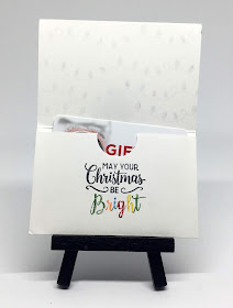
The inside of the gift card holder is fairly straightforward 
with a little creativity in the multi-colored letters in the word "Bright", 
to echo the colors used in the Christmas lights 
on the outside of the holder as well as on the belly band:


The belly band in all its glory:


Just a photo to show the belly band in the act of being removed:


Interested in making one of these quick gift card holders? Read on!

SUPPLIES:
Whisper White cardstock
Gold Foil Cardstock

Making Christmas Bright stamp set (page 7 in the Holiday Catalog)

Pacific Point ink
Real Red ink
Garden Green ink
Crushed Curry ink
Stampin' Write Markers in:  Garden Green, Pumpkin Pie, Pacific Point, Real Red and Crushed Curry
Black ink

Tear & Tape (page 213 in the Annual Catalog)
Simply Scored (page 208 in the Annual Catalog)
1" Circle Punch 
Christmas Bulb Builder Punch (page 6 in the Holiday Catalog)
Mini Stampin' Dimensionals
Basic Rhinestones

DIRECTIONS:
You will be using a strip of Whisper White cardstock that measures 4" x 7 3/4". With the Simply Scored, score at 2 1/2" and then again at 5 1/8". Crease on the score lines.

Work first on the part where you scored at 2 1/2". When folded up, this won't quite touch the next score line. There will be about a 1/8" gap. Refer to the sample. Take the 1" Circle Punch and, going in a little more than halfway, punch in the center of the end. This will help the recipient to get the card out of the holder.

With the piece still lying flat, and beneath the circle you just punched, stamp "May your Christmas be" in black ink. Then, using the brush end of the Stampin' Write Markers, color each of the letters in the word "Bright" a different color. REMEMBER: When working with markers, the ink dries quickly, so HUFF on the stamp before stamping it below the black words.

Add Tear & Tape along the sides with the tape going right along the edge so there is room enough for a gift card to slide in. Press the sides together.

Now you are going to work on the front of the gift card holder. In black ink, stamp the row of Christmas lights four times, being sure to stagger each line a bit so they aren't perfect rows of soldiers. Use the same Stampin' Write Markers to color in the strings of lights.

TO  MAKE THE BELLY BAND:
Take a 1" x 8 1/2" strip of Whisper White cardstock and wrap it around the gift card holder. Wrap it tightly, but not too tightly. You want to be able to remove and replace it easily enough but yet to stay in place on the gift card holder. Make creases where necessary.

Flatten the strip out. Centered across the top of the long portion of the strip, stamp the line for the bulbs in black ink. DON'T ROCK THIS STAMP AT ALL. ASK ME HOW I KNOW THAT.

Stamp each of the lightbulbs in a row in the colors according to the sample on Whisper White cardstock. Once your bulbs are stamped, use the Christmas Bulb Builder Punch to punch each of them out.

Take a strip of gold foil paper and punch out four of the bulb toppers. Adhere the toppers to the bulbs.

With a Mini Stampin' Dimensional on the back of each bulb, hang them hither thither on the black line.

Add a Basic Rhinestone to either side of the string of lights.

Adhere the two ends of the belly band together and slip it onto the gift card holder.

Go to your favorite store and purchase a gift card to slip inside for a lucky recipient.


There! Now, wasn't that fun?

Gifty
Smiles.

December 8, 2018

CHRISTMAS CHALLENGE - WEEK 4

Well, here I am, just having finished Week 4 of my personal Christmas Challenge. That means that I've created 28 cards since I started this challenge!! The stamp sets that I have left yet to create with should bring me almost to Christmas.

OK. Let's get started on this week's batch of cards.

Last Sunday, making the card below, I had just so much fun! These Christmas bulbs  and coordinating punch from the Making Christmas Bright set on page 6 and 7 of the Holiday Catalog make creating cute seasonal cards a snap.

Nothing terribly special about this card, except maybe its size. It measures 3 1/4" x 5 1/2". The cute spotty DSP in the background is from the Under the Mistletoe pack on page 189 of the Annual Catalog. Each of the light bulbs is popped up with Dimensionals.


I was really excited when I randomly grabbed this set, Beautiful Baubles, on page 10 of the Holiday Catalog. When I created the card in this post, I was so happy with the results of that one that I wanted to repeat the same color scheme for another card using the cluster of ornaments, so I kept the combination of Prismacolor Pencils out for just this case.

Treating the new card the same way as the previous one -- white embossing on kraft cardstock, then colored with Prismacolors -- I hoped I'd be as happy with this new card as I was with the one in the aforementioned post. However, that was not to be. I am not in love with this card. Perhaps it is the addition of Melon Mambo and Granny Apple Green to the kraft color. 

I don't know. It just doesn't grab me.


This next card was a lot more work than a card has any right to be. But, I am happy with the way it turned out, so I guess all the time and effort were worth it. 

Do you remember -- and have fond memories of -- this set, Loads of Love, from ancient times? Since they are showing so many red pickup trucks with a tree in the back, I thought I'd do my own rendition. 

For the post-Thanksgiving Online Extravaganza, I'd treated myself to several more duos of the Stampin' Blends. In that order was Cherry Cobbler. So that's what I used to color my pickup. I had also ordered the Smoky Slate set, so I used those colors on the trim and wheels of the truck.

The Christmas tree that comes with the set is sort of a "stick tree" in that it is all just lines, no substance whatsoever. To rectify that situation, I stamped the tree in Mossy Meadow ink, then filled it in with Old Olive Stampin' Blends.

To get that ol' tree in the back of the truck, I did some masking. After that, I added my little driver, then proceeded to fussy cut the whole thing.

To create the snowy landscape in which he is driving, I tore an edge of Whisper White cardstock, and sponged the torn portion with Balmy Blue ink so it blended well with the Balmy Blue paper of the sky. 

The faint trees in the background are from another set, but stamping them in Gray Granite worked well for the effect. The snow falling is from ANOTHER stamp set and is embossed in white.

So, this little creation utilizes THREE stamp sets!


I noted to my daughter, Sarah,  that this next card was the most problematic card I've ever endured created. It was a case of Murphy's Law from start to finish. What possibly could go wrong absolutely DID!

I know it doesn't show up in the photo, but the colors of the card are Whisper White and Blackberry Bliss. The stamping is embossed in gold.

Enough said.


I was sort of happy with this next card, but when I showed it to my husband, he just shrugged. I usually don't get much of a response from him, but never just a shrug. Husbands.

First of all, I think the color scheme is appealing. It's bright and modern. 

But, it's MORE SNOWFLAKES! In retrospect, I realize that I have an absolute BLIZZARD of snowflake stamp sets. 

To make the three little embellishments on the "merry" portion, I used some little ruffled edged sequins that came in a long ago Paper Pumpkin kit, followed by a silver sequin in the center, finished off with a Basic Rhinestone in the center of the whole thing. They do have quite a lot of dimension, so it would definitely require extra postage and hand stamping.


My oldest daughter, Emily, has long been a fan of the turquoise/red color combination. I'm not sure if she still feels like that. But, this card is a nod towards Emily. 

My color palette is Bermuda Bay and Cherry Cobbler on Whisper White. A strip of washi tape in the Bermuda Bay/Whisper White combo grounds the four trees as they proudly stand there is their red buckets and all their tree-y finery. Mr C is taking a quick flight through to check things out.

The cute embossed snowy sky is done with the Softly Falling embossing folder found on page 223 of the Annual Catalog. I never know if I should have the sparse snowflakes at the top or the bottom. So this time, I put them at the top.

Everything, including Mr C, is popped up with Stampin' Dimensionals.

This is another card that I made in a funny size. It measures 3 3/4" x 6". 


At this point in the photo session, Fred decided to pop in and check out the action.


Back to the cards.

This next one is the card I made for today. 

Ugh. MORE snowflakes! This utilizes the same stamp set that I'd used in my Beautiful Blizzard post. Since I wasn't crazy about the set at the time I made that card, I don't know why I didn't just stick it back into its drawer and called it done for the challenge. But, no. I had to shove it into the stack for the Challenge. Today it was my random pick. I balked and almost ditched it anyway. 

But a challenge is a challenge. The show must go on.

The photo definitely does not do it justice. It turned out peacefully beautiful. I loved the color scheme that I used, Smoky Slate against Whisper White. Since the colors were so subdued, I decided to add some glitz in a snowflake die cut from Silver Glimmer Paper.

Then, do you remember that old chestnut of a stamp set from which my sentiment comes? I LOVE those four stamps. I am going to make a note of it that I use them more frequently, retired or not.


Well, that's the end of my cards for my Christmas Challenge Week 4. Are you getting tired of this yet? I must admit that it is turning out to be a nice dose of Creative Therapy for me each day. It often turns out to be the highlight of a day.

Thanks for accompanying me on my challenging journey.

Challenged
Smiles.

December 4, 2018

BEAUTIFUL BLIZZARD

When I first laid eyes on the stamp set, Beautiful Blizzard, (page 39 in the Holiday Catalog), I felt that I just had to have it. So I ordered it. I think it was the snowflake image's fault. Yup. That's what it was.

Because when it was delivered to me, I really wondered. WHY did I order this set?

Well, I did. So I needed to use it. Somehow.

I was determined to design a card for my November Stamp-In Workshop attendees to make. So I came up with the card pictured below.


From the Clearance Rack while ago, I'd ordered this beautiful Night of Navy Corduroy Ribbon. Being that I used Night of Navy ink on my card, I thought it would be the perfect touch for the card.

After completing the card though, I was struck by the thought that the trim was too heavy and too dark for the card.

While preparing the projects for the workshop, I came up with another -- I thought more desirable -- option for the girls to choose from. Of course, I made the corduroy ribbon available, as well as thin strips of Night of Navy cardstock that I had run through the Seaside Embossing Folder (page 223 in the Annual Catalog) to mimic the blustery wind of the snowstorm.


Later I made another card using the embossed cardstock strip instead just to see for myself how different (and much better?) it looked. Unfortunately, I didn't use the Night of Navy ink as intensely as I did in my sample card, so it was not really a good comparison. 

Another thing I'd done differently with my second card was to add some Dazzling Diamonds Glitter to the Silver Embossing Powder before I embossed the snowflakes. I thought that by doing that, it would make the snowflakes glisten a bit more and show up more prominently. Wrong-o.


Anyway, if you'd like to give a card similar to this a try, following is a tutorial on how to do so.

SUPPLIES:
Whisper White cardstock
Night of Navy cardstock (optional)
Silver Glimmer Paper

Night of Navy ink
VersaMark ink

Beautiful Blizzard (page 39 of the Holiday Catalog)

Embossing Buddy
Silver Embossing Powder
Heat Tool
Night of Navy Corduroy Ribbon or strip of embossed Night of Navy cardstock
Basic Rhinestones
Stampin' Dimensionals
Seaside Embossing Folder (optional)

DIRECTIONS:
Fold a 5 1/2" x 8 1/2" piece of Whisper White cardstock in half, folding it well with a bone folder.

Next, take a 2" x 5 1/2" piece of Whisper White cardstock. Using the large blizzard-y blobs, stamp them in Night of Navy across the paper. Use the smaller blob if you'd like; otherwise, you can stamp the large blob twice, turning it each time, then filling in the remaining spaces with the edges of the blobs.

Once the stamping is done, rub the Embossing Buddy well over the piece. In VersaMark ink, add the cluster of snowflakes a few times, rotating the stamp with each new impression.

At the Heat Station, cover the snowflakes in Silver Embossing Powder, tapping the excess back into its container. Use the Heat Tool to emboss the images.

Adhere this piece to a 2 3/4" x 5 1/2" piece of Whisper White cardstock so it is centered with even borders on the top and bottom. On the bottom, adhere a strip of Silver Glimmer Paper that measures 3/8" x 5 1/2". At the top, either add a length of the Night of Navy Corduroy Ribbon, taping the excess to the back of the piece OR . . .  BUT, I think the ribbon is too dark and heavy for this card (my feelings once I'd had mine finished), so another option is to add a 3/8" strip of Night of Navy cardstock that had been embossed inside the Seaside Embossing Folder.

Once this panel is completed, adhere it with Stampin' Dimensionals to the card front, leaving about 1/2" of the card base at the top.

Underneath this panel, stamp "Season's Greetings" in Night of Navy ink. Add two Basic Rhinestones to the left of the greeting.


Blizzard-y
Smiles.