Navigation Bar

June 25, 2019

BIRDS ON A BRANCH THANKS

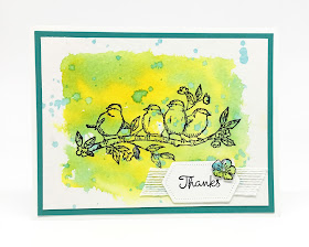
Do you absolutely LOVE the new set, Free As A Bird (page 92 of the Annual Catalog)? I do -- and I have from the very moment I first saw it. It was the set I preordered when demonstrators were able to do so.

Wanting to use this charming set for my May Stamp-In Workshop, 
this is the simple card I created:


My first attempt at the splotchy background for the card was unpleasing to me, so I redid it. I actually threw the first try in the wastebasket. But, as I was working on this card, I felt it needed just a little something to finish off the cute sentiment tag. In a moment of inspiration, I dug the first background out of the garbage, stamped one of the flowers from the set onto it, fussy cut the flower, and added it to the tag. Perfect! A tiny pearl finished it off.


In looking at these photos, you really need to use your imagination somewhat. The card looks like it is on a Bermuda Bay cardstock base. Nope. The Bermuda Bay piece is set atop a Whisper White card base. 

It is a pretty flat card, so should go through the USPS just fine. I don't think the teeny pearl would cause any problem whatsoever.


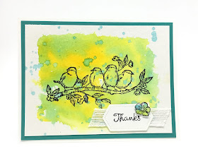
Just a close-up of the birds on their spotty background:


Keep on reading for a tutorial on how to create a Birds on a Branch Thanks for yourself:

SUPPLIES:
Whisper White cardstock
Bermuda Bay cardstock
Watercolor Paper

Free As A Bird set (page 92, Annual Catalog)
Varied Vases (page 61, Annual Catalog)

Memento Tuxedo Black ink
Retired Reinkers in a blue and a yellow

Aqua Painters
Water Spritzer
Palette
Big Shot
Stitched Nested Labels Dies (page 196, Annual Catalog)
Basic Pearls
5/8" White Flax Ribbon (page 174, Annual Catalog)

INSTRUCTIONS:
Fold a 4 1/4" x 11" piece of Whisper White cardstock in half, creasing it well with a bone folder.

Add to this base a 4" x 5 1/4" piece of Bermuda Bay cardstock.

You will be doing most of your work on a 3 3/4" x 5" piece of watercolor paper: Put a drop or two of the reinker into the well of a paint palette. Add drops of water to almost fill up the well. Using an Aqua Painter, pick up some of the watered down ink and add it to the center of the watercolor paper, moving the ink around so it doesn't pool too much in one spot. Repeat this with the second color of reinker. Keep your colored portion to the center of the paper as a backdrop for your focal point. Use the heat tool to hurry along the drying time. When this is dried completely, pick up some of the color with the Aqua Painter, and instead of "painting" it on, flick it onto the paper. (You could also use a soft paintbrush to do this step, whichever makes you more comfortable.) Use a paper towel to soak up the moisture so your dots don't get too dark and overwhelming. Use the heat tool to dry the piece.

Once it is completely dry, stamp the branch of birds in black centered on the background.

(I had a scrap piece of this type of background available that I wasn't pleased with. Stamp the small flower somewhere on this scrap. Fussy cut the flower. Set aside.)

Cut a tag that measures 1" x 1 3/4" from Whisper White cardstock using the Stitched Nested Labels Dies. Stamp the sentiment on this in black ink.

Add the fussy cut flower to the upper right corner of the label. Please one of the smallest pearls in the center of the flower.

Adhere a 3" long piece of the 5/8" White Flax Ribbon, cut at angles on both ends, to the back of the label. Adhere this whole piece to the lower right corner of the card.

Adhere this finished piece to the card base.


Branch-y
Smiles.

June 22, 2019

FIREWORKS QUILT

Every once in awhile I get a hankering to make a quilted card. I decided to give in to my hankering yesterday.

Not having seen one on social media lately, I did a search for "quilted cards" on Pinterest. I was surprised and delighted to discover what came up: Quilted Cards The very first card that came up in my search was one of my own. Love You Quilt. So exciting to discover! I noticed that it was also in the second row of cards for this search. Anyway, this was quite an honor.

Browsing through the cards, I discovered a few that were created using a die from PTI. This is a link to the die. I hadn't looked for this die until now, and seeing how reasonable it is, I should have just opted to purchase it, instead of going through the agony I did to figure mine out without using a die.

Anyway, after a few trials and errors, 
I finally came up with something that is pretty cool:


I'd used the two smallest square dies from the Stitched Shapes Dies (page 196 of the new Annual Catalog), thinking it would be extra cool that my little quilt pieces would actually have "stitches". However, since I had to cut each of these squares into triangles, not all my edges have the stitching. Oh well.


The Designer Series Paper prints I ended up choosing for my little quilt 
were meant to represent fireworks for the Fourth of July.


Wishing I had paid more attention to math in school, I think that would have helped me figure out the layout for my quilt considerably. But, not having been all that attentive, I just fudged it. While not perfect, with several tries, this one turned out -- shall we say?? -- not too bad.


Adding a gigantic red button with thick white Baker's Twine 
criss-crossed at the center 
adds a bit to the Americana look of a quilted piece.


Have you ever made a quilted card? Did you have a pattern and/or a tutorial on how to do it, or did you just work at figuring it out on your own? While it's frustrating and a waste of paper, I found it sort of fun to figure it out on my own. And, even though it's not perfect, I DID IT!!

Fireworks
Smiles.

June 18, 2019

#dailycreating MARCH

It's been awhile since I've shared the latest installment of my favorites from my expedition through #dailycreating. 

As part of this Facebook group, the brainchild of Terry Runyan, Visual Artist and Creative Encourager, we are given prompts for daily creating. Announced every Sunday for the coming week, we can follow the prompts or not, whichever we wish. The point is to keep us creating -- and growing -- on a daily basis.

Following are ten of my favorites from March. Above each of the drawings, I will note what the prompt had been:

#seahorse

#chameleon

#woodlandanimals

#dogurday

#mushroom

#panda

#bunnies

#dogurday

#manatee

#dogurday

And there you have it. 

I must explain the #dogurday prompt. Each Saturday, we have a choice of prompt: Caturday or Dogurday. Sometimes there is another option in addition to the old regulars.

As you may have noticed, I have quite fallen in love with doing portraits of animals. In fact, often when a prompt doesn't involve an animal somehow, I work it out so it does. 

If you have any questions about my illustrations, ask away!

Please respect that these are my personal original drawings and are not to be used for anyone else's purpose without my permission.

Illustrated
Smiles.

June 15, 2019

MASCULINE FEATHERS

The stamp set that came with the May 2019 Paper Pumpkin kit included an awesome feather image that was absolutely perfect for coloring. It had me instantly smitten. And I decided that I would use this image in a Father's Day card for my June Stamp-In Workshop, since the workshop was scheduled for the Monday prior to Father's Day.

So, I went to work, and this is what I came up with:


I used some retired Night of Navy corduroy ribbon behind the five separate feather images. I realize it doesn't show up all that well in the photograph. But, of course, that's one of the beautiful things about Stampin' Up! products: they are made to match. And the ribbon is resting against Night of Navy cardstock. Good stuff, huh? 

In real life, the corduroy ribbon adds a subtle pleasing texture and just one more touch of masculinity.

NOTE HERE: You MUST keep an eye on the Stampin' Up! Clearance Rack. You can find such delicious deals there. That's where I found my corduroy ribbon. I try to keep you informed whenever the Clearance Rack is updated. When that happens, move quickly -- things often sell out in a short amount of time.


I shuffled through my stash of Designer Series Paper for one that would work well with the feather image, and came across this one. To color in the feathers, I echoed the colors in the DSP in the Watercolor Pencils I chose.


Here you go -- a tutorial to make this simple card:

SUPPLIES:
Pool Party cardstock
Whisper White cardstock
Night of Navy cardstock
Designer Series Paper

Feather stamp (May 2019 Paper Pumpkin)
Teeny Tiny Wishes (retired -- and sorely missed!)

Memento Tuxedo Black ink
Watercolor Pencils (page 179 of the Annual Catalog)

Night of Navy corduroy ribbon
Scotch Tape
Paper Snips
Stampin' Dimensionals

INSTRUCTIONS:
Fold a 11" x 4 1/4" piece of Pool Party cardstock in half, creasing it well with a bone folder.

To this card base, add a 4" x 5 1/4" piece of chosen Designer Series Paper.

Cut five pieces of Whisper White cardstock that measure 3/4" x 2 1/4". In Memento Tuxedo Black ink, stamp the feather image on each one. Using Watercolor Pencils, color in the feathers as you wish. How I did mine: I colored them as normal. After coloring, I intensified the color by going over it lightly with an Aqua Painter.

Tape a length of navy corduroy ribbon slightly up from center onto a piece of Night of Navy cardstock that measures 5" x 2 1/2". Space the feather pieces evenly across this expanse. Obviously, I flipped two of the feathers upside down. Do the same, or whatever you prefer.

With Stampin' Dimensionals, adhere this piece over the DSP, leaving even borders of DSP on the sides and the top.

Stamp in black ink your chosen sentiment on a strip of Whisper White cardstock that measures 3/8" x 2 1/4". Flag the left side of the label.

Use a few Stampin' Dimensionals to adhere the sentiment to the card in the far right lower corner.


HAPPY FATHER'S DAY TO ANY FATHERS WHO MAY BE READING THIS, WHETHER YOUR "CHILDREN" HAVE TWO OR FOUR LEGS! ENJOY YOUR DAY!

Feather-y
Smiles.

June 11, 2019

DANDELION SYMPATHY

I loathe the need for sympathy cards, but, unfortunately, it's a part of the life cycle. 

Since the death of a loved one is a sad and solemn occasion, an expression of sympathy should mirror that feeling.


Don't the white embossed dandelion seeds pop?


The inside of the card:


Follow along for a tutorial on how to recreate this card.

SUPPLIES:
Whisper White cardstock
Night of Navy cardstock
Brushed Metallic Gold cardstock

Dandelion Wishes (page 77 Annual Catalog)
Simply Sketched 
Wishing You Well

VersaMark ink
Night of Navy ink

Embossing Buddy
White Embossing Powder
Heat Tool
Stampin' Dimensionals

DIRECTIONS:
Fold a 4 1/4" x 11" piece of Whisper White cardstock in half, creasing it well with a bone folder.

Rub the Embossing Buddy very well over a 2" x 5 1/4" strip of Night of Navy cardstock. (Remember the Embossing Buddy IS your buddy -- did you ever see white embossing powder on dark cardstock where you don't want it?? It's NOT a pretty sight!) About 1/2" from the left edge, stamp the dandelion in VersaMark ink.

At the Heat Station, cover the stamped image with White Embossing Powder. With a fine brush, whisk away any stray pieces of embossing powder. This is so important because any excess grains of the powder will look horrid against the navy cardstock. Once you are happy with the embossing powder, use the Heat Tool to emboss the image, making sure the entire image is shiny and set.

Adhere this embossed piece to a 2 1/4" x 5 1/2" piece of brushed metallic gold cardstock.

Using Stampin' Dimensionals, affix this strip to the card base about 1/2" from the top.

In Night of Navy ink, stamp the sentiment in the lower right corner.

Inside the card, in Night of Navy ink, stamp a second sentiment, as well as the image of the stray dandelion seeds.


Solemn
Smiles.

June 8, 2019

MUCHO MACHO

I recently tried a pretty cool technique. Not sure what it's actually called, I will think of it as stamping into Fun Foam.

The focal point on this card is made using this technique:


With a little bit of a closer view, the viewer will notice that there isn't an overabundance of detail. Actually though, the stamp I used didn't have any more detail than what you see here. It is meant to be used as a silhouette stamp. 

The first stamp I tried was a little more detailed. Plus it was circular. When I finished, the rubber on the outside of the stamp also impressed itself, giving it something of a drunken look. Not at all appealing.

After that fiasco, I went in search of a more suitable image, 
and this is what I came up with:


The Fun Foam I used was 1/8" thick and tan in color. 

Once the impression has been made into the Fun Foam, it is, of course, all one color. In order to bring out as much detail as possible, slowly build up a slightly darker shade of ink than the foam with a stamping sponge, concentrating on keeping the ink only on the raised surfaces.


I went over and over this impression with sponged ink until finally I was happy enough with the detail. A problem: I noticed that wherever I touched on the sponged area, my fingers removed some of the ink.

With that in mind, I allowed it to set for a few days, hoping the ink would have dried sufficiently in that time. 

Even though I created this more than a week ago, the foam area remains iffy, transferring ink to my fingers every time I touch it. 

I'm not sure what a layer of fixative or some such product would do to the foam and/or the color and look of the piece. Does anyone have any experience with this?


Because the color and the image looked fairly masculine, I decided to go masculine all the way. I dug through my hoarded Designer Series Paper to discover this one that I'd been saving for . . .  Well, this project? It was kind of a western/cowboy look, so I deemed it ideal for my purposes. 

Using Tombow Multipurpose Glue (my beloved Green Glue) close to the edges of the Fun Foam I adhered it to a piece of the DSP so I had a mat, then surrounded that with a thin layer of Early Espresso cardstock, the color of the ink that I'd used to sponge on the foam.


After adding a couple more masculine-looking elements, I was happy with the end result.

How do you do this technique, you ask? 

Use a piece of Fun Foam that is 1/8" thick in any color you choose. I'd done this technique on a bright yellow years ago, and it was wonderful. In that case though, I did not do any sponging. The yellow Fun Foam, combined with the image I chose to stamp into it, cast enough shadows to give the piece pleasing dimension. So, that card is not at all fragile -- if you touch it.

Cut the Fun Foam to a size slightly larger than the stamp you choose to use. Lay the Fun Foam on a heat bearing surface and use a heat tool on it until it starts to curl somewhat. Have your stamp right there, because at this point, you want to slam the stamp into place on the hot foam, holding it in place for a few beats. Then slowly lift the stamp straight up off the foam. The stamp image should have transferred itself deeply into the Fun Foam.

Let it cool completely before you start with the sponging. Then, as I noted before, sponge in layers, gradually building up the complementary color until you are satisfied.


Off the subject: This is a VERY IMPORTANT post -- my 800th post since I began Paper Seedlings in September of 2012. Yay me!!

Foamy
Smiles.

June 4, 2019

TROPICAL CHIC

I am thrilled to pieces that the stamp set, Tropical Chic, found on page 93 of the NEW ANNUAL CATALOG, "CREATIVITY IS CALLING", which went live TODAY, is still with us. The matching dies, Tropical, can be found on page 197 of the very same catalog!

Elegant and trendy, these stamps and dies are so much fun to play with. And the cards you create will look completely different depending on the color palette you choose. The colors really do make a difference.


For my version of the card, I chose cheerful colors that are sure to make the recipient of it really happy: Highland Heather, Granny Apple Green and Flirty Flamingo. I love the way this combination of colors plays so well together.


Not only is the purple main element die cut, but I also added a diecut leaf and a hibiscus flower. A few sequins scattered around the square portion seem just what the doctor ordered to complete the card.


With only a bit of gentle dimension, in the shape of a few Stampin' Dimensionals and the sequins, it will fly through the mail without paying any extra postage.


Following you will find a tutorial on how to recreate this card. I will be referring to my die cutting machine as the Big Shot, however, since that is what I use now until Stampin' Up! releases their new machine.

SUPPLIES:
Whisper White cardstock
Granny Apple Green cardstock
Highland Heather cardstock

Tropical Chic (page 93 in the Annual Catalog)
Retired sentiment

Highland Heather ink
Flirty Flamingo ink
Granny Apple Green ink
Stampin' Write Marker in Crushed Curry

Big Shot
Tropical dies (page 197 of the Annual Catalog)
Stampin' Dimensionals
Small oval punch
Sequins

INSTRUCTIONS:
Fold a 5 1/2" x 8 1/2" piece of Granny Apple Green cardstock in half, creasing it well with a bone folder.

Stamp the leaves randomly in the inks listed according to the sample -- or as you wish -- onto a 4" x 5 1/4" piece of Whisper White cardstock. Adhere this to the green card base.

Cut the large leafy square piece from Highland Heather cardstock. Adhere this to a 3" x 3" base of Whisper White. Attach this piece to the stamped background with a few Stampin' Dimensionals.

Ink up the hibiscus flower with Flirty Flamingo ink. With a baby wipe, gently remove the ink from the stamens (? = the things that stick out) and replace the color with the side of the brush tip of a Crushed Curry Stampin' Write Marker. Huff on it, then stamp it onto a scrap of Whisper White cardstock. At the Big Shot, use the appropriate die to cut out the flower. At the same time, cut a leaf from Granny Apple Green cardstock.

Adhere the leaf flat onto the square piece, followed by the flower popped up with a Stampin' Dimensional.

If desired, add a handful of sequins to this piece. (In my opinion, I'm not sure the sequins actually add anything wonderful to it.)

On a scrap of Whisper White cardstock, stamp the "Thanks" sentiment in Granny Apple Green. Punch it out with the small oval punch. (Since both the sentiment and the punch are retired, you can substitute the sentiment for whatever you think looks good if you don't have these items.) Adhere it towards the bottom right with a Stampin' Dimensional.


Tropical
Smiles.

June 1, 2019

I LOVE KOI

Another really sad situation: This wonderful stamp set, All the Good Things, will retire in two days. Yes, TWO DAYS! 

Featuring Distinktive Stamps, with their realistic look of 3-dimensionality, was around for only a year. Gone way too young -- I mean, too SOON! 

Being a lover of koi, this set appealed to me greatly from the very first look. It was truly love at first sight.

We had a pond of giant koi at our former house. But, after a raccoon ate all of them -- except the heads -- we didn't get any more. 


Anyway, in tribute to our long gone koi, I decided to use a few that I stamped, then fussy cut, on this anniversary card for my husband, Pat.

Playful Backgrounds, another super set that I love and really did not use nearly enough, will also retire in two days. Yes, you heard right. TWO DAYS! These fun stamps make for an excellent bubbly background. Even though they are retiring, I will keep using the stamps because they are so fun and versatile. 

I added a handful of Pool Party sequins to the bubbles to add to the realism. It really helps, doesn't it?? Yeah right.


Because I popped up the fish against the background with Dimensionals, they gain more prominence and give the card some dimension. I know IRL, the fish would not be popped up out of the water -- well, if they were, there'd be some trouble! -- but I liked the effect anyway.


Tomorrow, June 2, we will be married 46 years. Heavens! 46 years -- how can that be when we're both so young?? Anyway, I hope Pat likes his card.


Fishy
Smiles.