Navigation Bar

July 30, 2019

ANOTHER FUSSY CUT BIRD ON A BRANCH

I am having just so much fun fussy cutting the birds from the Bird Ballad Designer Series Paper on page 166 of the Annual Catalog!

There is one sheet of this pack that is solid single birds. I started out this sheet by trimming off a section of the birds. I cut off their feet (gasp!!) since I wanted them to be merely sitting on a branch. Besides, the feet were so delicate -- actually their legs are just single lines. So, without worrying about the feet and legs, they are pretty easy to fussy cut, so I cut off another chunk of birds, and went to work adding to the flock. Soon I had quite a pile of birdies.

The reason I'd gone so nutsy cutting these birds is because I wanted to use them on a card for my July Stamp-In Workshop for my girls to create. A few of the girls are not as crazy about fussy cutting as I am, so I felt I was doing them a favor, giving them a wide assortment of ready-cut birds to use on their projects.

Another reason I went crazy with the fussy cutting is that the weather has been so beautiful that our deck simply calls to me: "Come sit out here, Linda! It's lovely!" Well, not wanting to be rude, I, of course, obey. But I always bring my fussy cutting with me. Such a pleasant activity to while away the shady time on the deck!


To create the card for the workshop, I stamped a simple branch on which the girls' chosen birdies could perch. I used the Colorful Seasons stamp set (page 56, Annual Catalog) for this purpose.

Since this stamp set also features several beautiful sentiments, I chose one of them to add to the bottom of the card.


On the DSP, the birds' heads are facing several different ways. 
I sort of liked this one looking over his shoulder.


On some of the birds, as I was cutting off their feet (gasp again!!) the black lines near the feet were often cut off also. I simply filled the lines back in with a thin black marker.


If you keep reading, I will share with you a tutorial on how to create this simple card. If you want to make the card and don't like fussy cutting, let me know and I can send you a few birdies. (I cut up one entire sheet!)

SUPPLIES:
Pool Party cardstock
Whisper White cardstock
Bird Ballad Designer Series Paper (page 166)

Early Espresso ink
Petal Pink ink

Colorful Seasons stamp set (page 56)

INSTRUCTIONS:
Fold a 4 1/4" x 11" piece of Pool Party cardstock in half, creasing it well with a bone folder.

The next step will be done on a piece of Pool Party cardstock that measures 2 1/4" x 5". Stamp the branch in Early Espresso ink about centered onto this piece. In Petal Pink ink, add the flowers as desired, followed by the stamens in Early Espresso.

Choose a precut bird and adhere him to the branch.

Adhere this finished piece to a 2 1/2" x 5 1/4" piece of Whisper White cardstock.

Attach this finished piece to the Pool Party card base with even margins on the top and the sides.

Add the sentiment in the lower right corner of the card in Early Espresso ink.


Fussy
Smiles.


July 27, 2019

USE YOUR SCRAPS

Have you ever experienced this? 

You have just completed the prep work for a project, only to discover that you had numerous cool pieces of scrap, a.k.a., garbage, that you just could not bring yourself to actually toss into the circular file? They were just too too COOL!

I know those of you who have been reading my blog for some time already know that I have a really difficult time throwing stuff away. I mean, who knows when just that particular item might come in so handy as the perfect touch for a project that might come to mind sometime in the future!?! And then, if it had been thrown out the way it probably should have, it would have been a MISSED OPPORTUNITY! Oh no! Horrors.

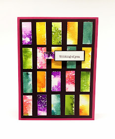
Anyway, back to my first paragraph. I had just finished planning and making up my sample for a card for my August Stamp-In Workshop. I had covered nice-sized chunks of watercolor paper in the six different colors that the Pigment Sprinkles (page 179, Annual Catalog) come in, anticipating cutting the dried pieces into strips to be used on cards. 

I had figured incorrectly, and the strips were 1/2" too long for my purpose. So I proceeded to trim off those 1/2" pieces. 


The pieces looked so colorful and inviting lying alongside the paper trimmer. I gathered them into my hands, and gazed down upon them. I just did not have the heart to throw these precious little pieces away. So I haplessly put them on my work table. 

Maybe . . .


The strips were 1/2" x 1 1/4", and they haunted me every single time I glanced down at them.

Until, finally the other day, I came completely under their spell and started to move them into various formations. Against my woodgrain table, they looked wonderful enough, but I thought that played up against a solid black cardstock, they would really pop. 


That proved to be absolutely correct. So -- I just couldn't resist -- I started gluing them in place against the black. The resulting piece was so bright and cheerful that it almost took my breath away. I wanted to make it into a card, but I struggled with the thought of covering up any of that colorful sparkle.

I satisfied my hesitation by doing a tiny sentiment on white against a teeny border of the black. I had a strangely sized piece of the purple lying there unused. I felt the sentiment piece needed just a little something else, and when my eyes landed on that poor unwanted strip of purple, I decided to adhere it to the back of my sentiment strip, and popped it up on my card front with two Stampin' Dimensionals. 

Since one of the Pigment Sprinkles is Melon Mambo, I opted to use that color cardstock for my card base.


I sadly mourn these photos of my card. You see, the brightness, the cheeriness, and the pop and pizzazz do not come through at all. Even my Melon Mambo card base isn't true in its color. I apologize to you because you are really missing out on a colorful treat.


Would you have had the courage to throw away these colorful little gems???

Scrappy
Smiles.

July 23, 2019

#dailycreating APRIL

 It's time for another installment of #dailycreating, this time April drawings.

Looking back on my drawings from April, it is apparent that it wasn't a stellar month for my creativity. After perusing all of April's work, I came up with a measly seven to share with you. And I'm not even all that crazy about every one of them either.

As I did in my most recent #dailycreating post, I will furnish the prompts above each of my drawings. Here goes:

 #ferret

#thingonthing

#dandelion

#bird

#dolphin

#thingonthing

#dogurday

Until next time, when I present my favorites from my May #dailycreating, please recognize that these are my own personal drawings and not to be used without my permission by anyone but myself. Thank you!

#prompt
Smiles.

July 20, 2019

ENJOY THE PIGMENT SPRINKLES

For awhile Stampin' Up! had carried the commercially available pigment ink crystals. Now, with the advent of the new annual catalog, Stampin' Up! has released their own version, called Pigment Sprinkles. These little wonders can be found on page 179 of the new Annual Catalog.

Following is a photo showing the six luscious colors the Pigment Sprinkles come in: 
Bermuda Bay, Daffodil Delight, Granny Apple Green, Gorgeous Grape, 
Mango Melody and Melon Mambo:


Once I got my Pigment Sprinkles in my hands, I was anxious to give them a try. My first foray with them involved doing the above swatches on strips of identical watercolor paper. I spritzed the paper first, followed by discriminate sprinkling of the Sprinkles.

I wanted to feature the Pigment Sprinkles in a card at my July Stamp-In Workshop. 
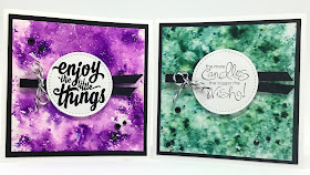
The card below is the one I came up with for my girls:


A couple of my Stamp-In girls are purple lovers, so I chose the Gorgeous Grape for my sample card. At the workshop, however, I let them choose their own colors for their personal cards by making all six of the colors available. I had purposely designed the remainder of the card in black and white so it wouldn't matter at all which color they chose.


After the workshop, while the supplies were still out, I made a second card, 
this time using Bermuda Bay.


The lighting in this photo does not do the beauty of the Bermuda Bay justice, 
however. Very frustrating.


Continue reading and I will share with a you a tutorial on how to create a Pigment Sprinkles card of your own. Keep in mind, however, that there are many ways you can work with the Pigment Sprinkles. This is simply one way. It is best to get the Sprinkles for yourself and experiment and have fun.

SUPPLIES:
Whisper White cardstock
Basic Black cardstock
Watercolor Paper

Retired sentiment stamps

Black ink

Pigment Sprinkles (page 179, Annual Catalog)
Big Shot
Stitched Shapes dies (page 196, Annual Catalog)
Water spritzer
Black 1/4" grosgrain ribbon
Black and white baker's twine
Stampin' Dimensionals
Black Rhinestones or sequins

INSTRUCTIONS:
Fold a 4 1/4" x 8 1/2" piece of Whisper White cardstock in half, creasing it well with a bone folder.

Add to this card base a piece of black cardstock that measures 4" x 4".

For this next step, you will be using a 3 3/4" x 3 3/4" piece of heavy watercolor paper. Using the water spritzer, mist some water over this piece of watercolor paper. Don't saturate the paper, but evenly cover it with droplets of water. Carefully sprinkle the Pigment Sprinkle color of your choice over the wet paper. CAREFULLY! It comes out fast! With a paper towel, sop up where there is too much pigment/water. Use the heat tool to dry it. If desired, add a bit more water and Sprinkles and repeat the process. Continue doing this until you are satisfied with the look of your background.

With the circle die that measures about 1 7/8" across from the Stitched Shapes dies, cut a circle from Whisper White cardstock. Stamp the sentiment in black onto this circle.

Take a 7" length of 1/4" black grosgrain ribbon, fold it in half, and attach it to the back of the circle. Trim the ends to angles.

Tie a piece of black and white baker's twine around the looped end of the ribbon close to the circle.

Use a few Stampin' Dimensionals to adhere the circle/ribbon to the card front, slightly raised from center.

Add an uneven amount of black rhinestones or sequins to the background if desired.


Sprinkled
Smiles.


July 16, 2019

FUSSY CUT BIRD ON A BRANCH

One more thing in the new Annual Catalog that I fell in love from the first moment I set eyes on it is the Bird Ballad Designer Series Paper, found on page 166. 

In the catalog, flip to that page, or even better, to page 92. On this page, the patterns in the DSP pack are shown a little larger, making it ever so much easier to feast your eyes on it. Page 90 shows a few cards on which the DSP is used.

After looking at the paper, can you guess why I love love love it so much? If you noticed the plethora of opportunities for fussy cutting, you got it right! Yes, I love fussy cutting. 


Of course, as soon as my DSP arrived, I went to work, clipping out varying sections of several of the pieces. For the past couple of weeks, it has been a real treat when I can sit down and work on cutting out these images.


The image I used on this card is one of the first larger ones I've completed. So, today I decided to sit down and create a card using it for this blog post.

If you notice, I cut right up to the lines of the bird, but left a small margin uncut around the flowers, leaves and branch. My reasoning for doing this is twofold. First of all, I thought that by leaving a margin around the floral pieces would give it a more airy, flowery look in contrast to the solidity of the bird. Also, if I would have cut to the lines on the flowers, leaves and branches, it would have made those portions much too fragile and weak, susceptible to tearing off completely. I am very happy with my decision.


The summer weather here in central Wisconsin these past few weeks has been beautiful and conducive to spending time on the deck. If I sit on the deck with nothing to do, I almost immediately fall asleep. How can I enjoy being in paradise if I'm sleeping? So, I bring my papercutting out with me and cut cut cut -- and love every minute of it!

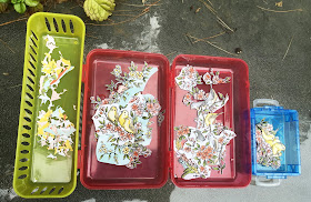
The next photo shows my set-up for cutting on the deck. The blue container on the far right holds pieces that are completely cut. The double red container in the center holds the pieces that I am working on. I take pieces from the right side, make a cut, and transfer it to the left side. I know it's a weird way to do things.The real reason I do it this way is that I have terrible arthritis in my hands, and if I cut too long on one piece, my hands get quite sore. This way, the cuts are brief, and I have a few beats in between to rest my hands.

Finally, the yellow container on the far left is my garbage can, where I drop any scraps that result from my cutting.

Don't you love that the three containers are in the primary colors? I do! Weird again, I know.

When my cutting session is over, I put all the in progress pieces on one side of the red, scoot them all to one end, cover the blue container and set it in the empty space, leaving just enough room for my Paper Snips. I snap the red container closed and slide it sideways into the yellow one. An easy way to transport everything in and out of the house.


The next photo shows the card resting against a curved uncut piece of the DSP 
from which my focal point was cut.


And here is an identical piece all ready to find its new home on a card creation:


As far as putting the card together, my card base, as well as the piece which has cord wound around it are both in Very Vanilla. The flowers in the image are actually white and yellow, but I thought the Very Vanilla would be a softer choice than the more stark look of Whisper White.

I ran the corded piece through my Big Shot inside the Subtle embossing folder (page 199 of the Annual Catalog). This folder adds SUBTLE texture and a little bit of class without overwhelming anything else.

Although the photos don't depict the colors of the oval and the pointed label correctly, the oval is actually Pool Party, while the pointed label is Mossy Meadow. 


Obviously I have a whole lot of fussy cutting going on, so I am sure you will be seeing other creations featuring these images in the future. Stay tuned!

Fussy
Smiles.


July 13, 2019

DIAMOND DUST BIRDS

 A week ago, I presented to you my first attempt at the Diamond Dust Technique. In that card, I'd stamped colorful floral components all over a piece of Whisper White cardstock, then did the technique.

While I was very happy with that card, I kept thinking about other options throughout the week following the creation of my original card. Finally, on Thursday, I couldn't stand it any longer, and dipped into the Diamond Dust Technique once again, and this is what resulted:


I had a lot more invested in this project, because, instead of simply randomly stamping all over a background, I stamped in Memento Tuxedo Black ink the four birds on the flowering branch. I then proceeded to take my time coloring in the image with Stampin' Blends. I also separately stamped three flowers and colored them to match the blossoms on the branch..

Because I was going to be covering my branch of birds and my three flowers with the Diamond Dust technique, I was glad I had the smarts to take a photo of all the colored images before I went on with the technique. You see, I wanted to find out if I would lose any detail and/or color after applying the technique.

This is a photo of the images just colored with the Stampin' Blends:


Although this next photo is of the completed project, I wanted to draw your attention to the two pearls on either side of the points of the label on which the birdies rest.

 Isn't it cool that they match my project?


The next photo shows just how easy it is to have matching embellishments. Simply take one of the Stampin' Blends you used on a project, and color as many Basic Pearls (or whatever) you need for your project. So easy! 


Back to the business at hand: doing the Diamond Dust Technique over my birds and flowers. 

The completed card shows that it was a success, and I actually didn't really lose much of the detail or intensity of color once it was done.


Although this next close-up shows a more powdery look, it isn't actually like that. I guess it's just how the light is catching the shimmer and sparkle. 


As in my previous project, once my images were stamped, I covered them with VersaMark. Then, at the Heat Station, I poured the leftover Clear Embossing Powder/ Dazzling Diamonds Glitter mixture from my first project over the VersaMarked images and heated them until they were set. 

I then used one of the Stitched Nested Labels (page 196, Annual Catalog) to cut out the bird image. I fussy cut the three separate flowers.


To finish off the card, I embossed Calypso Coral cardstock with the Country Floral 3D embossing folder (page 198, Annual Catalog) to echo the leaves and flowers on my focal point.

I should point out that, even though it appears in these photos as navy blue, the card base is made of the lovely new In Color cardstock, Pretty Peacock to match the bodies of the birds.


I don't have enough of this special mixture left to do any more projects. But, I love the look of it, and the ease with which you can get this awesome look, that I foresee myself mixing up another batch for future projects. 

How about you? Have you tried the Diamond Dust Technique yet? Do you like the looks of it?

Dusty
Smiles.

July 9, 2019

WATERFRONT

Have you used the Waterfront set (page 125, Annual Catalog) lately? Or at all? Are you familiar with it? Do you realize that it's a power-packed stamp set that costs only $17.00? 

Well, personally it is a set that I love, but forget to use for long periods of times. 

It came to mind recently, so I decided to work up a card that my girls could make at the July Stamp-In Workshop, which was held yesterday. 

This is the card I had for the workshop:


I gave the girls the option of choosing their own background, all taken from the same retired stack of Designer Series Paper, which I think coordinates so well with this set, especially with the palm trees present.


After seeing only my sample thus far, it was so interesting to check out the way the looks of the cards changed depending on the DSP they'd selected.


After the workshop, I made another card using a different design than in my sample. I am so pleased with the look of it.


Other than a different sentiment and the change in DSP from my sample, there is one more change in this card. Can you spot it?


The photo makes them looks weird, but notice the three Pool Party colored sequins in the foreground of the scene. 

Once I'd had my scene all stamped, I noticed a little spot of ink where it WAS NOT supposed to be. I thought about just leaving it, but I can't do that, when it's so easy to rectify the situation. I covered up my mistake with a sequin, then added two more to make it an uneven number.

Can you spot where the mistake was? No? Good! 
It is under the sequin farthest to the left. 


Follow for a tutorial on how to make this fun card that would be appropriate for any number of occasions. Even those elusive MASCULINE cards!

SUPPLIES:
Whisper White cardstock
Tropical Designer Series Paper

Waterfront stamp set (page 125, Annual Catalog)

Old Olive ink
Crushed Curry ink
Garden Green ink
Soft Suede ink
Crumb Cake ink
Pool Party ink
Bermuda Bay ink

Big Shot
Stitched Nested Labels (page 196, Annual Catalog)
Stampin' Dimensionals
Braided Linen Trim (page 174, Annual Catalog)

INSTRUCTIONS:
Fold a 5 1/2" x 8 1/2" piece of Whisper White cardstock in half, creasing it well with a bone folder.

Choose a piece of the tropical Designer Series Paper for your card, and cut it to 4" x 5 1/4". Set it aside for now.

Build your waterfront scene on a piece of Whisper White cardstock that measures 3 1/4" x 3 1/2", starting with the large stamp of water at the bottom in Pool Party about 1/2" up from the bottom. Add the water reflection in Bermuda Bay ink. Above that, stamp the sandy beach in Crumb Cake, then the mountain in Old Olive. The palm tree trunks are done in Soft Suede, while the tops of the trees are in Garden Green. Finally, place the sun to the left of the mountain in Crushed Curry.

Once the scene is all stamped, use Stampin' Dimensionals to adhere it to the DSP, keeping even margins at the top and sides.

About an inch from the bottom of the DSP, wrap a 12" length of Braided Linen Trim around it, knotting it just left of center. This can always be shifted around once you are working with the sentiment.

With the Stitched Nested Labels dies, cut a piece that measures 1 3/4" across. Choose a sentiment that will fit this size and stamp it in Garden Green onto this label.

Adhere the sentiment to the DSP over the braided cord so the right point of the sentiment is about even with the lower corner of the scene piece using Stampin' Dimensionals.

Once you are happy with the placement of the cord/sentiment, add the finished piece to the card base.


Tropical
Smiles.


July 6, 2019

DIAMOND DUST TECHNIQUE

I follow a few fellow Stampin' Up! demonstrators on YouTube. Each night, as a bedtime treat, I go to my YouTube channel and feast on a few of these wonderful videos, hoping some of the talent and creativity would transfer to me via osmosis.

The other night I was fascinated with what was presented in a video by Shelly Godby of Stamping Smiles. She mourned the fact that Stampin' Up! had retired the Iridescent Embossing Powder, and decided to try on her own to duplicate the finished look you get when using that embossing powder.

She divulged her "recipe" for her new embossing powder. (Thank you, Shelly!) What she created with her newly-minted technique, which she refers to as Diamond Dust Technique, was beautiful. 

I was intrigued enough to give it a try on my own. Unfortunately, as I'd said previously, I watch these videos at bedtime. So, I wasn't about to run down to my Creation Station to try out Shelly's technique right at that time. 

But, the next day, I was down there trying it! 

Unfortunately the photos cannot capture the glistening effect of 
Shelly's Diamond Dust Technique, but this is what I created:


I know the photo shows up a few sparkles here and there. Imagine those few sparkles multiplied by thousands, and you will realize how wondrous this technique looks in real life!


I kept trying to capture the look in a photo, but failed every single time. I guess you'll just have to try the technique on your own to appreciate how cool it really is!


According to Shelly -- and the recipe I used for my card -- to concoct your own mixture, mix in a separate container (I used an empty embossing powder jar) equal parts of Clear Embossing Powder and Dazzling Diamonds Glitter. I had a gelato spoon handy, so I simply used two scoops of each for my "embossing powder".

To do the technique, stamp a piece of Whisper White cardstock as you wish. Once you are happy with your stamping, take VersaMark ink directly to the entire surface. Make sure that your VersaMark is quite fresh, because you want a good even layer of it on all spots in order for this to work properly.

Once your piece is all VersaMarked, pour your mixture all over, being sure that every single spot is covered with the glitter/embossing powder combination. Tap excess back into its container for another time. Then, with the Heat Tool, melt the powder. It is difficult to see when it starts to melt, so be careful. When you think it is all embossed, tilt it and check for any powdery spots that the heat may not have melted completely and take the Heat Tool to it once again.


Seriously, once you finish this technique, you will want to cover up as little of this piece as possible.

Set the piece aside to cool completely -- and so you can admire it as you work! -- while you finish up the remaining elements for your card. For mine, I'd added a strip of the 5/8" Polka Dot Tulle Ribbon (page 175, Annual Catalog), mostly because it is lovely, BUT it is see-through.

I then added a simple sentiment on an oval label cut with the Stitched Shapes Dies (page 196, Annual Catalog) and a weird little flower I put together with a small Basic Rhinestone in the center to try to mimic the glistening of my background.


If you would like to watch Shelly's charming video for yourself, you can access it HERE. And, be sure to subscribe to her channel. She always has great ideas!

Thanks again, Shelly, for sharing your creativity with us!

Glistening
Smiles.