Navigation Bar

September 28, 2019

LISTEN!

 In my PREVIOUS POST I was excited to share the wonderful art supply I found at Dollar Tree. Remember?

Below is the first card I created with this wondrous art supply:


In that post I also noted that, not only had eight cards come out of that ONE DOLLAR art supply thus far, but I still had some panels left. Since all of the leftover panels had flaws, i.e., green rhinestones missing, I cut one of the panels into four squares. And used three of them in the following card:


 The card is a very odd size: 3 1/4" high and 5 1/2" wide. After I'd put together the focal panel, I didn't want to add just too much more to it.

Notice the three little frames that I'd cut from copper metallic cardstock on which I adhered my little treasures. That particular frame is one of 11 darling frames that come in the Ornate Frames Dies, which can be found on page 53 of the Holiday Catalog.

I know the samples using these frames are all Halloween-related. But I saw year round possibilities for all of them. So I ordered a set. And I'm glad I did. They arrived the other day, and they are too cute.


 After mounting the bling-y pieces onto the copper frames, I added them to a 2" x 5 1/4" strip of the woodgrain Designer Series Paper that was available last year. Loving this paper, I have been hoarding it for projects such as this one. I'm so glad that I have a selection of "woods" to work with.


I didn't want to make this a regular card that I was going to send to someone. I wanted to keep it for myself. Looking at all the possibilities for sentiments to run across the bottom, I came across this particular one, which I've never used. At that moment, I decided to make it sort of a motivational inspiration for me to look at on a regular basis.

I don't always feel like it's true. But we are ALL capable of amazing things! I just need to be reminded of that once in awhile.

Well, that's nine cards already made using this single sheet of Dollar Tree bling. I love the stuff! My mind is already working on how I can use in my next creation. 

If you had this wondrous sheet, how would you be using it?

Bling-y
Smiles.


September 24, 2019

COPPER LEAVES

I love it when I discover "strange" and nontraditional "art supplies" to use in my cardmaking! 

A few weeks ago, I was at the Dollar Tree, and among their fall decor, I came across something that I could not resist buying for $1.00. Admittedly, the one that I ended up purchasing was not the first one I came across and was about to buy. The first one featured acorns. When I proceeded to pluck it off its hook, I noticed that the one underneath it had LEAVES and a slightly different color palette. Excitedly I rummaged through the rest of the selection and finally settled on copper oak leaves.

What is this woman talking about you ask???


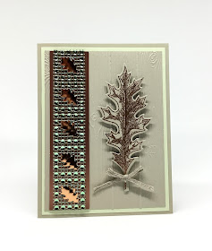
Notice the lovely strip along the left edge of this card. Difficult to describe, but the single piece I bought was enough for I think 12 cards at the size I ended up using. It was a floppy flat piece that contained pale green rhinestones and copper oak leaves. I was able to cut the sheet into 12 sections the size of the one on my card. 

Of course, when I got home and started working with the sheet, I discovered a few places that were missing the rhinestones. It worked OK, however, because I only ended up needing eight strips.

This ONE DOLLAR sheet also had a peel-off strip that exposed adhesive on the back! 

The card in this post is the one I created for my girls to make at the September Stamp-In Workshop. They were so excited about this piece that several of them were planning on visiting our Dollar Tree to pick up some of their own. 

Editor's Comment: I was at Dollar Tree today, and they had them again, only this time with pumpkins and skulls on them! I resisted and didn't buy any Halloween ones.


I added the jeweled strip to a slightly wider strip of a copper metallic cardstock.

Because I was dealing with leaves, thus TREES, I decided to put a modest embossed wood look background in Sahara Sand as the backdrop for the card.


I just so happened to have in my stash this lovely vintage oak leaf stamp, as well as the coordinating die to cut it out. The leaf also was done on Sahara Sand cardstock, diecut and popped up against the embossed background with Stampin' Dimensionals.


Although it doesn't show up at all in these photos, the rhinestones on my expensive strip nicely coordinated with Soft Seafoam cardstock, so that is what the embossed piece rests upon.


Adding a bow created with the new 3/16" Braided Linen Trim (page 174 in the Annual Catalog) and attached to the stem of the embossed leaf with a Glue Dot, gives the card just a bit of soft dimension.


If you keep on reading, I will share with you the supplies and instructions to make a card similar to this. Hopefully your Dollar Tree has some of these jeweled treasures for you to snap up!


SUPPLIES:
Soft Seafoam cardstock
Sahara Sand cardstock
Copper Metallic Cardstock

Vintage Leaves stamp set (retired -- <sob>)

VersaMark ink

Big Shot
Pinewood Planks 3D Embossing Folder (page 199 in the Annual Catalog)
Retired leaf dies
Embossing Buddy
Copper Embossing Powder
Heat Tool
Strip of leaves and rhinestones
3/16" Braided Linen Trim (page 174 in the Annual Catalog)
Glue Dots
Stampin' Dimensionals

DIRECTIONS:
Fold a 5 1/2" x 8 1/2" piece of Sahara Sand cardstock in half, creasing it well with a bone folder.

Add a 4" x 5 1/4" piece of Soft Seafoam cardstock to the card base.

Run a 3 3/4" x 5" piece of Sahara Sand cardstock through the Big Shot inside the Pinewood Planks 3D Embossing Folder. Adhere this over the Soft Seafoam layer.

After tearing the protective strip off, adhere the decorative strip to a 1 1/4" x 5" piece of brushed copper cardstock. Attach this to the left side of the card, leaving a margin of the embossed cardstock at the left edge.

Rub the Embossing Buddy over a piece of Sahara Sand cardstock that measures 2" x 4 1/4". Stamp the oak leaf in VersaMark ink. At the Heat Station, cover the stamping with Copper Embossing Powder, tapping the excess powder back into its container. Use the Heat Tool to melt the embossing powder.

Using the oak leaf die, cut out the embossed leaf with the Big Shot.

Tie a 6" length of the Braided Linen Trim into a bow, snipping off the excess. Use a Glue Dot to attach the bow to the stem of the leaf.

Use a few Stampin' Dimensionals to attach the finished leaf to the embossed area.

If you can't find some of this luscious treasure at your Dollar Tree, you can always replace that piece with a 1" x 5" strip of Designer Series Paper that coordinates with your other elements.


I plan to use my card as autumn decor.

Are you always on the lookout for something out of the ordinary that might work well on a card?

Treasured
Smiles.


September 21, 2019

SCRAPPY SPOTS

 Lately I have been making a truly concerted effort to use up some of my scraps. I have strips and chunks of Designer Series Papers from years back. I just, in good conscience, cannot throw anything away that could maybe be used in a future project. A piece has to be pretty tiny to escape my clutches.

This past Monday, I held my monthly Stamp-In Workshop, and one of the cards the girls created used up a nice handful of my strips of DSP, and gave them cute unique cards at the same time. I even let them have free rein in choosing and using any of my Stampin' Up! ribbons for this project.

Anyway, back to using scraps. A couple days ago I was leafing through an old issue of the Stampin' Up! Demonstrator magazine we receive called Stampin' Success. Each issue always boasts at least one or two good techniques and/or ideas we can use in our cardmaking. In this particular issue, I came across another scrappy idea.

Although, as I already mentioned, it was an old issue, so the embossing folder that was used in the example is retired. The embossing folder featured 3/4" raised dots. The idea in the article was to cover a few of these dots with circles of DSP of the same size.

I grabbed the container of all the strips the girls used last Monday and chose all those that would accommodate the 3/4" circle punch. I then somewhat sorted these strips into color families. The next step was to choose a few prints that I thought would work well together.

My choosing didn't take long. They were three designs in a REALLY old Night of Navy DSP, along with a more current design that was Night of Navy along with Call Me Clover. I've always loved navy and green together, so I grabbed these strips and punched out nine circles.


Once I had my nine circles punched out, I sponged the edges of each of the circles lightly with Night of Navy ink to cover up the white paper core that showed after the punching.

After embossing a 3 3/4" x 5" piece of Night of Navy cardstock, I placed my 3/4" dots around where I thought they'd look good. I left the center blank because I wanted to add a sentiment, which you can see in the upper right corner of the photo. Once I was happy with my placements, I glued them into their spots. 

As you can see from the photo below, some of them extended beyond the edges of the cardstock. I simply trimmed them even with the edges with my paper trimmer.


The following photo shows the card from an angle to show off the raised dots. I love the look.

My sentiment panel included the Stitched Nested Labels from page 196 in the Annual Catalog. The center label, which features the sentiment stamped in Call Me Clover, is a shaped label. I cut another label from Call Me Clover cardstock so the stitching would show up once again on that piece. But I left it in a rectangular shape rather than the label shape to give it a bit more interest.


A little embellishment of Night of Navy corduroy ribbon finished off the card with a decidedly masculine feel.


Just curious: how small does a piece of cardstock or Designer Series Paper need to be before you throw it in the garbage? 

Scrappy
Smiles.


September 17, 2019

CREEPY

The other day I had a brain inspiration. One that I thought might work especially well for a Halloween card.

Not having used any of my old Stampin' Up! background stamps in quite some time -- years?? -- this is a technique that would require one of them. At least, my brain thought so.


I thought the background stamp that looks like a ragged piece of old gauze would be ideal for this attempt at creepiness.

After rubbing Whisper  White cardstock well with the Embossing Buddy, I carefully stamped the gauze onto the paper with VersaMark ink. It is a little tricky to stamp a large background image, especially one that is mounted on wood. 

The way I did this was to ink up the stamp and set it on my work table inked side facing up. I then placed the cardstock on top of the inked stamp, covered it with a piece of scratch paper, and rubbed over the whole thing with my hands, being sure that I rubbed over each portion of the stamp at least once.

It's not until you add embossing powder that you see if you did a good job of stamping your image. After covering the stamping with black embossing powder, I used the Heat Tool to emboss it. And, I lucked out. I'd done a good job of stamping my background.

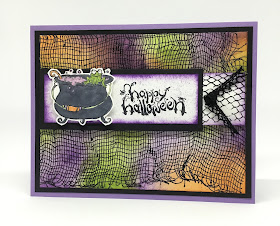
The next step was to choose a few Halloween-y colors. I chose Granny Apple Green, Highland Heather and Pumpkin Pie. Using a stamping sponge, I added the colors over the embossing until the entire piece was covered with creepy purple, green and orange. I was careful to make some areas darker, some lighter. Ca-reeeeepy.


My focal point was an old one, a big black pot cooking up a sparkly purple batch of lizard livers. Mr. Frog was in the thick of things, but keeping a close eye on the concoction while the witch stepped away for a moment -- to go to the bathroom?? Or would it be the batroom?? .

I added sparkles to the potion with Wink of Stella. Although the sparkles show up well in real life, they are not so evident in my photo. 


After stamping and coloring the witchy pot, I fussy cut it, using jagged cuts to add to its creepiness. I added my sentiment to a strip of Whisper White cardstock, followed by the cooking pot popped up alongside it. I sponged the edges and dabbed the sponge lightly inside the edges to make it not quite so white.


At this point, I was sort of stumped as to how to proceed. Nothing came to mind very quickly. The strip with the pot and the sentiment was just not enough to complete the card. It definitely needed something else.

But WHAT???

I finally came up with a solution to finish off the strip, and I am very happy with the end result.

Once I had that strip completed to my satisfaction, I mounted it to my card base with Stampin' Dimensionals.

There! Are you properly creeped out?


Yes, this was just a variation on an emboss resist. I don't remember ever having done it over an entire background stamp, so this was experimental for me. I will definitely be doing it again!


Do you create Halloween cards? How many do you strive to make? Do you use papercrafting to make any sort of decorations or Halloween treats? I just got my Paper Pumpkin kit in the mail today, and it is filled with darling skeleton-flavored treat containers to be created. I can't wait to get started on them!

Creepy
Smiles.

September 14, 2019

FAUX TEARING BIRDS ON A BRANCH

It seems as if I have been on a streak of revisiting age old beloved stamping techniques lately. 

I know I don't have to remind all of you how much in love I am with the stamp set that is shown on page 92 of the Annual Catalog, Free As a Bird. These four birds on a branch have completely captured my heart. I wanted to use it again for a Stamp-In Workshop, and was debating what sort of backdrop for the image would be most effective.

I knew I wanted to incorporate two colors, specifically blue and green. What to do? All of a sudden I got one of those bright lightbulb flashes that I just couldn't ignore.

FAUX TEARING!


I tore several strips of scrap cardstock and went to work with my blue and green, Balmy Blue and Pear Pizzazz. They are both soft colors, which enable me to make a background onto which I can stamp my birdie branch in black ink. And the image would still show up wonderfully. And it would seem to be a combination of leafy tree and balmy blue sky.


I admit that I do have more trouble sponging with the new style ink pads that Stampin' Up! released a few years ago, in that to me it doesn't blend quite as well as the old fashioned ink pads, of which I still have a great many.

The photo below shows the difference in the inks and their capability for even blending. The Balmy Blue is, of course, a new style ink pad, with much juicier ink, while the Pear Pizzazz has as its home an old style pad. 

A fairly simple, but a little time consuming technique, the Faux Tearing look can never displease.


To re-create this card, follow along.

SUPPLIES:
Whisper White cardstock
Balmy Blue cardstock

Pear Pizzazz ink
Balmy Blue ink
Pear Pizzazz ink
Black ink

Curly Cute stamp set (long retired)
Free As a Bird (page 92, Annual Catalog)

Torn cardstock
Stampin' Sponges
5/8" Polka Dot Tulle Ribbon (page 175, Annual Catalog)

INSTRUCTIONS:
Fold a 4 1/4" x 11" piece of Whisper White cardstock in half, creasing it well with a bone folder.

To this card base, add a 4" x 5 1/4" piece of Balmy Blue cardstock. Set aside.

You will be doing this next step on a piece of Whisper White cardstock that measures 3 3/4" x 5".

Tear a piece of scrap cardstock into several strips, varying each one slightly.

Place a torn strip of cardstock somewhat across the top of the white cardstock, and using a Stampin' Sponge, gently sponge the blue, starting on the torn strip onto the white cardstock, holding the strip tightly in place. When you finish with the first line of sponging, use either the same strip or another one and place it down somewhat from the first one. Don't place these strips evenly so to give your background some interest. Keep repeating this, using the matching sponge each time you change color, down to the bottom, until it is completely filled with Faux Tearing.

In black ink, stamp the birds on a branch centered onto this piece.

Take a length of the Polka Dot Tulle Ribbon that is about an inch longer than the inked piece and place it about 1/4" from the bottom, taping the two ends onto the back.

Stamp the sentiment in black ink onto a strip of Whisper White cardstock that measures 5/8" x 3". Adhere this flat over the ribbon to the lower right.

Adhere this completed piece to the card front.


Faux
(NO! they're REAL!)
Smiles.

September 10, 2019

KISSED FLOWER

Here is a technique that hasn't been heard from for a long time -- at least, by me. It's that cool technique known as KISSING. It sounds just so romantic, doesn't it?

I suspect that one of the reasons kissing hasn't been around too much lately is something that I discovered while doing my samples for my blog post. 

The newer style of Stampin' Up! ink pads don't work all that well for the technique. Yup. The new ink pads are so juicy and moist that the colors more or less seep together. Believe me, I tried it many times with lots of colors. The only time I found success doing the kissing technique was when I used the old style ink pads. Quite frustrating. 

Consequently, the only ones that turned out for me -- those in this post -- were done with old style linen ink pads. It just seems to give more individual definition when combining two colors.


I used old style Night of Navy ink upon old style (I feel like I'm talking about beer!) Pumpkin Pie.


To do a little romantic kissing, choose first a stamp that is solid, not line work. Then, for your pattern, choose a stamp that has a design, such as polka dots, that protrudes from the base surface of the stamp.

Ink up the solid stamp (the flower) with a lighter ink or, at least, one that will show after adding a second color. With the second color, in this case Night of Navy, ink up the design stamp (polka dots). Set the inked up second stamp directly onto the inked up solid stamp, pressing it down slightly, but being careful not to slide the stamp around at all. Lift the second stamp directly up from the solid stamp. 

If you've taken a little while to do all this, and your inks may be a bit dry, huff on it, then stamp it on your paper. There! After a little kissing, you have an otherwise plain image with a design all over it! Yay!


Below are two more examples that I did the same day:


Once all the kissing was done, I used the coordinating dies to cut out the flower, added another smaller stamped diecut flower in the center, then finished it off with a Pacific Point button, which actually coordinated really well with the Night of Navy dots. Carrying through with that combo, I added it to a background oval that I ran through the Big Shot inside the Subtle 3D embossing folder (page 199).


To make an oval-shaped card, fold a piece of Whisper White cardstock in half, and then place an oval die over it, with the folded edge slightly inside the oval. Thus, when cut, you will have a little hinge on the top of your card where the die didn't cut all the way through.. 

The only problem with oval (or round) cards is that they don't stand up to be displayed. Grrr.


The next time you're feeling like a little romance, grab a solid stamp and a stamp with protruding design and do a little kissing! Have fun.

Kissed
Smiles.

September 7, 2019

#dailycreating MAY

It's been awhile since I published the last post that featured my drawings from #dailycreating APRIL. So, I thought it was about time to share my favorite May drawings with you.

As part of Terry Runyan's #dailycreating group, we are encouraged to create something every day, obviously. Every Sunday a list of prompts to cover each day of the following week is published on her page. While following the prompts is optional, I find it very helpful to have these "assignments" given to me each day. You know, sort of like Mission Impossible. Working with prompts forces me at times to work outside my comfort zone -- at times, WAAAAAY outside my comfort zone. 

I think these daily forays into drawing are helping my skills to improve. I do all my drawings first in pencil, then finish up with Copic Sketch Markers. As you take a look through the drawings in this post, you will notice that I go through a LOT of gray Copic Markers. A lot. In fact, I needed to make two separate trips to the store just this week to restock a few of my pens. 

You may pick up from my lineup that I am beginning to really really enjoy drawing animals. And, another cool thing, as the result of my research for these various prompts, is I AM LEARNING A LOT! Extra bonus.

Above each of my drawings, I will include the prompt with a hashtag. Under that line, I will also include the name of the critter, if I know what it is.

Here goes. Welcome to May!

#lei

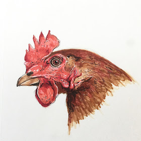
#chicken

 #iris

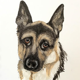
 #dogurday
Westie

 #mothersday
Robin

 #frogjumping
Leopard Frog

#thingonthing
Sloth

#wearingpurple

#bees

 #dogurday

#dragon
Komodo Dragon

 #thingonthing
Tarsier

I suppose I should explain the prompt, #thingonthing. Terry originally started doing this every Wednesday, although her thing on thing was usually #catonhead. People deviate from this prompt a bit, sometimes getting quite creative with their idea of thing on thing. I am guilty of this at times myself. 

In fact, a few weeks ago, my husband and I attended our County Fair, and I spent a vast amount of time photographing the fascinating chickens. After drawing the chicken I have featured in this post, I decided I love portraying those incredibly interesting faces. So, if I'm stumped as to a #thingonthing when Wednesday rolls around, I grab one of my photos and sketch a chicken. 

The members of the group -- more than 3,000 now! -- don't mind deviations. We just love to check out what each other is creating on a daily basis.

Also, I know I've mentioned this in previous posts, but one of the prompt options every Saturday is Caturday/Dogurday. That explains some of my hashtags.

Please respect that this is my personal artwork and cannot be used in any form without my express permission. Thanks for that!

Prompt
Smiles.

September 3, 2019

FROU-FROU DIECUT

I am still addicted to the papers in the Bird Ballad Designer Series Paper pack (page 166 in the Annual Catalog). Although I think I am finished fussy cutting -- at least, for the time being -- I have a few uncut sheets.


On this particular sheet of the DSP, there are several more detailed images of birds among the blossoms. You'll notice that, when fussy cutting these branches and birds, I cut close to the bird itself, but left a little white margin around the branches and flowers. I needed to leave a margin because many of the branches were so thin and frail that if I had cut right to their edges, they would either have been much too weak or fallen/torn off completely.

Another thing about this particular card is that, even though it looks quite Frou-Frou, it is completely 2-dimensional, flat as a pancake!

When I had originally finished the card, which, by the way, measures 4 1/2" square, it was simply mounted onto a Whisper White cardstock base. I thought the overall look was too austere and needed just a tad of something else. I know it's a bit out of favor lately, but I opted to do some soft Pool Party sponging around the edges of the card. This made me happy.


I'd had this bird on a branch cut out for awhile, but was hesitant to use it in something. It is so lovely and detailed, anything I could think of doing with it would have diminished it in some way.

Finally, I remembered a Spellbinders die that I had won a few years ago. When I received it in the mail, I was sure I'd never never find a use for something so, well, Frou-Frou. When I thought of it, I wondered if it would be too much for my bird. You know, an overload of Frou-Frou??

I decided it was at least worth a try.

What I ended up doing was die cutting it from Pool Party cardstock. BUT, I didn't remove all of the pieces from the diecut. I carefully preserved a few of the corner pieces as well as the entire inner section of the diecut. My thinking was that with a little more of a solid area behind the bird, it would be much better.

You can see in the photo below just how detailed the bird and blossoms are, 
as well as the very ornate frame for it.


Now, be honest, do you think it's entirely too much?


Frou-Frou
Smiles.