Navigation Bar

January 28, 2020

IT'S MADE OUT OF WHAT??

If you've been following my blog for any length of time, you may think of me as weird. Nontraditional. Entertaining. Frugal. Eccentric. A hoarder. Resourceful. Demented. Nonsense. Out-of-my-mind. Someone-to-be-admired. Creative. Any number of descriptives, some not as complimentary as others. Oh well. I am who I am. 

I am very happy with the place from which my creativity comes. Weird or not.

When working with Pigment Sprinkles recently at a Stamp-In Workshops, one of my girls was about to toss a used paper towel into the garbage. I gasped and grabbed it back out so fast her head almost spun around. "No! This is potential art!" She looked at me like I had finally completely lost my mind. Shrugged and walked away. 

Actually the piece she was about to toss in the garbage did need a bit more work. In that it didn't have quite enough splotches of color on it. 

Just to prove that this hoarding capacity of mine is not so weird, here you go:


Do you like my card? The main background is one layer of color saturated paper towel that most normal people would have tossed in the trash without a a second thought. Especially if it seemed to be saturated and used up. 


To utilize a colorful paper towel in this manner, carefully separate the plys (is that the plural of ply, as in 3-ply?). All of the layers will be colorful, but the top ply will probably boast the most intense color. 

Once you have your desired layer, cut a scrap piece of WHITE cardstock for the base. The one for this particular card measured 3 3/4" x 5". Cut your layer of paper towel so it is slightly larger than this base, about 4 1/2" x 6" maybe? 

Crumple the towel in your hands, loosely uncrumple it. Repeat with the crumpling and uncrumpling a couple of times. Don't ever really flatten it. It's the crumples that give it its character and texture.

Using a good glue stick, carefully cover the entire surface of your base white cardstock, being especially careful on the edges and corners. Very important. 

Working quickly, before the glue starts to dry, place the half flattened crumpled paper towel approximately centered over the gluey piece. Don't pull on the edges! Simply pat gently over the paper towel to push it into the glue, being careful to preserve any creases or wrinkles you can. 

Once you are happy with the texture of your piece, gently bring the excess paper toweling to the back of the glued piece and adhere it all neatly in place. 

From there, you are all ready to proceed with your creation!

FYI, the reason I specified that this base be WHITE is that, well . . . I didn't really think it mattered. For my first one, I used a piece of pale gray scrap cardstock. Yuk. A very toned down nondescript piece that DID go right into the garbage. So, for this process, be sure to grab white cardstock for the brightest most flattering colors.


Notice my card sitting atop some more potential backgrounds!


Isn't it amazing how much beautiful texture and dimension you can get 
if you are careful with your crumpling and gluing down?


Just imagine the potential here:


Tell me now, and be honest. Are you going to look at wet soppy paper towels the same again? Are they going to be tossed in the garbage? Or are they going to be dried flat and lovingly stacked in neat piles for the future?


Weird
Smiles.


January 25, 2020

POPPY THANKS

Tell me. Who doesn't love poppies? 

Well, to tell you the truth, I didn't. As a kid. I thought their centers were really too creepy for words. But, now that I'm grown up, I have more grown up ideas (in some ways), and I think poppies are lovely.

The cover of the new Mini Catalog had me swooning.That breathtaking cover succeeded in doing just that -- took my breath away -- the first time I laid eyes on it. All those poppies. Sigh.

But wait!

There is lots more poppy love inside the catalog, on pages 24 - 27. If you love poppies, please do yourself a favor and check out these pages. 

Unfortunately, so far the only purchase I've made from these pages is the Painted Poppies set on page 26. FYI: I love this ENTIRE catalog, so I have to proceed slowly. Right?

Once I got my hands on this set, I was sure I wanted to create a card for my girls to make at my January Stamp-In Workshop. 

This is the card I came up with:


I used the large poppy stamp for the background stamping on -- you guessed it! -- Poppy Parade cardstock. For the two focal point poppies, I stamped two of the smaller poppy onto Whisper White cardstock with Memento Tuxedo Black ink and used, yup!, the two shades of Poppy Parade Stampin' Blends to color them in. 

Obviously, since this is the only poppy-themed item I own, and don't have the dies that do the fussy cutting for me, I (and the girls) had to fussy cut these two small poppies.


Just a couple of Stampin' Dimensionals under the left poppy give the card a modest amount of dimension. Ideal to stick in the mail.


Below you see a closeup photo of the two fussy cut poppies perched atop their black diecut frame, which used the Ornate Frames Dies from the 2019 Holiday Catalog. Happily, this set of dies is one of the items from the Catalog that are still available. Their product number is 150664.


Following you will find a tutorial on how to recreate this card.

SUPPLIES:
Poppy Parade cardstock (of course!)
Basic Black cardstock
Whisper White cardstock

Itty Bitty Greetings (page 30, Annual Catalog)
Painted Poppies (page 26, Mini Catalog)

Memento Tuxedo Black ink
Poppy Parade Stampin' Blends, both Light and Dark

Big Shot
Ornate Frames Dies (item #150664)
Stampin' Dimensionals

DIRECTIONS:
Fold a 4 1/4" x 11" piece of Whisper White cardstock in half, creasing it well with a bone folder.

To this card base, add a 4" x 5 1/4" piece of black cardstock.

Stamp in Memento Tuxedo Black ink the larger poppy image randomly onto a 3 3/4" x 5" piece of Poppy Parade cardstock, starting with a poppy near the center and working out from there, turning the stamp so the poppies aren't all facing the same way. Be sure to add pieces of the poppy to the edges also so the entire paper is covered with wall to wall poppies.

from black cardstock, die cut the large ornate frame, as well as the smaller one for the sentiment, using dies from the Ornate Frames Dies.

On a scrap of Whisper White cardstock, stamp the smaller poppy twice. Use both of the Poppy Parade Stampin' Blends to color them, doing a little blending.

Fussy cut the two flowers. Add one to the right of the large ornate frame, adhered flat. Tilting the second flower a bit, add this one to the left, but pop it up with a couple Stampin' Dimensionals.

Adhere this flat to the card front, about 1" - 1 1/4" from the top.

Choose a sentiment from the Itty Bitty Greetings that will fit on a 1/2" x 1 1/2" strip of Whisper White cardstock. Stamp your chosen sentiment. Add it to the smaller of the ornate frames.

Adhere the sentiment flat below the poppies.


Poppy
Smiles.

January 21, 2020

ADD-ON BUNDLE

As it always is, the August 2019 Paper Pumpkin kit was adorable. The contents of the kit were meant to be used to make fall-flavored treat bags. 

Well, Stampin' Up! hadn't done this before -- at least, not to my recollection -- but to coordinate with this kit, they also offered an add-on bundle. With this bundle, rather than use the kit elements to create treat bags -- something which many Paper Pumpkin subscribers may have no need for -- the add-on bundle enabled purchasers to make cards instead. 

There were two card designs in the bundle. Two of my stamping friends, who had also purchased the bundle,  got together with me at my house and we had a lovely time making card after card after card. The possibilities were endless, especially if you were willing to dig through your stash for even more creative elements. 

While I did make many of the cards using the Paper Pumpkin components, I eventually moved on to a different drummer. As I almost always do. I still used the cute card bases, which measured 3 1/2" x 5" with matching envelopes, but I incorporated a few other elements.

Do you recall, when the new Annual Catalog was released in June of 2019, there was a Suite, 
Bird Ballad Suite (pages 90-92), that cause a lot of excitement? One part of this Suite was the lovely Designer Series Paper, found on page 92. 

Several of the sheets of this DSP consisted of many many birds. Being an avid fussy cutter, this was right up my alley. Balmy summer days on the deck found me cutting away at these birds (and feathers) until I had more birds than I knew what to do with. 

I grabbed the packet of birds I'd fussy cut and added a few of them to three of the cards I made with the Add-On Bundle. I love how they look in their new homes!

This first card used a burgundy diecut circle that came in the Paper Pumpkin kit. After digging through my many past Paper Pumpkin kits' stamp sets, I came across one that I decided to use on the card. That stamp, the lined circle, was stamped on the circle in VersaMark ink, then embossed with white embossing powder. I took some of the snazzy ribbon that came in the kit and added it in loops to the lower right of the embossed circle. I also added a diecut tan branch that came in the kit. My cute fussy cut bird is perched atop the branch.

Using another stamp from the kit where I found the lined circle, I stamped "happy" in Merry Merlot on Whisper White and popped it up with Dimensionals above the bird's head. Inside is the rest of the sentiment, "birthday" in the same font and color.


The second card is much simpler than the first. I used the other style card base, which is a gorgeous Pretty Peacock color, with the autumn wreath already printed on the card. I simply added another of the tan diecut branches and perched another of my fussy cut birds on top of it.

This card obviously can be used for any number of occasions. It would even work well for a masculine card!


The third card is also quite simple. Using one of the diecut circles again, I stamped the word "thanks" in VersaMark and embossed it with white embossing powder.  This stamp with the awesome calligraphy is from another past Paper Pumpkin kit.

Our fussy cut bird is perched atop another diecut leafy piece that came in the August Paper Pumpkin kit. 


There! Now I have three fairly simple cards on hand. And three of my fussy cut birds found permanent homes!

OK. This next thing is something a little weird about me. Each evening I draw the prompt for the next day for the #dailycreating group. As I am shutting down for the night, I close my computer, stand the night's prompt drawing on its easel on the cover of the computer. I also usually add a card or two (or three) that I'd been working on. So, when I come into my room in the morning, I am greeted by a little creative tableau that I'd set up. Weird, huh? The photo shown below is what I got up to this morning.

FYI, as soon as I publish this post, I am going to finish my drawing for tomorrow, which happens to be of a young orangutan's face. I have it all drawn, but it's the coloring that takes me forever. So, wish me luck!


Stay safe and warm.

Add-On
Smiles.


January 18, 2020

TWO COLOR EMBOSSING

Do you love the look of heat embossing? Especially when a metallic embossing powder is used? Gold? Silver? Copper? Or my all time (retired) favorite, Pewter? They are all so lovely and always succeed in making a creation extra special.

Have you ever combined two different embossing powder colors? 

In my card today, I have combined gold and silver in the same background. While it may seem complicated and fussy to do, it really isn't. You just need to take some extra precautions to avoid contaminating any of your embossing powders.


I started out with a piece of Whisper White cardstock. 

My first step was to rub the Embossing Buddy really well over the entire piece before stamping. This prohibits embossing powder from sticking where it's not wanted. An easy enough step to take, but so necessary. It saves a lot of heartache. Believe me. I know.

Using a stamp of little snowflake clusters, I stamped randomly with VersaMark ink, leaving lots of space between the stamping. Starting with gold embossing powder. I sprinkled the stamping with the gold, tapping the excess off the stamped piece back into its container. Using the Heat Tool, I heat set the gold snowflake clusters.

When I am doing embossing, I always have a fresh page from an expired mini catalog to work on. As soon as the embossing is done, I dispose of this page. Clean away any signs of that first embossing color. 

I then went back to my work table and used the Embossing Buddy again, then filled in the spaces left over from the first stamping with the same snowflake clusters, once again in VersaMark ink. 

At the Heat Station, I this time added SILVER embossing powder to the new stamping. Since the gold was all finished and heat set, this new embossing color won't affect it at all. Tap the excess silver embossing powder back into its container. Use the Heat Tool to set the embossing powder.

Immediately throw away the page you'd done the silver embossing on.

By being intensely careful about disposing pages from embossing immediately after finishing, you run very little risk of mixing any of the embossing powders together. 


There! In two simple steps you now have both silver and gold clusters of snowflakes on a white background.

The next step involves some sponging. Bringing in Balmy Blue ink, I carefully sponged over the embossed white cardstock, making it lighter and darker in areas. 

Because I didn't want to cover up just too much of my two color snowstorm on Balmy Blue, I elected to adhere three beautiful snowflakes die cut from Whisper White with the Seasonal Layers dies, found on page 195 of the Annual Catalog. Have you checked out this set of dies? Please do so. There is such a variety of beautiful seasonal pieces.


To pick up a little bit on the silvery of half the embossing, I added Basic Rhinestones to the center of each of the diecut snowflakes. Don't they look pretty?


To create the blue on blue look of the background polka dot piece, I used a Sponge Brayer (page 181 of the Annual Catalog) over the dotted Pattern Party Decorative Mask, found on page 181, also in the Annual Catalog. I inked the brayer with white ink.

After using sticky tape over Night of Navy cardstock to hold the mask in place, I rolled the inked up brayer over and over across it. Lifting up the stencil for a quick peek showed me if I was getting the ink dark enough. If not, tape it back in place and give it a few more runs of the inked brayer.


With the exception of the three Basic Rhinestones at the centers of the three snowflakes, the only dimension in this card comes from the central snowflake panel that I popped up with Stampin' Dimensionals onto the polka dot piece.


A beautifully simple card, it doesn't really even need a sentiment. Living in central Wisconsin, this card can be used for any number of occasions.

Now, give two color embossing a try. Just be careful to not mix any of the embossing powders together. Have fun!

Metallic
Smiles.

January 14, 2020

PIGMENT SPRINKLES WATER LILY

Stampin' Up!'s annual promotion, Sale-A-Bration, is in full swing, and will be through March 31. During this time period, for every $50 you spend with Stampin' Up! (before tax and shipping), you qualify for free product. The SAB brochure is chock full of goodies to choose from.

Because this is the best time of the year at Stampin' Up!, I wanted to feature some of these items at my monthly Stamp-In Workshop, which was held yesterday, January 13.

Lots of goodness is included in the card I posted today, Pigment Sprinkles Water Lily. Three of the items, the stamp set that contains the water lily and lily pad, the dies that cut out these two pieces (and lots more!), as well as the lovely Designer Series Paper you can see in the background of the card, are all free items you can get during Sale-A-Bration!

Other featured product includes the new Label Me Fancy Punch, found on page 41 in the new Mini Catalog, the beautiful sentiment from the Bird Ballad stamp set on page 92 of the Annual Catalog, and then the perky little enamel Melon Mambo triangle found near the sentiment, which is from he Dinoroar Enamel Shapes, page 178 of the Annual Catalog. Oh! And last, but perhaps most important, the "paint" used to color in the flower and the lily pad was made with PIGMENT SPRINKLES, which you can find on page 179 in the Annual Catalog. Whew!


The card is fairly easy to put together, partly in thanks to the lovely Designer Series Paper that makes creating a card quite effortless -- so much of the work is done for you!


We used Memento Tuxedo Black Ink to stamp the water lily and its pad on watercolor paper. The paint was created with a few Pigment Sprinkles in Melon Mambo and Granny Apple Green and a spritz of water, in conjunction with Aqua Painters. 

Using the Memento ink, the colors seemed to bleed a bit. So, I tried it again using StazOn black ink. This didn't bleed at all, but made for a very pure Melon Mambo and Granny Apple Green. Which looked great. But this more painterly look that the Memento ink yielded more closely resembled the painted background of the DSP. So, that's what we decided to go with.


I know that sponging isn't as much in vogue anymore as it was some time ago, but this poor naked little sentiment looked just so lost and out of place that I dragged out my stamping sponge and Melon Mambo ink, and treated the edges to a touch of pink. I love how the pink livened it up!


Following you will find the Supplies List and Instructions on how to re-create this card for yourself. Please note that, if you opt to not get the dies that cut out the flower and the lily pad, they are very simple to fussy cut. Although the die set does contain some other wonderful dies such as a leaf stalk and a nifty edging. Just saying.

SUPPLIES:
Watercolor Paper
Whisper White cardstock
Bermuda Bay cardstock
Lily Impressions Designer Series Paper (page 6, Sale-A-Bration brochure)

Lovely Lily Pad stamp set (page 5, SAB brochure)
Bird Ballad stamp set (page 92, Annual Catalog)

Memento Tuxedo Black ink
Melon Mambo ink
Pigment Sprinkles in Melon Mambo and Granny Apple Green (page 179, Annual Catalog)

Big Shot
Lily Pad dies (page 4, SAB brochure)
Stampin' Dimensionals
Dinoroar Enamel Shapes (page 178, Annual Catalog)
Stamping Sponge
Label Me Fancy Punch (page 41, Mini Catalog)
Aqua Painter (page 180, Annual Catalog)

DIRECTIONS:
Fold a 4 1/4" x 11" piece of Whisper White cardstock in half, creasing it well with a bone folder.

To the card base, adhere a 4" x 5 1/4" piece of Bermuda Bay cardstock, followed by a 3 3/4" x 5" piece of the Lily Impressions Designer Series Paper.

In Memento Tuxedo Black ink, stamp the large water lily and the large lily pad onto a 3" x 6" piece of watercolor paper.

Add a few sprinkles of Melon Mambo Pigment Sprinkles to a paint well. Spritz with water to liquify the powder. Using an Aqua Painter, color in the water lily.

Before moving onto another color, write with the Aqua Painter on scratch paper until the water runs clean. Repeat the same process with the Granny Apple Green sprinkles in a separate well and paint the large lily pad. Once these are dry, use the proper dies to cut them out with the Big Shot. If you do not have the dies, fussy cut the pieces, leaving narrow borders of white.

Glue the flower and the lily pad together as desired.

Glue the completed flower to the right of a 1 1/2" x 5" piece of Whisper White cardstock.

On a scrap of Whisper White cardstock, stamp the sentiment in black. Punch it out with the Label Me Fancy Punch. Sponge the edges of the label with Melon Mambo ink. Add a Melon Mambo enamel triangle tilted in the upper right corner.

Use a few Stampin' Dimensionals to add the sentiment to the white strip so it balances the flower.

Adhere the finished strip flat to the card front, about 1" down from the top of the DSP.


Water 
Lily
Smiles.

January 11, 2020

DO AS I SAY, NOT AS I DO

Notice the title of this post: DO AS I SAY, NOT AS I DO. Yup. You've heard that before, I'm sure.


We are in the midst of winter here in central Wisconsin. The Holidays are over. But wintry conditions still remain for . . . oh, another four months?? 

These cute rows of houses, die cut from Gray Granite cardstock, were begging to be used in a winter-time card. 

With that in mind, I proceeded to create my wintry card, suitable for any of many occasions. Just because it says "Warm Wishes" . . .  Yup. Those are the kind of wishes we will be sending for the next several months.


I showed the following photo because it depicts the snowflakes present in the Balmy Blue sky so well. I had originally carefully brayered white ink over the embossed raised snowflakes, but, unfortunately, the white didn't show up too much. 


If you would be interested in getting a set of these cute dies, they are on the Stampin' Up! Clearance Rack. The link directly to the dies can be found HERE

Seriously, while you are at the Clearance Rack, spend some time browsing around. There are terrific buys on some wonderful products! 

Also keep in mind that we are in the middle of Sale-A-Bration. If you spend a minimum of $50 (before shipping and tax) on the Clearance Rack or anywhere else on the Stampin' Up! site, you will earn free product!


Anyway, I suppose you are wondering what exactly I meant by the title of this post. Here goes:

While making this card, I was so careful to get the little pieces that extended beyond the buildings to line up exactly at the edge of the cardstock. Not a great idea. This resulted in crooked buildings. Yup. See how the top row leans to the left and the bottom row to the right? Grrrrr! 

Everything was glued firmly in place when I noticed this. Oh my! Not feeling like redoing the card and straightening out my buildings, I decided to simply use my misadventure as a teaching tool for the future. 

If you do have these dies, or anything like them, be sure the ends are longer than the edges of the cardstock. Then, concentrate on gluing your buildings in an upright position, followed by trimming the ends even with the edges of the cardstock. 

See? Do what I SAY, not what I DO! My error can be your learning experience.

You're welcome.


Sending you warm winter wishes!

Crooked
Smiles.


January 7, 2020

TIN TILE THANKS

I realize that I show you cards created with the Tin Tile 3D embossing folder fairly frequently. But, you see, I love it. Truly. I find it so exquisite.


This is a card my Stamp-In Workshop girls created back in October. At about that time, I had begun concentrating on sharing holiday themed creations with you. So, now that the holidays are over, well, you know . . .

Isn't the embossing so elegant? Whenever I use this embossing folder, I try to make it part of the focal point so as not to cover up too much of its beauty. 


For this card, I set my container of retired cardstock scraps on the work table for the girls to choose their own fallish color combo. It was so interesting to discover the enticing leaf arrangements they came up with. They were all beautiful.


Following is a tutorial on how to create a card similar to this one. 

SUPPLIES:
Mossy Meadow cardstock
Very Vanilla cardstock
Brushed Copper Metallic cardstock
Variety of cardstock colors for the leaves

Big Shot
Tin Tile 3D Embossing Folder (page 199, Annual Catalog)
Seasonal Layers Dies (page 195, Annual Catalog)
3/16" Braided Linen Trim (page 174, Annual Catalog)
Glue Dots
Stampin' Dimensionals
Thanks die of choice

INSTRUCTIONS:
Fold a 5 1/2" x 8 1/2" piece of Mellow Moss cardstock in half, creasing it well with a bone folder.

Use the Tin Tile 3D embossing folder to emboss a 3" square of copper metallic cardstock.

Adhere the embossed piece to a 3 1/2" square piece of cream cardstock.

With your chosen die, cut the word "thanks" from the matching cream cardstock. Adhere the word to the bottom of the card base, centered and about 1/2" from the bottom.

From a selection of cardstock scraps, choose three papers that would work well as autumn leaves. With the leaf dies from the Seasonal Layers dies, cut one of each of the leaves. Adhere the leaves together in a pleasing arrangement. Add a Linen Trim bow with a Glue Dot to the stem portion.

Glue the leaf bunch to the lower right corner of the embossed copper piece.

Then glue the entire square to the card from about 1/2" from the top edge.


Copper 
Smiles.

January 4, 2020

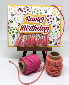
BIRTHDAY FRINGES

My precious granddaughter, Stella, turned 12 a week ago. Being that she was entering the last year known as the tweens, I wanted to make a birthday card that was a little less childish than I have in the past..


It was a fairly ordinary looking card what with the balloons and sequins. But I felt it needed something with just a bit more oomph befitting a girl her age. 

I finally came up with the fringe edge to add to the sentiment piece. When Stella opened the card, the expression on her face confirmed my decision. Usually fairly complacent, she actually thrust the card to her mom and said, "Look!" 


To make the fringe, I grabbed two of my spools of thick baker's twine from Stampin' Up! in colors that coordinated well with the rest of the card.


I cut the baker's twine into several lengths, oh, I don't know, maybe two inches long. After adhering them to the back side of the birthday greeting in alternating colors, I took a piercing tool to loosen the ends of each of the twine pieces. I then unraveled the ends until they made a nice fringe across the bottom.

Adding the piece to the card front with Stampin' Dimensionals allowed the fringe a little bit more free motion than if I'd simply glued it in place.


Happy Birthday, my Stella!


Fringed
Smiles.