Navigation Bar

May 30, 2020

A SNEAKY PEEK

As if you didn't already know, the beautiful new Annual Catalog goes live on June 3! Yesss! I have my personal copy of the catalog in my hands, and it is definitely a beaut. 

We lucky Stampin' Up! demos have the opportunity each year to do a preorder of a select list of items from the upcoming catalog so we can get started on creating to have things on hand for display when the catalog finally goes live. 

Two of the offered preorder items caught my attention immediately, One is the set, A Jar of Flowers. Once you get your own hands on a catalog, you can find it on page 12.

This set features four assorted bouquets, as you will see in this Sneaky Peek, two types of flower holders, including a mason jar-type and a shorter container, stems, a jar lid and a length of stripes.

Wanting to make my bouquets look like the proverbial flowers in a jar, I proceeded to do my stamping in Memento Tuxedo Black ink. I then proceeded to color them in with Stampin' Blends. Underneath each photo, I will supply the list of Blends I used for that particular bouquet.


For this first bouquet, I used: Light Highland Heather, Light Rococo Rose, Light and Dark Flirty Flamingo, Light So Saffron, Light Soft Sea Foam, Light Old Olive and Light Pool Party (for the jar).


The second bouquet uses the following Stampin' Blends: Dark Petal Pink, Bronze, Dark Pink Pirouette (retired), Light Flirty Flamingo, Light Calypso Coral, Dark Mint Macaron, and Light Pool Party (for the jar).


This bouquet used: Dark Purple Posy, Light and Dark Lovely Lipstick (retiring -- quick! order yours!), Light Pineapple Punch (also retiring), Light and Dark Highland Heather, Light Night of Navy, Light Mango Melody and Light Pool Party for the jar.


Our final bouquet features: Dark Daffodil Delight, Light Soft Suede, Ivory, Dark Soft Sea Foam, Dark Mint Macaron, Dark Cajun Craze, Light Old Olive and the jar is done in Light Pool Party.

To make the cards look like a set of four (wouldn't that make a nice gift?), I used one of the Stitched Rectangles dies to cut out each bouquet, another larger one to make the mat from Old Olive cardstock, then finally adhering it to a card base of Mellow Moss.

I also used a narrow craft knife to cut slits in either side of the jar top. Through these slits, I threaded a length of hemp twine and tied it in a bow for each bouquet. If I were to do this again, I think I would simplify this process immensely by just adding tied bows of the hemp twine with Glue Dots. 

Another thing I am definitely going to try is fussy cutting a few of the single flowers in each of the bouquets to pop up for more dimension. Sometime in the near future I am sure I will do this. If they are a success, I will share them with you.

To coordinate with this cute set are a couple other products. including a jar punch (in fact, the jar punch and the stamp set are available as a bundle for a 10% savings!), and Mason Jar Shaker Domes! The Suite also includes other coordinating products such as Designer Series Paper, ribbon, and more.

So, what do you think of your Sneaky Peek? 

Flower-y
Smiles.

May 26, 2020

PEACEFUL POPPIES DSP

Did you ever have a piece of paper you loved so much you were afraid to cut into it? C'mon. You know you have! There are so many luscious Designer Series Paper designs offered by Stampin' Up! There have honestly been times that I purchased an entire pack of DSP because I was in love with a single design in the mix. I ended up hoarding it and hoarding it, saving it for just the right project. 

Years later, it's still in my stash. Uh, no good.

When I received my pack of the Peaceful Poppies Designer Series Paper, there were several designs that I was in love with. Unfortunately, this DSP is scheduled for retirement as of June 2, and I haven't yet used up the pack! As usual.

One of the sheets in this pack is so lovely in its entirety, I wasn't sure how to use it. So I hesitated. 

Finally, I took courage and carried it to the paper cutter. The sheet consists of an identical 12" long design on each of two sides, with a bit of fluff in the center. 

Wanting to preserve the looks of it as much as possible, I cut a piece that measured 4 1/4" x 5 1/2". Yes, the size of the front of a standard card.

I used Stampin' Dimensionals to pop it up onto a same-size Whisper White card base. Although I thought it was lovely as is, I figured I should put SOME sort of effort into the creation of a card.

Following is what I eventually decided to do:


As I said previously, I wanted to preserve the looks of this paper as much as possible, so I was very limiting in what I added to it.


I stamped the single poppy from the Painted Poppies stamp set (page 26 in the Mini Catalog. This set WILL be in the new Annual Catalog!) in Memento Tuxedo Black ink onto Whisper White cardstock, and colored it in with Stampin' Blends. 

Then using two of the precious dies from the Stitched So Sweetly set, on page 20 of the Mini Catalog, I cut out the colored poppy, as well as the tiny sentiment.. This die set too will appear in the Annual Catalog, which goes live June 3.


I popped the tiny sentiment up onto the poppy image, then the whole thing to the card front among the poppies on the DSP. Adding a couple Basic Rhinestones colored with Stampin' Blends finished off the look.


Even though the Peaceful Poppies Designer Series Paper sheet itself gives this card quite a splash in appearance, it truly is a simple card. I think I {love} it.


If you want this lush pack of Designer Series Paper, you have a week before it retires! Quickly!

Poppy
Smiles.


May 23, 2020

A FEW TIPS

I have a couple of good tips for you in this post. At least, I think you'll find them to be good tips, unless you've already discovered these things by yourself.

I love cards that look like paper quilts. Although this card isn't a traditional quilt pattern, this is the kind of quilts I've made in the past. Just equal sized squares of fabric. A patchwork quilt? 

For my card, I decided to alternate the squares with Blackberry Bliss cardstock and Designer Series Paper. I wanted each of the squares to be 1". I've done the 1" squares thing in the past, using my paper cutter. No matter how careful I was in my cutting, they were always -- ALWAYS -- a sliver off. Frustrating indeed. To alleviate this situation, I smartly used my 1" square punch. Every once in a while the brain kicks in.

My card is 20 squares, four across and five down. I've seen cards similar to this one where the creator used partial squares to accommodate the 4 1/4" x 5 1/2" card. Huh. Not necessary. Simply use a 4" x 5" piece of white cardstock as your base. This way your "quilt" goes edge to edge with full squares all around. You then mount it onto a base that measures 4 1/4" x 5 1/4". So it's a quarter inch shorter than a traditional card. It still fits perfectly inside an A2 envelope.


For my card, after I had the quilting done, I wanted it to look even more quilt-like. So I opted to emboss the layer. Because I had used DSP that had gorgeous skeleton leaves all over it, I found an embossing folder that had leaves in it. I thought that would be ideal.


After running the layer through the Big Shot inside the leafy embossing folder, I was somewhat disappointed. The leaves were much too sporadic for my liking. What now? I had just "ruined" my paper quilt.


But wait! No, I didn't!! I simply put it back into the embossing folder again, but this time I turned it upside down. Not sure that this would work, I was nervous about seeing the results of this double dose of embossing.

To my delight, it turned out very nicely. And this time some of the embossing was on every single one of the squares.


OK, so maybe that ended up being three little tips: Use a 1" square punch to make all your quilt squares the exact same size; use a 4" x 5" piece of white cardstock as the base for your quilt, enabling each and every square to fit on perfectly, then mounted onto a 4 1/4" x 5 1/4" card base; and finally the tip for double embossing. Cool stuff, huh? I just LOVE happy accidents, like the double embossing. I'd never tried that before.


Tippy
Smiles.


May 19, 2020

CARD WITH A GAP

Some cards are ever so irritating to try to capture in a photo so the viewer can get a fair idea of what it actually looks like in real life. This card -- a really cool card -- is just one of those. Grrr. I have quite a few photos of the card. Not one of them properly captures the reality of the card. 


I'm not sure of the exact name of a card such as this one, so I just called it a card with a gap. Clever, eh? I initially thought of "Mind the Gap", but for those of you who have never been to London, you would be going, "Huh???" 


Basically, as shown pretty well in the card below, it is a standard size card when finished, but the way the 5 1/2" x 7 1/2" piece of Whisper White cardstock (instead of the classic 5 1/2" x 8 1/2") is scored, it leaves a gap somewhere near the center into which the sentiment can be stamped.


Unfortunately, I was unable to capture the image of the card fully closed. It kept popping open. So in the following photo, you are treated to a photo of part of my thumb trying with all my might to hold it closed. Still didn't work.


You can see what the inside looks like, with the sentiment in there all by itself. 
The two flaps come open to reveal the inside completely.


And here is a photo of the card completely open. 


I tried so hard.


Finally I added a little temporary adhesive. Even that didn't work. So you have to just imagine what it looks like completely closed.

Here are the dimensions and measurements on how to make a card like this:

Score a 5 1/2" x 7 1/2" piece of Whisper White cardstock at 2" and 6" with the Simply Scored. Crease the folds with a bone folder for crisp edges. 

Cut two pieces of your chosen Designer Series Paper, one at 1 3/4" x 5 1/4" and the other at 1 1/4" x 5 1/4". Add these pieces of DSP to the fronts of the flaps.

The piece of Whisper White cardstock on which I stamped my image measures 2" x 3 1/4" and is mounted on a coordinating mat of cardstock that measures 2 1/4" x 3 1/2". When adhering your matted image, only add glue to the top half, then secure it to the top flap to the left so there is room in the open space to add a sentiment.

When adding the sentiment, hold the card closed and lightly pencil the edges where the sentiment should go. Stamp the sentiment between the pencil lines with the card in the open position. Carefully erase your pencil lines.

The stamp sets I used in my card are Butterfly Gala (will be in the new Annual Catalog!) and Inspiring Iris (also in the new Annual Catalog!)


The most difficult part for me in creating this card was in figuring out the measurements and the scoring positions. After lots of trial and error, I am happy with the results. With my measurements in hand, you should have no problem whatsoever in recreating a card similar to this. 


Frustrated
Smiles.

May 16, 2020

STAMPIN' BLENDS MEET LIGHT COLORED CARDSTOCK

I read and look at so many ideas and techniques online that they all become a blur. Once in awhile I will jot a quick note so I don't forget to try something that intrigued me sometime in the future. 

One of the notes I'd made was to use Stampin' Blends on cardstock other than Whisper White. Hmmm. Curious as to how that would work out, I decided to give it a try.

Not wanting to be just too adventurous, I opted to try it out on Smoky Slate cardstock, a very light gray. I stamped the four cute birds on a branch from the Free As a Bird stamp set (it is also in the upcoming Annual Catalog!) in Memento Tuxedo Black ink on the light gray.

I colored the birdies and their branch in with the following Stampin' Blends: Dark Petal Pink, Light Balmy Blue, Light Pumpkin Pie, Light Rococo Rose, Light Old Olive and Light Crumb Cake.

The coloring went well, but the finished product was not nearly as vivid and bright as it would be on Whisper White cardstock. Nice though. I decided it looked more masculine, so I went ahead and made it into a card which I will send to my brother-in-law for his birthday later this month.


I cut the colored piece out with one of the rectangular dies from the Stitched So Sweetly die set, which has also been carried over to the upcoming Annual Catalog. A big YAY for that!

Before mounting it onto a Basic Gray background, I embossed this 4" x 5 1/4" piece of cardstock with the lovely Coastal Weave 3D Embossing Folder, found on page 39 of the current Mini Catalog. I mention this because, since it is such an awesome embossing folder, I thought you'd maybe like to order it before it RETIRES on June 2! Unfortunately, this embossing folder didn't get promoted into the Annual Catalog. I'm so glad I got it before it left us forever.


The retired sentiment was stamped in Basic Gray ink, then cut out with another of the dies from the Stitched So Sweetly die set. I added a piece of Basic Gray satin ribbon to the back of the sentiment piece to give it a little differentiation from the bird piece, popping it up to give it the importance the greeting deserves.


I am not convinced that I like the look of this alternative to Stampin' Blends on Whisper White. Although I just may give it a try once again, this time with Petal Pink. What do you think?

Unsure
Smiles.

May 12, 2020

#dailycreating DECEMBER 2019

Here I am with another month of halfway decent drawings from my #dailycreating group with Terry Runyan, visual artist and creative encourager. Pretty faithfully following the daily prompts, I rarely miss a day of drawing.

These are ten of the drawings I did during December. Of course, being December, many of my drawings were very seasonal. With the exception of the snowman, I didn't want to bore you with all the holiday stuff. I thought maybe the snowman was allowed since, here in Wisconsin, we did have snow the other day.

As always, I will show above each drawing the prompt for the day, as well as any other information I may know about the subject matter. 

#autumnweather

 #thingonthing

 #bucketlist
I've always wanted to visit Switzerland, 
so I guess the closest I'll ever get is a mouse inside Swiss cheese.

 #plants
banana flower

 #thingonthing

 #dogurday

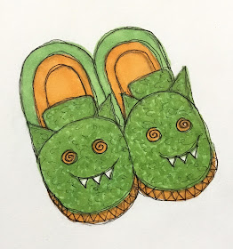
 #smilingshoes

 #winteranimals

 #snowman

 #cardinal

I don't know if it's my anxiety over the coronavirus stuff we are all going through, but I am having a rough time of drawing lately. I hope that improves. If it doesn't, I just may give up on drawing rather than produce garbage day after day after day.

How are you all holding up with the pandemic and all it entails? I hope you stay safe and well.

THE SMALL PRINT: Please respect that these are my original drawings and may not be used or reproduced for any reason whatsoever without my express consent. Thank you.

Willicontinuedrawing
Smiles.


May 9, 2020

FUN FOLD PANEL CARD

I miss my Stamp-In girls. Plain and simple. I haven't been able to have one of my monthly Stamp-In workshops since March. Because, you see, in mid-March, our lives and the way we do -- or don't do -- things completely changed.

A lot of Stampin' Up! demos provide excellent videos for their customers. But not this girl.

I am not a video type of girl. I have bad arthritis in my hands, so I am very self-conscious about my crooked fingers. Also, I'm not a good demonstrator. If I tried to do a video, the rest of the day would be spent doing retakes, fixing all the bloopers I would be certain to commit. No, not a public sort of person.

So, having my workshops via any kind of live social media is completely out. 

It is important to me that my girls stay active creatively during this quarantine time. Heaven knows, it helps me tremendously. Whether people think this is true of themselves or not, it is a scientific fact that remaining creative helps a person in all sorts of ways.

With that in mind, I sent my girls a little kit to do on their own. Stampin' Up! policy doesn't allow us to share anything stamped, so that prevents me from providing a complete kit. So, I decided to do the next best thing and prepare everything else they would need to make a card.

Using different Designer Series Paper on my sample than the cut pieces I provided for them in their kits, this is my sample of the card they would be creating:


Once you use the Simply Scored and get all your folds going the right way, it is an easy card to create. Can you tell from the following photo that when the card is completed, part of the front bends backward?


It's impossible to photograph the card in a flat position unless I actually hold it. But, you don't want to see my hand in the photo. So, just imagine that the following photo has the card lying flat on the surface.


In the next photo, it is once again standing, but partially open. When in this position, the narrow panel farthest to the left is hidden by the panel just to its right.


Once again, I show it lying flat. When you are making your score lines, you score at 
4 1/4" like you would when making a traditionally folded A2 card. Then you open the card again and score at 1 3/4". This panel, however, bends backwards to form something of a Z-fold.


Follow along for the directions on how to put this card together.

DIRECTIONS: 

Take a 5 ½" x 8 ½" piece of Whisper White cardstock and score it at 4 ¼".  Open it up and score again at 1 ¾". Crease on the score lines,  but bend the smaller fold the other direction from the halfway fold.  

When the card is closed, the smaller portion will fold back on the front of the card. If the card is folded correctly, you will have three separate sections: on the far left, it will measure ¾" wide, while the next two sections will each be 1 ¾" wide. 

Adhere the Designer Series Paper pieces, which are cut at ½" x 5 ¼",  and two of them at 1 ¾" x 5 ¼", onto these panels. 

Now you should have a card with fairly equal margins of white cardstock  between the DSP panels.  

Stamp a sentiment that fits within the parameters of the white label.  Adhere this stamped label onto the frilly label I’d die cut in Mossy Meadow. Add any embellishments if you wish. 

With the card folded shut, adhere the label to the card front as follows:  First of all, only add adhesive to the left half of your label;  otherwise you will be gluing your card shut.  You want this panel with the sentiment to move freely.  The sentiment will be approximately centered over the two wider panels  and about 1 ¼" from the bottom of the white card.   


Creative
Smiles.

May 5, 2020

IT'S THE LITTLE THINGS

If you've been reading my blog for any length of time, you already know that practically anything can be considered a prospective art supply for me. Even things that people have no second thoughts about tossing in the garbage. I've been know to rescue all kinds of "garbage" to use in a project.

Used paper towels are one of my favorite mediums to use. Yup. Once those paper towels are all inky, wet and yukky, most normal people would simply toss them and move on to pristine brand new dry ones.

Not this girl. See below:


After one of my workshop attendees reacted in a horrified way when I snatched the paper towel she had just "finished" out of the garbage, I warned her that she would be using just this art supply in an upcoming workshop. This is my sample of the card the girls got to work from.


Look at all the lovely texture! Doesn't it just make you quiver with excitement??


The sentiment is from a darling Hostess Set that retires in less than a month. It is called Make A Splash and can be found on page 73 of the Mini Catalog. The set also features a fish bowl, fish and all the fixins'. And four wonderful sentiments. If this appeals to you, you only have a matter of weeks to get one for yourself!

For the workshop, since no two "finished" paper towels are ever the same, the girls had to make some choices.


Following is the tutorial I provided for my Stamp-In girls to make their own version of this card.

SUPPLIES:
Whisper White cardstock
Scrap white cardstock
Basic Black cardstock
Scrap cardstock that complements the colors in your chosen paper towel

Pigment Sprinkles on a paper towel -- one ply only

Make A Splash hostess set (page 73 of the Mini Catalog)

Black ink

Ornate Frames (they are in the Annual Catalog coming up!!)
Stitched Rectangles dies (page 196, Annual Catalog)
Big Shot 
Glue Stick
Stampin' Dimensionals
Sequins that complement the colors in the paper towel
Mini Glue Dots

INSTRUCTIONS:
Fold a 5 1/2" x 8 1/2" piece of Whisper White cardstock in half, creasing it well with a bone folder.

To this card base, adhere a 4" x 5 1/4" piece of black cardstock.

Choose a piece of the color saturated paper towel. (You are only using a single ply. Gently separate the plies.) Once you have your piece of colorful stuff, crush it in your hand, then sort of flatten it. Do this several times. YOU DON'T WANT TO ELIMINATE ANY OF THE CREASES, HOWEVER.

Use a glue stick to completely cover a 3 3/4" x 5" piece of white cardstock. Completely cover it with glue, especially the edges and corners. Gently lay your paper towel over the glued paper and pat it in place. Do not pull to flatten it out. You want those wrinkles! Otherwise, your card will be wrinkle free. That's where the character comes in. Once the paper towel is completely patted into place and touching the glue everywhere, you can add adhesive to the edges of the backside of this piece and start gently wrapping the colorful piece to the back side. The paper towel will probably be too large, so you can simply trim off some of the excess so it is easier to work with. Be especially careful on the corners, that you make them neatly pointed.

Adhere the colorful piece over the black cardstock on the card base.

On a scrap of Whisper White cardstock, stamp the sentiment in black ink. Use the proper die to cut out the sentiment.

From scraps of colored cardstock, choose one that complements your background well. Using the Stitched Rectangles Die that measures 7/8" x 2 7/8", cut a rectangle. Center your white sentiment piece over this and adhere it in place. With a couple Stampin' Dimensionals, attach it over the colorful piece as desired. I tried to choose an area that was maybe a little muddy.

Choose sequins that coordinate well with your card, and add them. To add the sequins, place a Mini Glue Dot in the spots where you want your sequins to be, then just pop the sequins over the dot.

Because all the pieces of paper towel the girls had to choose from differed, I made the rest of the card in black and white, then just had them choose a coordinating scrap for the base of the sentiment, as well as sequins, to personalize it.


Wasted
Smiles.