Navigation Bar

August 29, 2020

FLOWERS AND STRIPES

 Recently I went through my stash of retired Designer Series Paper to check over the situation. My stash of DSP is serious stuff. I mean LOTS of serious stuff. I must have more than a hundred uncut sheets from years past. 

I decided to try to use some of it, at least. So, I grabbed a few sheets that had possibilities. Possibilities for COLORING, that is! 

After cutting a 4" x 5 1/4" piece from a few of them, I went over to my tower of Stampin' Blends, and happily went to work. 

Even though coloring in such a vast space of 4" x 5 1/4" -- seriously, try it sometime. It does take quite awhile! -- I was extra excited about the piece I used in the card below.


Since I didn't want to cover up too much of my happy coloring, to make this into a cute card, it needed very little in the way of embellishments. 

I stamped in Granny Apple Green a cute sentiment from the Butterfly Gala set on page 79 of the Annual Catalog, then cut it out with one of the rectangular dies from the Stitched So Sweetly die set, found on page 179. 

Speaking of the Stitched So Sweetly die set, if you don't already  have it, you are seriously missing out on one of the most valuable and diverse die sets ever! If you do decide to order it, tell them Linda sent you. Even better, why not designate me as your demonstrator? I would be so happy!

I put a little flag in Granny Apple Green cardstock under the left side of the sentiment piece, to which I added a Gold Glimmer Enamel Dot (page 157).

Mounted onto a Granny Apple Green base, my card was completed. Quick and easy -- other than the coloring, that is.


In the following photo, my card is posing with a swatch of the original DSP. 
Quite a difference, eh?


The Stampin' Blends I used were Light Granny Apple Green, 
Dark Flirty Flamingo and Dark Daffodil  Delight. 
As you notice, the blue was already there.


If you love to color -- it is ever so relaxing! -- check through some of your retired Designer Series Papers. If they don't seem quite up to par for some reason, give them a new lease on life with your Stampin' Blends. Win Win. You use up some of your stash, you get to relax and flee from your worries for awhile, and you end up with a darling unique card.


Colorful
Smiles.

August 25, 2020

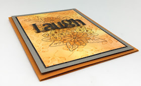
WOODGRAIN LAUGH

Much as I hate to admit it, autumn is closer than we would like. With that said, late August brings to mind more of a fallish palette of colors to use in our cardmaking. Therefore, for this card I used Pumpkin Pie and Gray Granite for my cardstock choices. 


This card consists of multiple steps. First off, I started out with a 3 1/2" x 4 3/4" piece of Whisper White cardstock. Using stamping sponges with Pumpkin Pie and So Saffron inks, I gradually built up the background, lightening, darkening, etc., until I was satisfied with the overall look.

My next step was to stamp some leafy images randomly across this sponged piece. I used leaves from the Forever Fern stamp set (page 110 in the Annual Catalog), and Pumpkin Pie ink, stamping off gently each time. I wanted the leaves to show, but not to overpower.

The next step entailed stamping the large bouquet image from Ornate Style, found on page 67 in the Annual Catalog. I stamped it in Gray Granite ink. 


While working on this card, I made an awesome discovery! 

I had always used Memento Tuxedo Black ink any time I wanted to use Stampin' Blends on a stamped image. After stamping the image in Gray Granite ink, and liking what I had, I wanted to make the flowers stand out a bit more. How would I do that? By adding some extra color with Stampin' Blends, of course.

But wait! I didn't stamp it in Memento Tuxedo Black ink! To test it out, I stamped something on a scrap in Gray Granite ink and took a Stampin' Blend marker to it. Surprisingly, it worked well! Yay! A discovery that I shall use often in the future!

So, I proceeded to work with Light and Dark Pumpkin Pie Stampin' Blends, as well as Dark So Saffron to enhance my flowers. The enhancement is subtle because these were the same colors I used in my sponged background. But I love the look!


The finished card possesses a modest amount of dimension.


Wanting to add a die cut of "laugh", I spent quite some time with various scraps of Designer Series Papers that I thought would work well. After lots of laughs (die cutting the image in different DSPs), the strong winner was this woodgrain word. 


I used narrow strips of Dimensionals to add my word near the top of the large flower image.


To finish off my creation, I added a thin margin of black cardstock on top of a 4" x 5 1/4" piece of Gray Granite cardstock, and popping it up with Dimensionals to the Pumpkin Pie card base.

Finally, I used the Pumpkin Pie Stampin' Blends to add a little color to some of the basic Rhinestones, and dropped them into the centers of the flowers.


Give my new discovery a try! 

Laughing
Smiles.


August 22, 2020

SUNSHINE PLAID

Since the pandemic started way back in March, there have been only two retail establishments I have visited. They are a local quick store and, of all things, Dollar Tree. I don't know why I feel "safe" at Dollar Tree, but I guess I do to some extent. It is never overcrowded and easy to keep my distance from others, while wearing a mask myself. 

One of the main reasons I love to shop at Dollar Tree is the availability of so many crafting supplies, even some thing that aren't even meant to be crafting supplies.

Yesterday, when I was there, I picked up a sheet of flat cork, which is sticky on the back after you peel off the protective waxy layer. I actually dreamed about an idea using this cork sheet last night, with a project idea pretty well set in my brain upon waking. I was anxious to finish my upstairs chores today and get downstairs to my Creation Station to see if I could make my dream come true.. 

Not exactly the vision of my dreams, this is what resulted:


In my dream, I wanted to combine the cork with one of the plaid pieces from the Plaid Tidings 6" x 6" Designer Series Paper pack.. 

Have you set eyes on the sheets in this pack of DSP, found on page 57 of the current Mini Catalog? Luscious luscious luscious. In choosing a sheet for this project, I kept coming across the "perfect" sheet. But, then a few more down in the stack, nope, here is the perfect one. Oh, no. Here it is! Such an assortment of wonderful. 

I finally settled on this plaid. I needed to choose the paper first so I would know which colors I would use to coordinate with it. 


I wish I could say that the dies I used for the flowers and leaves were from a Stampin' Up! set, but it's not. It is a set I purchased a few years ago because it had a cute picket fence with it. Good reason to buy, right?

The cork is a snap to work with in die cutting. It cuts without any issues whatsoever. I used Pretty Peacock and Cajun Craze for the flower components, and Mossy Meadow for the leaves.


Does the mason jar look familiar? It is left over from last month's paper pumpkin kit, meant to be used with firefly die cuts. I didn't use the jars for that, and instead saved them for a different project. This is the project! 

The jars themselves are made from vellum. When I laid the jar atop the plaid DSP, of course, the plaid showed through. I didn't want that. So I carefully traced the jar onto a piece of Whisper White cardstock and fussy cut it just inside the lines. I used tiny drops of glue along the very edge of the back of the vellum jar and fastened the white cardstock jar to it. With a little time and patience, it worked out very well.

The first thing I did then was to adhere the jar in place onto a pared down piece of the plaid paper, all ready to receive its corky bouquet of flowers.

All the flowers except the very center small flower are adhered directly to the piece, using the adhesive backing on the cork. 

To the centers of the two larger flowers, I added little yellow adhesive-backed pearls that were left over from a past Paper Pumpkin kit.


Up close and personal of the corky flowers.


The white empty space of the jar needed a little something to finish it off. I'd considered stamping something across it. But, at this point, I was reluctant to do so because vellum can be so fussy with stamping, and I was so afraid of messing it up.

What then? Yes, a die cut word. 

I dug through all the word dies I had, and finally hit upon this retired Stampin' Up! die from a set called Sunshine Wishes. I cut it out of the Pretty Peacock cardstock, and glued it carefully with miniscule dots of glue to the vellum. I was lucky in that I lined it up fairly well, even to adding the dot above the "i". Whew.

Thinking all along that I was going to make it into a giant sized card, at the last minute, I decided against that option. I matted it onto a 5" x 7" piece of Mossy Meadow cardstock, and called it finished. At that standard size, I could actually frame it. I may do that. Not sure yet. 

For now, I'm enjoying it as it is.


Dreamy
Smiles.


August 18, 2020

PAPER FLOWERS

I know you are going to feel truly sorry for me when I tell you this. I can't have fresh flowers in my house. Why? Because my darling 14-year-old cat, Fred, eats them. Then throws up all over the house. But never on hard floor. Always on carpeting. 

If someone does give me flowers for an occasion, they have to sit on the mantel where it's fairly dusky -- not light at all -- and where I rarely see them. Now, during the summer, it's nice because I can just set them on the table on the deck. I can see them nicely from the kitchen. And, when the weather is nice, I spend lots and lots of time sitting out on the deck. So that's perfect.

Anyway, no flowers in the house -- except on the mantel. Boo.

So, I thought I'd make myself a little permanent bouquet of flowers that he will leave alone. At least, I THINK he will. He hasn't spotted these yet.

The other day I was in my Creation Station all set to get started on a brainstorm idea I'd had. When I had finished the brainstorm part of the creation, it stunk. It ended up in my wastebasket. Which rarely happens. But it was that bad.

Wandering around aimlessly and disappointed in myself, my eyes fell upon a package of little white clothlike paper flower bunches that I'd purchased on Clearance and had yet to do anything with. I had an aha moment, and this one worked out nicely. 

My result is the following:

I wasn't at all sure this brainstorm would even work, but I went ahead with a little bunch of five flowers I'd plucked free from the others. Grabbing five of my Stampin' Blends, I carefully colored each of the flowers. It worked perfectly!

The colors of Stampin' Blends I used were Light Granny Apple Green, Dark Pool Party, Light Melon Mambo, Dark Mango Melody, Light Seaside Spray and Dark Purple Posy. Didn't they turn out adorable?

My little bouquet needed some greenery, so I grabbed the teeny leaflet dies from the Forever Flourishing Dies (page 175 in the Annual Catalog), and cut out four of them. The die set comes with FOUR of these little dies, two facing each way, so you can run them through the die cut machine just once and get four of them. They were cut from Granny Apple Green cardstock.


My next question was, "what shall I put my little bouquet in?" Remember a few weeks ago when I had stamped and fussy cut a whole slew of vases from the Basket of Blooms set (page 48, Annual Catalog)? I dumped out that supply of assorted vases and tried my bouquet in several that I thought would work well. This is the one I decided was THE ONE. 

I adjusted my bouquet behind the vase itself, taping it in place, then added three of the four leaflets I'd cut.


A close-up of my permanent Fred-proof bouquet:


All well and good. I had my bouquet in a vase. Now what?

I dug out the Stitched So Sweetly die set, found on page 179 of the Annual Catalog. This set is actually a terrific value in that you get six nested rectangle dies with stitched scalloped edges, as well as four assorted shaped dies, all for only $32.00. This set of dies is one I am constantly grabbing. It is so easy to find a die that is suitable for your project. You can even layer the different styles of dies as I did in my card.

I must confess that I tried several combinations of colors until I came up with the two whites together. To make the smaller piece a little different from the flat white base, I ran it through the Subtle 3D embossing folder (page 185 in the Annual Catalog). I then popped it up with Dimensionals to make it a bit more prominent.

Because all the stems from my bouquet were towards the top of my vase and made that area quite bulky, I added a couple Dimensionals to the bottom of the vase to balance it out and mounted the completed vase to the textured piece.


I wanted to use one of the sheets from the darling Flowers for Every Season 6X6 Designer Series Paper (page 148). The patterns on several of the sheets were much much too important and distracting on which to add my cute little innocent bouquet. But I did find one side that was perfection personified, as you can see below. I have the card sitting atop a swatch of the flip side of the DSP I used. Beautiful, but not suitable for this card.


Because my little leaflets were cut from Granny Apple Green cardstock, I added a sliver sized mat of the same color before I used Dimensionals to mount it to my Whisper White card base.

Since the little uncolored stamens in the flower bouquet reminded me somewhat of pearls, I added a few Basic Pearls to finish it all off.


This simple little bouquet is going to sit right alongside my computer so I can enjoy it forever. Stay away, Fred!

Paper
Smiles.


August 15, 2020

PAPER STRIP PACKAGE

If you've been following me for any length of time, you already know that I love projects that allow me to use up paper scraps, especially Designer Series Paper scraps. The Designer Series Papers of Stampin' Up! are always so so lovely that I can't help myself. I just need to invest in some of them as soon as they are released. After using them for a few projects and workshops, my stash still seems to grow uncontrollably. 

So when I get an idea like I did for this card, it is always fun to dig through my stash for papers to use. It almost always works great if you are trying to coordinate papers and stick to one single pack of DSP since they are meant to be used together.


Using five different designs from a long retired pad of DSP (yes, they used to come in pads!), I was able to coordinate my pieces nicely. Shown in the following photo is the end result of my paper strip package.


Don't you love the very unsubtle texture of the new 3D embossing folder called Old World Paper, which can be found on page 185 of the Annual Catalog? With this particular embossing folder, it is always difficult to decide which of the two sides of embossed paper to use; they are both so incredible.

For my card, I decided to have the prominent texture facing outwards. 


Unfortunately, the die cut "happy birthday" is not a Stampin' Up! die. It's one I've had for a long time, and the size and look of it fit so well, I decided to use it. Added sort of haphazardly and higgledy piggledy to a narrow strip of cardstock, then popped up with Dimensionals, seemed to work very well.


Of course, this card, which in these colors definitely has a masculine feel -- which is always so welcome, since masculine cards are often quite a challenge -- can be made in any DSP or color combination whatsoever. 

Following you will find a tutorial on how to recreate a card like this.

INSTRUCTIONS:
Fold a 5 1/2" x 8 1/2" piece of Whisper White cardstock in half, creasing it well with a bone folder.

Choose five different Designer Series Paper scraps that coordinate well, and cut them to 1/2" x 2 1/2". Cut a scrap of white cardstock to 2 1/2" x 2 3/4". Adhere these strips to this cardstock, butting the edges tight against one another.

Choose a cardstock that coordinates with one of the colors in these strips and cut it to 4" x 5 1/4" Run this cardstock through a die cut/embossing machine inside the Old World Paper 3D Embossing Folder. Choose which side of the embossed cardstock you would like facing out, and adhere it to the white card base.

Use Stampin' Dimensionals to add the strip package to the card front so it is about 1" from the top of the embossed piece.

Tie a piece of thick baker's twine that matches your card into a bow with longer ends hanging and attach it with a glue dot to the top of the package.

Add three Basic Rhinestones, one of each of the sizes, onto the package.

Die cut your choice of sentiment. Add it to a coordinating strip of cardstock that measures 1/2" x 4". Pop this strip up towards the bottom of the card with Stampin' Dimensionals.


Packaged
Smiles.

August 11, 2020

LACY BACKGROUND

 I bring to you today another example of upcycling. I love love love to do that! As you already know about me, I loathe throwing away potential craft supplies. Most people would have tossed the two things that I used in this card that, I think, makes it quite special. Not me!


Do you wonder at all how I made the bright pink on white background? Read on for a surprise!


Don't throw away that lacy paper doily that you just finished using for a special occasion! That, my dear, is a STENCIL! Yes.

No need to be especially careful either. Another thing I love: The inconsistency of the results you will get with this "technique". 

Using a Stampin' Sponge and Melon Mambo ink, I randomly placed the holes of the doily all over a 4" x 5 1/4" piece of Whisper White cardstock. If, when checking it out, you discover a place or two that seems a little empty, plop that doily stencil over the needy places and sponge away some more. I think doing some of the sponging lighter and some darker gives it a lot more frivolity and diversity.


The finished card:

I just wanted to call to mind the sheer FUN of this card. 


MORE fun!


Do you have any ideas about the "mat" I used for the sentiment? The scalloped flower-printed piece? No? 

It was a cute little paper cup that held a few treats at a special celebration. Too adorable to throw out (!), I flattened it under a few heavy books for a couple days so it was easier to work with.


The spot under the sentiment featured the name of the company that manufactures these cups. So, it was a perfect spot to display the sentiment. And this die, from the Painted Labels die set on page 177 of the Annual Catalog, fit the area perfectly. The cute little "thanks", stamped in Melon Mambo, is from the Inspiring Iris set on page 118. 

SIDE NOTE: Have you checked out the Inspiring Iris set yet? Besides some wonderful images, it also contains several very meaningful sentiments appropriate for lots of occasions. And it's a steal at only $21.00!


Once I had the "thanks" stamped on the die cut label, there was a bit of space that was filled perfectly with a couple of Basic Rhinestones that I'd colored to match with my Melon Mambo Stampin' Blend.


A bit of Melon Mambo ribbon peeking from beneath the treat cup added the absolutely perfect finishing touch. 

Just a little further note: Because this was a thank you card for a very special person, I used a stamp from a long ago Paper Pumpkin set that read "You're the reason I smiled today." on the inside of the card.


Upcycled
Smiles.


August 8, 2020

#dailycreating MARCH 2020

March 2020. Already depressed from the new coronavirus pandemic and all it entailed, I also had to deal with double prompts throughout the month. Oh, woe is me. 

Not only did I continue to follow the prompts of Terry Runyan's #dailycreating group, but my 12-year-old artist granddaughter, Stella, hosted her second annual March Into Spring challenge throughout the month. Wherever possible, I attempted to blend the two prompts. Whatever. It added a great deal of stress to my daily creating. I don't know why. It should have been fairly straightforward. 

Anyway, as the result of the pandemic feelings, plus the undue stress of two prompts each day, I am not proud of my output for the month. Yuk. 

I chose nine of my drawings that were not nearly good enough to post publicly, but, unfortunately, were the best of the bad. So please forgive me for the crummy pieces I have to share with you in this post. As always, I will add the prompt(s) above each drawing.

#pig

#chorus

#koi

#puppy
#rainpuddle

#meditation
#mushroom

#dogurday
#umbrella

#herbs (I named this dog Herb)
#dogwalk

#walkinthepark
#mud

#giraffe
#choice

Wow! I really had to reach for some of these, eh? I apologize for the poor quality. Hopefully April will bring some better stuff.

Until then . . .

Stay safe and well!

I know no one would be interested in "stealing" any of these drawings, but please remember that this is my personal work and not to be used without my express consent. Thanks..

Mediocre
Smiles.
 

August 4, 2020

DAISY SMILE

There is such a pretty pack of 6X6 Designer Series Paper in the Annual Catalog called Flowers for Every Season. It can be found on page 148 of the Catalog. There really are papers in this pack that can be used for every season throughout the year, even a Christmas pattern with poinsettias.

Then, to coordinate with these pretty papers, there is a stamp set in this year's Make Beautiful Things brochure. Found on page 5 of this brochure, Four Season Floral contains a handful of good-to-have sentiments as well as four flowers that can be used throughout the year. And this st is only $14.00!!

I stamped the daisy from the set in Memento Tuxedo Black ink onto a scrap of Whisper White cardstock and colored it in with Stampin' Blends. Since I wanted my daisy to echo the daisies on the DSP I was using for my card, there wasn't a whole lot of coloring to do. 

The Stampin' Blends don't come in the Bumblebee color (darn), which is the yellow featured in the DSP, so I colored the center of my daisy in Dark Daffodil Delight. I used Dark Just Jade for the stem and leaves.

I fussy cut the daisy leaving a narrow margin of white around it. 


Since the design in my paper was soft and not too overpowering, I chose one of the frilly dies from the Ornate Frames dies set (page 182 in the Annual Catalog) to back up the fussy cut daisy. I cut this from Just Jade cardstock and adhered the daisy to it. The size was perfect. 

After cutting a piece of the DSP to 4" x 5 1/4", I popped the matted daisy onto this with Stampin' Dimensionals.


To finish off this simple card, I stamped the word "smile" from a retired stamp set (that I am so glad I hung on to!). It is an outlined word stamp, which enables me to color it in with Stampin' Blends. I used the Dark Just Jade Blend to color the word.

A bit of advice when coloring in images that have varying widths such as this word: Use the brush end of the pen for the wider portions, while the bullet tip works well with narrower areas, such as the downstrokes of the letters.


Once all this was finished, I added the panel to a card base of Just Jade cardstock. 


I plan on featuring the other three flowers from this stamp set against other coordinating DSP from the Flowers for Every Season Designer Series Paper pack. Lovely stuff to work with! Stay tuned.

Flower-y
Smiles.