September 27, 2022

INPUT NEEDED

OK, all of you Paper Seedlings readers. Let's get a conversation going on this card. I have worked with vellum a million times. Alright, maybe that's a bit excessive. But, I have had a lot of experience with vellum. So I feel a bit flabbergasted about all of this.

This card was somewhat complicated to figure out and put together. But, when I finished, I was quite satisfied with the result. 


Shortly after I finished the card -- uhem, after the glue dried -- I discovered something that made me go "OH NO!" THE VELLUM HAD BUCKLED! 


It's so noticeable that I can barely stand to look at it.

I'm sure lots (most?) of you have used vellum in your papercrafting. I know it's a challenge workiing with it so the adhesive doesn't show. With vellum, that's a given. We know we need to be creative with the adhesive aspect. This card is no exception and I guess I wasn't successful.

I thought I'd done everything right on my card, but apparently that is not really the case.

Have you ever had buckling vellum occur with any of your creations? If so, how did you rerctify it? Let's get a vellum conversation going in the comments.


For what it's worth, here is a tutorial on making this card. Maybe, as you're working through it, you will have a better way of handling the vellum portion.

SUPPLIES:
White cardstock
Blackberry Bliss cardstock
Vellum
Designer Series Paper (from Sale-A-Bration)

Rich Razzleberry ink

Watercolor Shapes stamp set (page 102, Annual Catalog)

Die cutting/embossing machine
Brilliant Wings dies (page 169, Annual Catalog)
Stitched Rectangles dies (page 174, Annual Catalog)
Iridescent Purple Sequins

DIRECTIONS (flawed as they may be)
Fold a 5 1/2 x 8 1/2" piece of white cardstock in half, creasing it well with a bone folder.

Cut a piece of vellum to measure 3 3/4" x 5".

Choose a color palette for your card. My main color was Rich Razzleberry.

Find a piece of Designer Series Paper that coordinates with this chosen palette (or choose your DSP first, then coordinate your colors to that), and cut it to 4: x 5 1/4".

Grab the Stitched Rectangle die that measures 2 5/8" x 4" and cut a rectangle into the center of this DSP. Be sure all the outer edges are the same width.

Carefully adhere the vellum to the back side of this rectangle.

From the Watercolor Shapes stamp set, select the rectangle that measures 1 5/8" x 3". Ink this stamp up well with your chosen color and stamp it in the center of the vellum that shows through the diecut window in the DSP. Set this aside so it can dry completely. Ink on vellum has a tendency to smear if it's not dry enough. You can also hit it briefly with a heat tool.

Add this piece to the white card base.

I used Blackberry Bliss for the butterfly, which I die cut using the largest detailed butterfly die from the Brilliannt Wings Dies.

After checking that the ink is completely dry, add the butterfly by putting glue only on the body. This will also take a little bit of time to dry on the vellum.

Once the butterfly is firmly in place, add an Iridescent Purple sequin near the head of the butterfly.

If you are displaying this card, gently tilt the wings into an upward position, as if he is ready to take off.


I seriously hesitated about putting this card in a blog post. But then, none of us are perfect, right? And I thought maybe someone would come up with a really great idea so this doesn't happen to me or anyonne else again. Thanks in advance!

^^^^^^^^^^^^^^^^^^^^^^^^^^^^^^

I like living. I have sometimes been wildly, despairingly, 
acutely miserable, racked with sorrow, but through it all, 
I still knew quite certainly that just to be alive is a grand thing.
- Agatha Christie -


^^^^^^^^^^^^^^^^^^^^^^^^^^^^^^^^^

Vellum

Smiles.


September 24, 2022

FUSSY CUT FLOWERS

Have you ever had a sheet (or two) of Designer Series Paper where the images are so huge that you hesitate to use it for anything at all because the grand scale of the images would completely overwhelm whatever you wanted to create? Besides, when you cut the sheet into a smaller size, for example, 4" x 5 1/4", all these beautiful images are reduced to pieces of images. 

The only way I can see to get around this situation is to . . . yes! Fussy cut the beautiful oversized images.

To create this set of six cards, that's exactly what I did. One fine summer day, I sat on my deck with a sheet of this DSP, which, by the way, came from a Sale-A-Bration pack, and snipped away. Ah. Bliss. 

After I'd finished the fussy cutting, I wasn't sure how I wanted to use these lovely floral stems. But, following are the photos of what I finally came up with.


I'm actually not a crafter who combines two very different Designer Series Papers, but I happily discovered that it really worked in this case. The two papers are from the same set of DSP. 

Die cutting the putple layer gave the Rich Razzleberry it that lovely stitched line. Adding a bow made from thick white baker's twine and attached with a mini glue dot gave me an easy-to-put-together set of cards.

I purposely didn't add a sentiment to the card because they can be used for almost any occasion, and I figured that that can be addressed on the inside of the card. 

If you get your hands on a piece of Designer Series Paper with oversized images, how do you work with it? Or do you just add it to your paper stash?

^^^^^^^^^^^^^^^^^^^^^^^^^^^^^

Count your age by friends, not years.
Count your life by smiles, not tears.
- John Lennon -


^^^^^^^^^^^^^^^^^^^^^^^^^^^^^^^^^^^^

Flowered
Smiles.


September 20, 2022

SENDING GOOD THOUGHTS

The July 2022 Paper Pumpkin, Sending Good Thoughts, had some wonderful little sea themed stamps that I found completely irresistible.

I have to admit that I still haven't put the kit together as per the instructions, but I certainly have been having a lot of fun with the seahorse (isn't she precious??), the starfish, the dots and the sea weeds.

To make my card, I stamped these tiny stamps randomly all over a Very Vanilla panel, stamping some lighter than others by stamping off first.


I searched through my Designer Series Paper stash in an attempt to locate a design that would be reminiscent of the sea. While the DSP I ultimately decided on does not meet that criteria, I still like it as a pleasing contrast to the undersea panel.

To create some faux bubbles to the scene, I added some beautiful Iridescent Rhinestone Basic Jewels.

That sentiment though. It is such a versatile and encouraging stamp! I know I will be grabbing it often. Imagine all the occasions that it will be great for!


SUPPLIES:
Bermuda Bay cardstock
Very Vanilla cardstock
Designer Series Paper

Stamps from July 2022 Paper Pumpkin kit, Sending Good Thoughts

Bermuda Bay ink

Iridescent Rhinestone Basic Jewels (page 142, Annual Catalog)
Stampin' Dimensionals

DIRECTIONS:
Fold a 4 1/2" x 11" piece of Very Vanilla cardstock in half, creasing it well with a bone folder.

Choose a color palette. I used all Bermuda Bay ink.

To this card base, add a piece of Designer Series Paper that coorddinates with the color palette that measures 2 1/4" x 5 1/4", leaving even margins at the bottom and the sides.

Take a strip of Very Vanilla cardstock that measures 1 1/2" x 5". Use underwater stamps to decorate this piece, stamping off first before stamping in a few areas.

Adhere the stamped strip to a piece of Bermuda Bay cardstock that measures 1 3/4" x 5 1/4".

Add this to the top of the card, leaving even borders at the top and sides. It should butt up well with the DSP that you've already adhered.

In Bermuda Bay ink, stamp a suitable sentiment onto a 1/2" x 3" strip of Very Vanilla cardstock.

Cut a short strip of Bermuda Bay cardstock to measure 1/2" x 1 1/2". Flag one end of the strip. Tuck it behind the sentiment strip, leaving the flagged end extending to the left.

Add this finished sentiment strip with Stampin' Dimensionals about 1/4" from the right edge of the DSP and about 1/2" from the bottom.

Add a trio of Iridescent Rhinestones Basic Jewels onto the stamped portion.


^^^^^^^^^^^^^^^^^^^^^^^^^

Doubt is a virus that attacks our self-esteem, 
productivity and confidence.
- Sean Stephensen - 


^^^^^^^^^^^^^^^^^^^^^^^^^

Underwater
Smiles.


September 17, 2022

DOUBLE CARD

Surfing the Web recently, I came across a card with a really interesting fold. I changed it up quite a lot to make it my own, but I did borrow the essence of the folds. I'd like to thank Jessica Taylor for her wonderful idea. A video of hers can be seen HERE

I call it a Double Card because that's what it really is: one part of the card opening normally, the other portion opening unexpectedly backwards. Confused? Read on!


I know the following photo isn't the greatest and seems to be at a weird angle. But I wanted to illustrate how the double card actually opens.


This next photo shows the card from an even different angle, lying down. If you look carefully, you can see the left flap, normally 4 1/4" wide, is only 2" wide. When that flap is closed, the flap from the second card on the right flips over onto it.


Now, standing up, you can see once again how charming this double card is.


SUPPLIES:
Flirty Flamingo cardstock
Pear Pizzazz cardstock
Wonderful World Designer Series Paper (Retired, from Sale-A-Bration)
White cardstock

Quiet Meadow stamp set (page 68, Annual Catalog)

Mossy Meadow ink

Die Cutting/ Embossing Machine
Merry Tags Framelits dies (retired)
Pear Pizzazz ribbon
Pear Pizzazz/White Baker's Twine
Bone Folder
Stampin' Dimensionals

INSTRUCTIONS:
Cut a piece of Flirty Flamingo cardstock to 5 1/2" x 6 1/4. Score the piece at 2". This 2" section will be the "front" of the card.

Cut a piece of Pear Pizzazz cardstock to 4 1/4" x 6 1/4". Score this at 3 1/8". Crease it well with a bone folder.

The green piece forms another "card", but will open backwards. Fold this "card" closed with the creased fold at the right. With the card folded, center it onto the larger section of the Flirty Flamingo piece. Adhere this in place. Now your card unfolds twice. The 2" gate will fold down first, followed by the backwards green card.

It is important to crease these scores well with a bone folder. Otherwise, the gates will flap open too much.

Now, we will decorate the top section of the green gate, the "front" of the card.

Cut a 2 7/8" x 4" piece of Designer Series Paper. Mine came from the Wonderful World DSP, available during Sale-A-Bration. Adhere this DSP to the backwards fold.

In Mossy Meadow ink, stamp a sentiment on white cardstock. I used an old tag die that had a "hanger" in the top.

Thread a 5" piece of Pear Pizzazz ribbon through the hole at the top and finish it off with a piece of baker's twine, tied in a bow. If you don't have the tag die, you can use an appropriately sized circle die to cut out your sentiment. Punch a hole in the top of the circle for the ribbon.

Use Stampin' Dimensionals to adhere this on top of the DSP layer.


^^^^^^^^^^^^^^^^^^^^^^^^^^^^^^^^^^^^^

A pessimist sees the difficulty in every opportunity; 
an optimist sees the opportunity in every difficulty.

- Winston Churchill -


^^^^^^^^^^^^^^^^^^^^^^^^^^^^^^^^

Double
Smiles.


September 13, 2022

BIGGEST WISH

A month ago, I published a blog post in which the card background was created by using the Blending Brush and ink through the "stencil" left over after punching out some strawberry shapes from a long ago Paper Pumpkin kit. The card I'm referring to is strawberry birthday.

Well, at the same time I was working on the strawberry-shaped "stencil", I also had one with blueberry shapes, i.e., just circles.

Using that same method in a different color scheme, I came up with this card.


As you can see from the next photo, there is practically no dimension to the card 
save for the three pretty rhinestones.


The finished card sitting atop the "stencil" I used to make it:


To create the assorted circles, which somewhat resemble the technique known as bokeh, I used inks in the following colors: Melon Mambo, Gorgeous Grape and Highland Heather. As you can see, I used varying pressure with the Blending Brush to ink in the circles. If it is all one darkness/lightness, you get a result that is a little boring. As they say, variety is the spice of life.


Because I used purples and pinks for my circles, and wanting the sentiment to stand out more, I stamped the sentiment in Blackberry Bliss. The stamps come from the stamp set Biggest Wish, found on page 40 in the Annual Catalog. I love the variety of sizes in this set!

Once the sentiment was in place, I added three purple rhinestones, 


I had done all the stenciling and stamping on a piece of white cardstock that measured 3 3/4" x 5". Because the wonderful coordinating colors in a piece of Sale-A-Bration Designer Series Paper went so well with my circles, I elected to use a piece of that as my frame around it. BUT, wanting more than 1/8" to stick out in order to make it worthwhile, I cut this DSP to 4 1/4" x 5 1/2", the size of an A2 card. This gave a frame of 1/4" all around. 

Since this piece was the size of a card front, I added the whole thing to a white card base even though the white didn't show on the front.


The photo below shows both cards I created using something 
most people would have just tossed in the garbage. 
But me? 
Remember, I see most things as a potential art supply!


^^^^^^^^^^^^^^^^^^^^^^^^^^^^^^^^

Creativity is a drug I cannot live without.
- Cecil B. DeMille -


^^^^^^^^^^^^^^^^^^^^^^^^^^^^^^

Creative
Smiles.


September 10, 2022

FLOWERY BIRTHDAY

I love the bright cheeriness of red with yellow together on a card. Add in flowers, bling and ribbon, and your recipient cannot help but be uplifted when looking at this card. 


To make a card like this is quick and easy, even though it might look more complicated. 


Grab some gorgeous Designer Series Paper, 
cut a small piece and coordinate the rest of the card with the paper. 


SUPPLIES:
Red Glossy cardstock
Daffodil Delight cardstock
Designer Series Paper

Happy Birthday Gorgeous stamp set (retired)

Black ink

Die Cutting/Embossing Machine
Merry Tags Framelits (retired)
Daffodil Delight Seam Binding Ribbon
Real Red Braided Linen Trim
Sparkly green gems
Stampin' Dimensionals

INSTRUCTIONS:
Fold a 5 1/4" x 8 1/2" piece of glossy red cardstock in half (or Poppy Parade) and crease it well with a bone folder.

Cut a piece of Designer Series Paper to 2 1/4" x 3 1/4" and mount that to a piece of coordinating cardstock that measures 2 1/2" x 3 1/2".

Add this to the card base about 3/4" from the top of the card.

Use a die to cut a tag with a hole in the top from white cardstock. If you don't have a die like this, you can use a circle die and punch a hole in the top.

In black ink, stamp a sentiment that fits the tag well.

Thread a 5" piece of matching ribbon through the hole in the top of the tag and tie it off with a piece of baker's twine or some other narrower trim. Tie this into a bow.

Trim the ends of the ribbon to opposing points.

Use Stampin' Dimensionals to add this to the card so the bottom of the tag is about 1/2" from the bottom of the card.

If desired, add two sparkly coordinating embellishments to the tag.


I realize that, in the crafts that I present on my blog, often certain elements are retired. While that can be frustrating if you don't have that particular item in your stash, there is ALWAYS something else that can be substituted. My intent is to simply get your creative juices flowing and hope to inspire you to try to make something similar. Remember, it is always important to march to your own drummer, and create something that is YOU. I am here for inspiration. 

^^^^^^^^^^^^^^^^^^^^^^^^^^^^^^

You have not failed until you quit trying.
- Gordon B. Hinckley - 


Inspired
Smiles.


September 6, 2022

WOODEN LEAVES AND TENTH BLOGIVERSARY

Yesterday was milestone time for paperseedlings.com. I started this blog on September 5, 2012. My tenth blogiversary! This is blog post #1137! 

For several years now, I have been very faithful about blogging twice a week, writing my posts on Tuesdays and Saturdays. Without fail. All the blogging experts advise bloggers to be consistent with their posts, in that, if my readers expect a post from me on those two days, there'd better be one. 

Another thing that I am very proud of is the fact that I have never deviated from my reason for starting Paper Seedlings, and for calling it by that name. All through these ten years, I have continued to share with my readers little paper seedlings of inspiration that I hoped would grow into full-sized wonderful and satisfying paper creations. Another reason for starting my blog was that I also hoped to grow my business through my blog, asking readers that, if I inspired them in any way, to maybe order from me as a Stampin' Up! Demonstrator once in awhile. That has never happened.

I have been ruminating on blogging for some time now. 

My daughter, a wonderful artist, tells me constantly that blogging is so out of style. That NO ONE blogs anymore. She is somewhat wrong about that, in that I subscribe and link up to many wonderful blogs. 

It does seem that bloggers who host Linky Parties on their blogs are becoming fewer and fewer. Those Link-Ups seem to be where most of my traffic, what little there is, comes from. So, I am indebted to those bloggers who continue to hold these events, mostly on a weekly basis. 

Let's look back a bit. 

My very first post, on September 5, 2012, had 243 views. Not bad for a beginner. Just a few weeks later, on September 27, an autumn post went pretty big on Pinterest and boasts 19,104 views! While that enormous number was a wonderful fluke -- I thought -- the rest of that year did well with many of my posts reaching in the lower 1000s. May 3, 2013 saw an even better surprise: 19,283 views! 

Just before my second blogiversary, on August 20, 2013, my White Wedding post -- WHOA! -- had 36,741 views. Another Pinterest surprise! On my first blogiversary, September 4, 2013, I had a so-so blog post, and even that one garnered 998 views. That second year of blogging was OK, nothing so astounding, but holding in the thousands much of the time.

For my third blogiversary, I posted a card that gained 941 views. Hmmm. That year hummed along sort of boringly, but still maintaining high 100s and into the thousands at times.

A delighrful surprise greeted me with the February 3, 2016, post, Love You Quilt. 18,015 people checked it out! The rest of the year was very similar to the previous one.The next few years found views more in the high hundreds than in the thousands. This continued until the Pandemic hit, when viewership fell into the mid-hundreds for the most part. Huh. 

All of a sudden, long about mid-April 2022, I have been consistently at under 100 views per post. I am actually excited if a post exceeds 100 views. I do not know what happened. I don't think my work is lacking. 

Anyone have any clues? Has something like this happened to you, if you are a blogger -- and had been doing really well before?

I don't know if people are just not interested in cardmaking anymore. Or just stamping in general. Once a month, I do a post on the drawings I'd done from Terry Runyan's #dailycreating group. While, in the beginning, they seemed to have been well-received, but not lately. 

I have been racking my brain, trying to come up with something that would instill more interest in my blog. So far, however, nothing. 

Anyway.

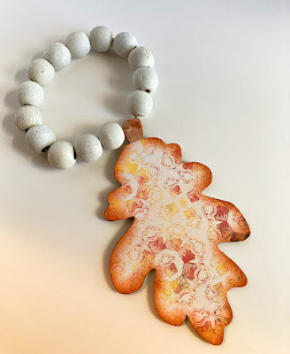
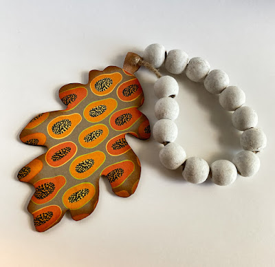
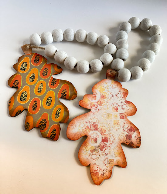
Today, I share with you a bit of autumn decor that I created. Last week, I discovered at the Dollar Tree some wooden leaves on a white beaded ring. One side of the leaf had an initial. ??? Don't ask me why. So, I put two of these leaves in my cart to make them more "me".


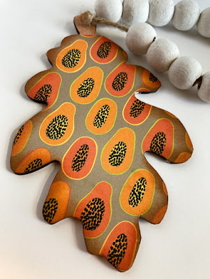
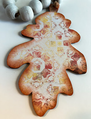
By adding some fallish colored Designer Series Paper to the initial side of the leaves, I made cool little doorknob hangers.


I traced the leaves onto my chosen DSP, fussy cut them, and adhered them with liquid glue. Even though the leaves were dressed up in pretty DSP, they still seemed a little plain to me. So I fixed that with a little sponging on the edges.


+++++++++++++++++++++++++++++++++++++++++

It seems like forever that I have been enamored with quotes of all sorts. In the beginning stages of paperseedlings.com, I used quotes quite frequently. I am going to bring them back, hopefully in each blog post. But, that, of course, will depend on time elements. To accompany each quote, I will also include one of my photos that seems to complement the quote.

Don't let one cloud obliterate the whole sky.
- Anais Nin -


++++++++++++++++++++++++++++++++++++++++++++++++++++

Please, if you have anything to add about blogging, some advice for me, or just anything at all, I would love to hear from you!

I wish you love and joy.

Blogiversary
Smiles.


September 3, 2022

#dailycreating APRIL/MAY 2022

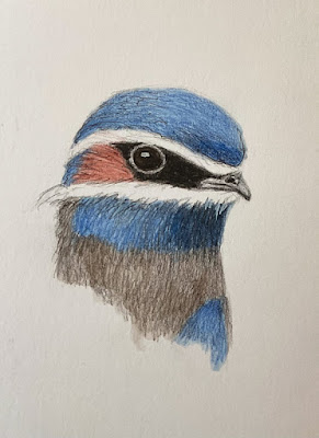
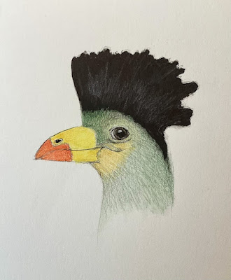
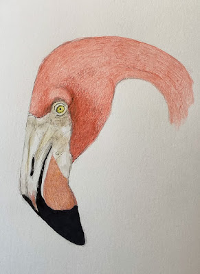
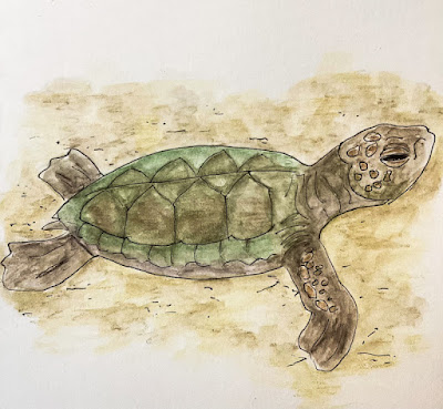
 My apologies. I haven't been drawing just too much as part of Terry Runyan's #dailycreatiing Group. In fact, what I am sharing with you today is the complete portfolio of drawings from TWO months (instead of the normal one), April and May, 2022. 

I will include above each drawing what the prompt for the day was, as well as any other pertinent information I may have on my subject matter.

#off prompt

whiskered tree swift / malaysia


#thing on thing
great blue turaco / central africa
#flamingo

#world turtle day

#thing on thing
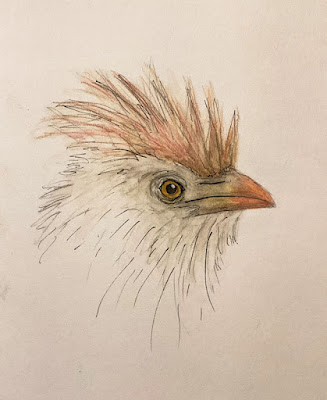
guira cuckoo / south america

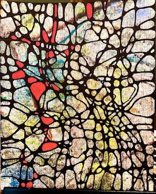
off prompt
based on neurographic art

Two months' worth of work. 

Uncreative
Smiles.